One of the best ways to give an image more emotional impact is through color grading. “Color grading” generally refers to any alteration or enhancement of color for artistic purposes (unlike “color correction”, which is about accuracy). In practice, it can mean a lot of things. Punching up sunset colors. Toning a portrait to give it a hipster look. Adding a color theme to a movie to convey a subtle message.
From a more technical standpoint, you can think of color grading as remapping colors and tones to create an effect. Photoshop includes several tools that enable this, including Color Balance, Selective Color, HSL, Lookup Tables (LUTs), RGB curves, Solid Color layers set to overlay blend mode, etc. However,with the exception of LUTs, these tools aren’t very precise. Color Balance adjustment layers are a great example.
With Color Balance layers, you get an option to target “shadows”, “midtones”, and “highlights”. Sounds perfect for split-toning, right? Not so fast. This tool probably doesn’t work at all like you might think. There are several important things to know about Color Balance:
- For the most part, it really doesn’t target shadows, midtones, and highlights – unless you adjust a few of these at the same time. For example, adjusting the “shadows” will create significant changes well into bright highlights, and adjusting “highlights” will affect very deep shadows. You can, however, adjust shadows and highlights in opposite directions in the same adjustment for greater control (ie, you can set blue shadows and yellow highlights and you’ll see better targeting). But the key thing to know is that shadows/midtones/highlights are NOT giving you very precise control. The simplest solution here is to use BlendIf, which we’ll cover below.
- The same adjustment values can create very different colors when set under shadows, midtones, or highlights. For example, using 100 Red and -100 Yellow will cause a shift toward yellow when set under shadows, orange under midtones, and red under highlights. You can make some adjustments to the sliders to try and match results, but it can be an exercise in frustration. I generally take the approach of making adjustments first in the most relevant area (ie, highlights when targeting highlights) and then tweaking as needed. Also note that negative adjustments in shadows affect highlights more than making the same adjustments in the highlights. So if you really want to push yellow or magenta into your sky, try using those adjustments in shadows in addition to in the highlights section. Or just duplicate your layer for twice the effect.
- “Preserve luminosity” is very unpredictable, and often causes MORE change in luminosity. It can cause significant changes in color as well. I almost always leave this option off. If you want to avoid luminosity shifts, just set the blend mode on the layer to “color”.
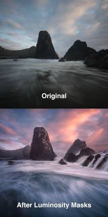
You can make some great enhancements with a Color Balance layer on its own, but using a more precise targeting by shadow, midtone, or highlight will allow you to properly split-tone and color grade your images. There are two basic ways to do that targeting: luminosity masks and BlendIf. While luminosity masks offer more control, they are generally overkill in this situation. And they have some drawbacks: you may need to re-create them if you change underlying layers and they can increase the size of your file substantially. BlendIfs produce great results that dynamically update as you change the image and add nothing to the file size. I do nearly all color grading with BlendIfs.
In the video tutorial and written instructions below, you’ll learn how to use BlendIf to use Color Balance with greater precision. Once you get comfortable with that, try using the technique on other types of layers, this is just one example of how to color grade with BlendIf. You can apply the same general workflow to any adjustment layer, including: Solid Color layers (probably using a blend mode like soft light or overlay), Selective Color, Color Lookup, and HSL.
If you want to take things further, be sure to check out my new Exposure Blending Master Course, where I go into great depth on many ways to get incredible color from your images using more techniques like this.
Be sure to also see How to use Color Channels in BlendIf for Stunning Sunsets.
I’ve built advanced BlendIf support into my Lumenzia luminosity masking panel. If you have it, here’s the workflow you should use to color grade with Color Balance layers:
- Click the Color Balance icon in Lumenzia
- Either switch to “BlendIf:under” mode or hold the key while clicking on any of the preview buttons such as L2, D4, or Z8. If you want to see what areas of the image are being targeted with the BlendIf, click the “If” button at the bottom of Lumenzia for a green overlay (and click “If” again to clear the visualization). You can do this after adjusting the color balance layer, but it often helps get to the right settings in Color Balance more quickly if you have some rough targeting to start.
- Adjust the Color Balance layer. If you are targeting highlights or shadows, you may get better results by adjusting the sliders in those sections, as you’ll probably find the colors respond more the way you would expect.
- You keep iterating by adjusting the Color Balance layer, by trying different BlendIf buttons, or double-clicking the squares icon on the layer to manually customize the BlendIf further.
If you do not have Lumenzia, use the following workflow:
- Create a new Color Balance layer in Photoshop
- Adjust the Color Balance layer. You’ll need to do this first, or you won’t see what you are affecting when you adjust the BlendIf sliders. If you are targeting highlights or shadows, you may get better results by adjusting the sliders in those sections of Color Balance, as you’ll probably find the colors respond more the way you would expect.
- Double-click the right-side of the layer (the blank area right of the name) to open the “layer style” dialog, where you’ll see “Blend If” at the bottom.
- Adjust the black and white sliders for the “underlying layer” to roughly target the shadows, midtones, or highlights.
- The initial result will have some rough edges, so you need to split the sliders (which creates a transition from areas which are included or excluded in the mask). To do that hold and click and drag on the sliders.