Do you need to calibrate Apple XDR monitors?
Photographers need accurate monitors. If you are viewing a display with inaccurate color temperature, crushed shadows, etc, you are likely to be frustrated with your prints and your online audience probably won’t see your image as you intend. This is why we prefer high quality monitors and profiling tools. Things get a bit more complicated with HDR photography, as we do not yet have an ICC standard for profiling in HDR mode (if you create a profile, the HDR values will clip to SDR white).
As I’ve written on my recommended HDR monitors page, you only have two good options for HDR now: calibrate in hardware or buy a monitor which is accurate out of the box. There is no standard yet for ICC profiling in HDR mode. The only monitors on the market which support HDR calibration are ASUS ProArt monitors or Apple XDR displays (which includes MacBook Pro, iPhones, and many iPads). It’s great to have the option, but are these premium displays accurate enough out of the box?
I do extensive monitor testing, so I decided to get lab-grade test equipment (the CR-250-RH spectrophotometer) to calibrate and test five Apple displays with the highest possible accuracy. In this post we’ll take a deep look at a critical question: how accurate are Apple displays without calibration / profiling?
TLDR: Apple displays with the “XDR” branding are outstanding. They are extremely accurate out of the box, and even several years after purchase. Unless you are both a professional who demands extremely high levels of color accuracy (such as a Hollywood colorist), you do not need to calibrate XDR displays. The results are so good that most people would struggle to notice any difference between the factory results vs after custom calibration. If you want to ensure the highest accuracy as the display ages, I recommend using the Calibrite Display Pro HL to measure reference white and use MacOS’s built in “fine tune” calibration (see how below). To understand the basis of my conclusions and learn much more about how calibration/profiling works, keep reading…
[Disclosure: This post contains affiliate links. I rarely endorse other products and only do when I think you would thoroughly enjoy them. By purchasing through my links on this post, you are helping to support the creation of my tutorials at no cost to you.]
What does an accurate display mean for photographers?
Everyone’s level of tolerance for error will vary, but there are some fairly clear targets and expectations for photographers.
The most important targets to ensure accuracy for photography are:
- Color accuracy.
- Overall, a color deltaE (ΔE) of 2 or less is ideal. If you are above 5, you too much error for photography (and high error is common for gaming monitors).
- Accuracy in neutral gray values is most important (its not only most easily noticed, gray is most of user interface surrounding your image and therefore biases your decisions while editing).
- The target white point for photography is D65. This is a specific white (measured as 0.3127x, 0.3290y).
- Your measurement software may report a “correlated color temperature” (CCT) such as 6500K. This is not a specific white: D65 is a 6500K value, but there are a wide range of 6500K values which are not D65. CCT specifies only the blue/yellow balance (not magenta/green).
- Gray tracking (aka tone response / EOTF, the Electro-Optical Transfer Function).
- Overall, a gray deltaE of 1 or less is ideal (with a 10% test window – peak luminance will vary for HDR monitors as noted below, so we just do our best).
- This ensures proper shadow detail, contrast, etc.
- For SDR, your target is gamma 2.2. For HDR, the signal to the monitor is PQ (“perceptual quantizer”). However, the effective EOTF target for HDR is undocumented / unclear unless you are using an XDR monitor in a reference mode. Neither Windows or MacOS specify how they are trying to drive the display when you use brightness sliders. You can test an external monitor with a pattern generator, but would only confirm good calibration in the hardware and not tell you how the operating system is trying to adapt shadow values, etc.
- Apple XDR displays uniquely offer several reference modes and the ability to create custom user presets (including control over the EOTF in the SDR range).
- Peak luminance
- This is the most critical metric for HDR performance, as it determines how many stops of headroom you have at a given brightness.
- This is not a fixed value in a monitor. Peak brightness depends on several factors – most commonly how bright the display is overall. OLEDs (other than Tandem Stack OLED iPads from Apple) are far more likely to be subject to dimming than mini-LED.
- It is ideal to have a display offering 1000+ nits peak for great HDR. It is also ideal to have a sustained / full screen capability of 400+ nits (as this ensures accuracy is retained even while viewing bright content).
- Uniformity
- This means consistency across the entire display. Lower quality displays may often show less accurate results near the edges of the display.
- Some solutions (such as ProArt calibration) offer ways to improve uniformity, but this is most commonly something you cannot improve. An ICC profile affects all pixels equally, it has no mechanism to correct the edges of your display.
- Wide gamut
- Real world color is much more vibrant than sRGB. A wide gamut monitor doesn’t just show more vibrant color – it shows more detail. A limited gamut won’t show the full texture of sunset clouds. A flower petal may look flat when the gradient of colors gets clamped. A wall lit by a colored light may even look like an artifact or blown pixel when the colors get clipped.
- A wide gamut display will let you enjoy much more beautiful images, and give you an edge in creating them (and there is no downside in editing with wide gamuts like P3 – preemptively clamping the colors in your edit won’t produce a better final result on less capable displays and you can export sRGB from any source).
- Black levels
- This refers to the deepest black the monitor can produce and is also critical for HDR to ensure shadow detail and avoid halos.
- This is mostly a function of monitor hardware, but may be influenced by OSD options (such as for backlight and black level). An ICC profile cannot make the deepest black any darker.
This is only a partial list of the most important monitor capabilities. Other factors like anti-reflective coatings, zero fan noise, and simple operation are often also important (Apple performs extremely well on these other considerations too).
Performance for some of these goals (such as color accuracy) may be improved if you are able to “calibrate” or “profile” your display (we’ll discuss that those terms mean below). Your ability to do either will depend on your monitor, budget (for test equipment/software), technical skills, and support.
What’s the difference between profiling and calibration?
These terms get thrown around very loosely. Often times photographers will say they “calibrated” their monitor, when in fact they profiled it.
Calibration is a process of making the monitor itself more accurate. In other words, when you ask for a specific RGB value you get something very close to it. This may be done in some monitors by changing settings in the OSD (such as RGB gain values) or by using special software tools to write lookup tables in the monitor (such as with ASUS ProArt).
Profiling is a process of making the overall system response more accurate by hacking the signal that goes to the monitor. If your computer knows that requesting a red value of 230 actually produces the result you would expect for 227, then the computer may send a request for something like 232 instead in order to get a result closer to the desired value. This is very well supported for SDR mode thanks to ICC profiles, but not yet for HDR (though Apple’s “fine tune” options for XDR offer a limited option for a basic white point correction).
If you do both, calibration must be done first (otherwise the profile is based on the wrong assumptions about how the monitor will behave). The ideal scenario is a high quality monitor with both a good calibration and profile.
How accurate are Apple XDR displays?
I tested my five XDR displays: the Pro Display XDR, an M1 MacBook Pro, an M4 Max MacBook Pro, an M4 iPad Pro, and an iPhone 17 Pro. Using a spectro for these tests has given me a level of confidence I’ve not previously had (as the quality of color matching functions has always been a question for me).
While these are all XDR displays, they very in both technology and options for profiling / calibration. As you can see in the SPD below, the panel technology in the older Pro Display XDR and M1 is extremely similar if not potentially identical in many ways other than size. The M4 MBP improved by changing from a red KSF phosphor film to QD (quantum dot) mini-LED. The M4 iPad uses a “Tandem Stack” OLED and is therefore inherently different (note that the peaks are closer together in the iPad). The iPhone uses a different OLED, showing more of a blue spike.
Apple offers a few mechanisms to improve display accuracy (all found under System Settings / Displays / Preset dropdown at the bottom):
- “full” calibration
- Calibrates the white point, primaries, luminance, and gamma response.
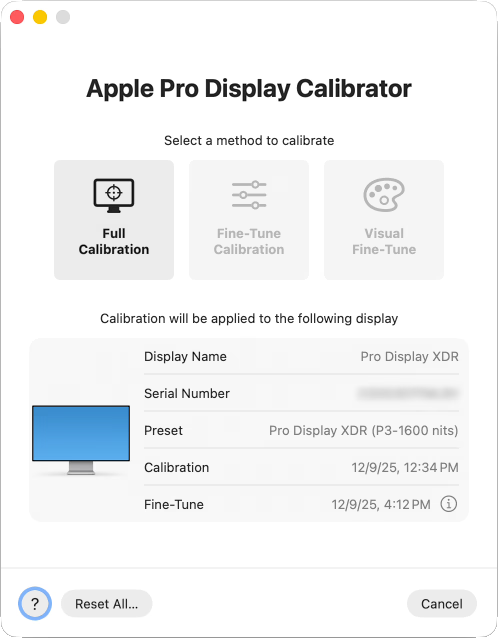
- This option requires a supported spectrophotometer (the CR-250-RH I bought is the least costly – note that “RH” means “rubber hood” and is the one you would want). See the last section below for more information on why spectros are more accurate than a colorimeter.
- The test is very simple to use. You point the spectro at a target on the screen and click a button to run. There are no options to configure (nor any final report when done). It’s very simple and effective.
- The test runs for just under 90 minutes. If you have multiple monitors, you can view the progress in the dialog box if you didn’t leave it on the display being tested. It will show “performing stabilization” during warmup and then show progress through 96 measurements.
- When you calibrate the Pro Display XDR, it is written in the monitor and therefore will benefit other Apple computers you later connect to that display.
- Calibrates the white point, primaries, luminance, and gamma response.
- “fine tune” calibration
- This provides a minor correction based on a single measurement (x, y, and luminance values of a known white). You can do this manually with any colorimeter or spectro.
- This is a great option for those who don’t have a spectro to run full calibration. And even if you do, this offers a much faster way to test and tweak performance on a regular basis after full calibration.
- You may only initiate this while in one of the system preset XDR modes, so use “HDR video (P3-ST 2084)” to measure its D65 reference white.
- On MacOS, it affects performance in all XDR presets in MacOS (even ones where you cannot start fine tune).
- On an iPad, fine tune only shows benefit while reference mode is enabled.
- “visual fine tune” calibration
- Do not use this, you are more likely to reduce than improve accuracy.
- XDR presets:
- These presets don’t make the display more accurate – they give you more control over the target (such as a specific SDR luminance or EOTF).
- For XDR displays under MacOS:
- You can choose from a list of system presets. “HDR video (P3-ST 2084)” offers predictable HDR results.
- Or better yet you can easily create a custom profile with SDR brightness adapted for your ambient light (80-120 is ideal under controlled lighting), gamma 2.2 for SDR range (ideal for print work), 1600 nits HDR peak (to use the full capabilities of the display), and P3 primaries.
- For XDR iPads:
- You may only choose “reference mode” (under System Settings > Display & Brightness > Advanced). When enabled, this is the same as “HDR video (P3-ST 2084)” on the computer – it provides a predictable/fixed response and disables options which reduce accuracy (such as true tone and night shift).
- It would be nice for home use if there were a way to add a toggle for reference mode to control center so that you could switch between accurate viewing in controlled lighting – vs otherwise normal use (brightness adaptation is key when outdoors or near a window, and many may like to use true tone / night shift. Apple’s rational for the iPad is likely just so that pros in Hollywood can review “dailies” on an iPad with sufficiently high accuracy under reasonable controlled ambient light – toggling this setting probably doesn’t appeal to that audience.
- The XDR iPhone (ie 11+):
- Offers no reference mode nor options for any calibration. You cannot improve on the factory default results. The iPhone is too small for normal Hollywood use, and I wouldn’t see much value for home use without the toggle I mentioned (try turning off brightness adaptation on your phone and using for a day, it’ll be unusable in some parts of the day or night – we need adaptation here).
- (Third party tools support profiling, but only in their apps and not systemwide – which makes them of very limited value).
I tested my various XDR displays under several conditions:
- Factory settings (ie “out of the box” performance). This will show the minimum performance you should expect.
- Full calibration only. This shows the benefit of Apple’s advanced calibration (ASUS ProArt is the only other display offering a similar capability).
- Fine Tune calibration only. This reflects the only calibration most photographers can perform (ie the best possible result until there is a standard for ICC profiling).
- Full calibration + Fine Tune. This may be expected to show the best possible results.
- [ Note that I did not use any ICC profiling with any of these displays as they are not supported in HDR mode nor iPad / iPhone for any profile systemwide. There would be nothing further to gain above the excellent results I’ve achieved. ]
For MacOS testing, I used XDR set to HDR Video mode (which is the only option to measure HDR with a predictable EOTF), a CR-250-RH, CalMAN targeting P3 PQ, and MacOS Patterns using full range encoding (HDR10 enabled in CalMAN). For iPad, I used reference mode. For iPhone, I could only measure white point (the EOTF is undocumented and hard to reliably control with a brightness slider).
Note: I manually evaluated actual data points, but the average and max deltaE values below are skewed high as CalMAN automatically includes several test patches which are clipped (ie it over-weights the brightest value, which is often one of the least accurate). So actual performance is better than the average values below suggest, but I didn’t bother to manually exclude extra readings to re-calculate the average.
What can you reasonably expect after calibration / profiling?
While calibration and profiling are important tools which can improve the accuracy of your display, they are not magic solutions that can fix everything. In fact far from it, especially when working with HDR. These issues come up in SDR editing too (finding that your prints are dark even after you’ve profiled your monitor is a very common example – as your display can be both perfectly accurate and still the wrong brightness for your working conditions).
To set expectations, here are a few things to know about the limits of accuracy with an HDR display even if you get great results from calibration and profiling:
- Calibration and profiling cannot improve capabilities
- If your monitor can only hit 1200 nits or only has 97% P3 gamut, that’s the best you can get.
- In fact, your capability will probably decrease (very slightly) after calibration and profiling because the least accurate values are at the extremes and they will be eliminated.
- For example, peak nits are likely to drop after calibration and profiling. The only way to correct white balance issues for the brightest values is to turn down the maximum red, green, or blue sub-pixels a bit until we find the brightest white where the three channels add up to an accurate white.
- Calibration does not mean that two different displays will match perfectly!
- Different displays have inherently different SPD (“spectral power distribution”), which is discussed below. As a result there are inherent limits to how closely two different panel types can produce any given color – and matching all colors across your gamut is nearly impossible.
- To achieve the widest modern gamuts, many monitors have very tight ranges of wavelengths emitted for red, green, and blue (measured as FWHM or “full width at half maximum”). These more precise colors for the sub-pixels allow creation of very saturated colors – but they also increase the risk of “observer metamerism” (ie different people may perceive some colors from the display slightly differently).
- You don’t need to worry about metamerism, but it may come up when a display with very high coverage of the Rec2020 gamut is involved (ie with newer technologies such as RGB mini-LED and laser projectors). This could result in two people disagreeing about whether a calibration looks “neutral”, whites appearing slightly greener or redder to different people, skin tones differing subtly between viewers, or blue highlights varying more than expected.
- The only time you should expect a very close match is when both display use the same panel technology (ie backlight, phosphers, etc), are in good condition, and warmed up. So if you use multiple displays, it is beneficial to use the same model for color matching. Apple does a very nice job even across different technologies.
- HDR luminance is dynamic and impossible to fully characterize or control.
- No monitor (other than $30k reference monitors) offer the ability to hit peak brightness across all pixels at the same time. Due to power consumption, thermal design limits, monitor burn-in risks, etc your pixels may dim significantly – sometimes even with just SDR content. This dimming is typically known as ABL (automatic brightness limiting).
- As a result, calibration and profiling are typically done with a 10% window (ie covering 10% of the pixels in the center of the display). If you were to run your tests with a 2% or 50% window, you would see very different results!
- For example, an OLED might achieve 1000 nits in a 2% window, but only 200 nits in a 50% window (Apple “tandem stack” OLED iPads uniquely avoid this and are able to offer full screen or “sustained” values of 1000 nits – and consumer phones are less prone to this).
- For this reason, today’s mini-LED displays are generally more accurate than OLED in real world use. You may well see a great test result for an OLED (based on that 10% window) – but when you start viewing real photographs, you are likely to find that the OLED has dimmed and is therefore less accurate (potentially causing you to edit the image in a way which will look too bright on a display which does not suffer as much from ABL).
- deltaE only tells you how well the display performs against a target value – it says nothing about whether those targets are suitable for photography!
- The display needs to not only be accurate, it also needs to be set for the brightness appropriate for the level of ambient light in the room. The accuracy of your laptop does not change when you turn the lights in the room on or off, but you’ll certainly struggle to get good results if you don’t adapt the brightness when the ambient light changes.
- Your display may also be configured to target different EOTFs (“electro-optical transfer Function”). In SDR, gamma 2.2 is the correct standard for photography. For HDR, there isn’t a clear standard (you can’t even tell what the operating system is trying to do – other than when using an XDR display in a reference mode).
- As an example of the impact of EOTF: When viewing my dark shadow detail test in a dark room, I can see down to the 0.1% level when I have the display set to the HDR Video Preset or a custom preset using gamma 2.2 and 100 nits for the SDR range. But when using the variable brightness preset with brightness is set to the same 100 nits SDR white, I can only see down to 0.25%. I assume these are all accurate (Apple doesn’t publish their target for the default variable brightness preset, but unless there is a bug in MacOS it would be expected to leverage the same calibration data). These are just different EOTF targets and it affects the shadow detail.
- Low deltaE values may not tell the whole story:
- What does it mean when a manufacturer claims “deltaE <1”? Did they test HDR or just the SDR range? Which gamut did they test?
- A deltaE claim of <1 suggests the monitor should be decent, but take these claims with a pinch of salt.
- Note that there are also different deltaE values. In photography, we typically mean ΔE00 (CIE2000) when we simply say “deltaE”, but there are others. For example, CalMAN can optionally report ΔEITP, is based on the ICtCp space and is designed to help better reflect human perception in the HDR range, better handle wider gamut, and helps separate color error from luminance error.
- Performance varies across the screen:
- Corners are often darker and less accurate than the center (ASUS ProArt offers some way to compensate, but performance here is often just based on the quality of your hardware).
- With mini-LED, each pixel is dependent on its neighbors due to the shared backlight. For example, this may cause halos visible in dark areas next to bright content.
- Performance varies across time:
- A display may vary a fair bit in the first 30 minutes it is turned on or if temperature varies in your environment (which is why it is recommend to let the monitor “warm up” before testing).
- It may also change as the display ages (as you’ll see in my M1 results below).
- Your monitor may include several important settings outside the scope of calibration
- Many OLED monitors include a setting to limit peak brightness, and it may be enabled by default (such as in the ASUS PA32UCDM). This likely won’t change test results, as a monitor which is accurate at 1000 nits will likely be just as accurate when forced to never exceed 400 nits. And while the typical 10% test patch won’t trigger ABL during the test, limiting HDR may improve EOTF accuracy with real world images which trigger ABL.
- Some mini-LED displays include options to control local dimming. This creates complex behaviors where pixel-level accuracy varies with neighboring content and changes over time.
- There may be additional controls for sharpening or other factors outside the scope of our testing.
These considerations are an important part of the reason why Hollywood professionals often pay $35,000 for a “reference monitor” (which more or less means one which is as accurate as possible vs the intended standard, such as mastering content for 4000-nits P3 D65 – though it also typically includes support for special features like built-in vectorscopes or SDI input ports).
Apple has done an outstanding job addressing these concerns with their XDR displays:
- They are all held to a very high standard. There is not a single “XDR” branded display which is not outstanding.
- Sustained luminance values are very high (even in the OLED XDR), so ABL is not a problem affecting accuracy.
- Everything works great by default, and there are easy to use controls in MacOS for experts who wish to customize performance.
Summary of key findings for the XDR displays:
- My 5-year old M1 MBP achieved excellent results after fine tune calibration, but was slightly out of spec when relying only on factory performance.
- With the factory calibration, deltaE was 2.8 average (max 4.9). That isn’t tragic, but falls below expectations. Color was accurate, but the display was about 15% dimmer than expected across the range (tested peak of 835 nits vs expected 1000).
- I consider this factory result good enough for most photographers (who would work in the default variable brightness mode and would have compensated by increasing brightness one tick). However, a Hollywood colorist would not accept the factory results. The most color critical users should test to validate accuracy rather than assuming full + fine tune achieves target on aging hardware.
- Using fine tune calibration only (used 1,000 nits D65 test), results were excellent. Peak brightness overshot at 1066 vs 1000 target, color was dead on. Average deltaE 0.4 (max 1.0). CCT measured 6407 at peak.
- Using full + fine tune calibration, deltaE only improved to 1.2 average (max 1.2). Peak brightness was near perfect (998 vs 1000 target) and RGB balance was great across the range (red drifted lower in bright values). CCT measured 6627K at peak.
- We’ll consider this result in greater depth further below.
- Excellent deltaE scores for color and gray tracking even with factory settings. These results would meet the expectations of the vast majority of photographers.
- M4 Max achieves outstanding scores with the factory calibration:
- deltaE 0.7 average / max 1.7 (peak error near brightest whites – achieving 968 nits vs 1000 nits target).
- Running CalMAN’s ColorChecker test against P3 targets with the factory calibration showed average 0.5 deltaE (max 0.8). Color was excellent across the range.
- 99.8% P3 gamut coverage (68.1% Rec2020 coverage)
- My ~5 year old Pro Display XDR still very good scores with just the factory calibration:
- 1.3 average deltaE / max 2.6. Color balance was very good across the range. Peak white was 987 vs 1000 target.
- Running CalMAN’s ColorChecker test against P3 targets with the factory calibration showed average 0.6 deltaE (max 1.4). Color was excellent across the range.
- M4 Max achieves outstanding scores with the factory calibration:
- Accuracy could be further improved using Full calibration and/or Fine Tune.
- M4 after full calibration
- deltaE 0.4 average (max 1.2)
- This is a measurable improvement, but at a level so trivial that most photographers wouldn’t even notice if you could view them side by side.
- XDR using only fine-tune calibration:
- When tuning from a 1,000 nit sample results improved to 0.8 deltaE (max 2.3). White balance was notably better across the range and peak luminance hit 996 vs 1000 target.
- When tuning from a 100 nit sample, results showed 1.2 average deltaE (max 2.6). White balance was better across the SDR range but not over HDR. Peak luminance hit 1007 vs 1000 target.
- Comparing the two, the 100 nit sample unsurprisingly showed improved accuracy over the SDR range (but worse HDR), while the 1000 nit sample showed nearly perfect HDR measurements and failed to benefit SDR.
- Compared to factory calibration, fine tuning at 100 offered the most benefit to the SDR range (but degraded HDR), while fine tuning at 1000 improved HDR significantly and very slightly improved SDR.
- XDR after full calibration:
- 0.8 average deltaE / max 1.8. Peak 994 vs 1000 target.
- These results would meet the expectations of even the most demanding photographers, but are optional and full calibration is likely not an option unless you know someone or can hire a TV calibrator to use their spectro with your display.
- Fine tune is not worth the effort if you are not using a reference mode / custom XDR preset (ie if you wish to use brightness controls on your display).
- M4 after full calibration
- Excellent gamut, with the M4 Max showing 99.9% coverage of P3 in HDR mode (bright HDR colors can be difficult to achieve, so this is outstanding).
- Excellent uniformity on all displays (including that M1).
- Halos are well controlled for the mini-LEDs, but visible and the OLED iPad is clearly superior in extremely dark detail.
- EOTF tracking remains excellent even in a very large test window due to 1000 nits sustained performance. This is a huge advantage for photographers working with HDR, as it means that the actual performance with real images will track these test results closely (unlike most non-Apple OLED displays which will likely dim quite a bit with larger test windows).
Aside from the accuracy, perhaps the most notable benefit is that XDR displays are extremely easy to use. Great results are the default, you literally don’t have to do a thing. HDR works automatically, SDR content looks great, and the display is very accurate (there is also zero fan noise). XDR-branded displays from Apple are excellent and are clearly the way to go for serious photography.
The Pro Display XDR is perhaps the best investment I’ve ever made in photography gear (the Nikon D850 is right up there too). It gave me capabilities far beyond anything I could previously do and was far more affordable than you would expect. Yes, it costs $6000 (plus tax) new for the monitor with stand. However, I bought mine used in like new condition with warranty remaining for only $3000. I could likely sell it today for a net $1000 – $3000, so I’ve risked almost nothing to pick up one of my favorite products of all time.
For reference, I also tested an M1 MacBook Air. It does not have an XDR-branded display, which means it offers no options for calibration or fine tuning. It also has very little HDR capability (400 nits peak and no local dimming to ensure deep blacks). The out of the box color was notably less accurate at 7185K, though acceptable for a general audience. As this device is primarily intended for SDR use, a custom ICC profile would be a good option and should easily get much closer to the ideal 6500K white point.
My M1 MBP results:
As noted above, my M1 MBP fails to achieve ideal results when relying entirely on the factory calibration. Specifically, it is off by less than 1/3rd of a stop at the peak (15% dimmer in nits, but linear values are overstate how this would be perceived by humans). This is still very good for most photographers. If you use the default P3-1600 nits mode (ie you use the keys to adjust brightness), you would never know the difference. Furthermore, the results were excellent after fine tune calibration (which can be done with a standard colorimeter, no fancy spectro required).
I have no serious concerns here for several reasons:
- If you are using the default (variable brightness) preset, there is no loss of capability. You would just turn up the brightness and see nearly the same results even without calibration.
- Fine tune calibration can be easily performed to bring it back into the target range.
- Even without calibration, it outperforms nearly every HDR monitor on the market. The ASUS P16 laptop is the only other one supporting calibration and 1600 nits. The rest of the options out there will have lower accuracy, less HDR headroom, and in all probability higher rates of quality issues with less generous support.
- As a mini-LED, it will likely outperform most OLED in real use by avoiding ABL.
The best way to profile / ensure accuracy for your XDR monitor:
As you can see, there is no need to calibrate / profile XDR displays, though it may be helpful in some cases (outliers / old monitors) and you should definitely disable options which alter white balance. Here is a quick summary of the best way to ensure accuracy with your Apple XDR displays:
- For any Apple display: Disable true tone / night shift (both are found under Settings / Display in iOS / iPadOS / MacOS)
- iPhone:
- You cannot improve further. There is no reference mode nor options for any calibration or profiling iPhone (third party apps can offer this within their own app only, which makes it fairly pointless).
- iPad
- Accuracy may be improved by using reference mode (same as HDR Video preset for XDR computer displays). It is found under under System Settings > Display & Brightness > Advanced
- In the same area is “fine tune” calibration.
- Only use reference mode when working under controlled ambient light (as it fixes SDR white to 100 nits, which will make the display too dim in bright ambient light).
- Computer XDR :
- Accuracy may be improved by using fine tune calibration
- You
- To perform fine tune (for MacOS or iPad):
- Enable reference mode in the target display (required at least temporarily to get a predictable SDR white to test, as well as to use the fine tune calibration):
- For an XDR computer, switch to the “HDR Video (P3-ST 2084)” preset for MacOS (via the preset dropdown under System Settings / Display).
- For iPad, just turn on the reference mode toggle as noted above (there are no other options for iPad).
- If you have previously set a fine tune calibration, reset it before proceeding to test the display.
- Connect a colorimeter to your computer
- I recommend Calibrite Display Pro HL colorimeter (or Plus HL if you wish to future proof for >3000 nit displays). These may be used with the included PROFILER software.
- When testing an iPad, you will connect the colorimeter to your computer (required to use the colorimeter), but will point the colorimeter at your iPad instead of the computer’s display.
- Use Calibrite PROFILER to measure SDR white
- Go to Utilities / Monitor Quick Check
- select your Calibrite colorimeter
- set the dropdown to OLED (M4+ iPad Pro) or mini-LED (all Apple computer displays and gen 5-6 iPad Pro)
- click “next”.
- Run the test:
- At this point, you should see a screen with a target saying to “position calibrator in the circle”. If that’s on the display you are testing, just click next.
- Otherwise, if you are running PROFILER on a display other than the one you are testing (such as for an iPad), you need to first show an SDR white test patch on the target display. You may open this page on that display and click the “show SDR white test patch” button below to show an SDR white test patch. This is the same target you’d see from the PROFILER software, but gives you a handy way to test a screen that isn’t running that software. Note that I have not bothered creating a 10% window here, as all XDR displays offer full screen brightness vastly exceeding SDR white without dimming (800 nits for iPhone 16e, and 1000 nits for other XDR displays).
- The luminance and xy values shown here are what you need to enter manually into the Apple Fine-Tune dialog.
- Go to Utilities / Monitor Quick Check
- Open Apple’s fine tune calibration to enter the values you just measured:
- in MacOS, go to System Settings / Display / Preset dropdown / Calibrate / Fine-tune calibration.
- on an iPad, you’ll find it next to reference mode.
- for the left hand target values, type in the values for 100 nits D65 white, which are:
- enter the values you measured with PROFILER in the right hand column and click enter.
- Once you are done,
- your MacOS computer will be more accurate in all modes – even if you switch back to the default “Pro Display XDR (P3-1600 nits)” preset where you can use the keys to change brightness.
- your iPad will now be more accurate whenever reference mode is enabled (but it won’t help when reference mode is off)
- Enable reference mode in the target display (required at least temporarily to get a predictable SDR white to test, as well as to use the fine tune calibration):
What could be improved with XDR displays?
Apple has the best HDR displays on the market. They are very accuracy and easy to use. Yet there is always room for improvement and I’d love to see the following:
- The Pro Display XDR is excellent, but beyond the budget of most photographers. The key opportunity would be some kind of prosumer-oriented HDR monitor (ie a 27″ Studio Display updated for serious HDR use). Specs similar to the MacBook Pro (ie 1600 nits / 1000 sustained) would be ideal so there is no compromise when docked.
- I’d gladly welcome a refreshed Pro Display XDR. It’s still arguably the best HDR monitor for photography, but after six years it would be ideal to push the boundaries even further and add features commonly found on premium displays. A webcam, 120Hz refresh rates for smoother scrolling / panning, pass-through Thunderbolt for single-cable laptop connections, increased rec2020 coverage, and a higher zone count / dual-layer LCD / OLED to reduce or eliminate local dimming halos would all be great updates. I’d also love to see 3,200 nits peak to support 5 stops HDR (and get close to 4000 nits video mastering), but I’m not holding my breath there.
- Better mirroring. Even when you connect two identical XDR displays, the one which is not “optimized for” will show degraded results with reduced HDR headroom. This problem affects any display under MacOS, but XDR displays should be much easier to support here.
- An option in custom XDR presets to allow 1600 nits with clipping rather than ABL would be nice. The current design forces you to choose between accuracy and use of the full range. In practice, most content hitting 1600 nits won’t be bright enough across the whole screen to require dimming. It would be ideal to simply clip to something between 1000 (the full screen limit) and 1600 (the peak limit) as required when the display limit is reached for bright content. This would satisfy hardware requirements with less impact to practical capabilities for real use.
- It would be very helpful if the fine tune input had an option to just choose D65 values. These will almost always be the target, and typing manually is both cumbersome and creates risk of user error.
- For those with supported spectros, offer an automated option to measure / implement fine-tune calibration. The manual test setup and typing could be eliminated.
- For pros using “full” calibration, it would be ideal to get a summary of results (ie deltaE values). This is important for any calibration/profiling to confirm success or failure, and eliminates the need for a complex validation tool like DisplayCAL (or CalMAN, which is costly and requires another computer running Windows or a virtual machine).
- Simpler custom XDR preset management. You cannot hide any of the system presets and likely don’t need many of them. There is no simple way to edit an existing preset (or even open it to confirm the settings). And deleting presets is very slow (the screen blacks out for ~15 seconds when you delete any preset, even if it isn’t the one in use).
While some photographers would probably love to see a reference mode on the iPhone, I’m not sure it’s needed nor practical (as phones need to adapt brightness constantly throughout the day).
There will certainly also be photographers who’d love to see the full calibration support extended to colorimeters. However, that’s not a trivial effort given the need for color matching functions for each colorimeter + display pairing. As the potential gains are small, this doesn’t seem like a great use of resources now. This seems like a task better suited to vendors like Calibrite when we have an ICC standard for profiling HDR. I’d rather see Apple invest in things like HDR support on AppleTV, iMessage, and iCloud.
How do these results compare to other options?
Apple has a very solid lead in HDR display capabilities, ease of use, and accuracy. But everyone’s needs are different. Here are some thoughts on the alternatives:
- External monitors:
- You can also achieve great HDR results with an ASUS ProArt monitor (or a 42″ TV), but setup is required, calibration is likely required (out of the box accuracy is not as high), and there are no reference modes – though ASUS is the only option for Windows, is much cheaper than a Pro Display XDR, and has some other advantages such as pass-through USB support.
- For SDR-only work, there are great and very popular alternatives to the Studio Display from Eizo and BenQ. But once you dive into HDR, there’s really no going back to SDR – everything else looks flat by comparison.
- Laptops:
- There are a few very good HDR PC laptops now. But in general, most fall well short of the MacBook Pro’s display. Windows support is also lacking: there are no reference modes, HDR content brightness slider can cause clipping issues, bugs are more common, and pre-installed 3rd-party tools may cause incorrect results.
- I did limited testing on the Lenovo Yoga, which had very good reference white color balance at 6250K. As CalMAN Client3 cannot generate HDR test patterns for a PC laptop and Windows does not document its EOTF target (which varies under its SDR content brightness slider), I cannot comment on how well it tracks a target EOTF – but I believe most photographers would be very happy with this display’s factory results.
- The only PC laptop supporting calibration is the new ASUS ProArt P16.
- Tablets: I have yet to see any tablet offering HDR performance remotely similar to the Tandem Stack OLED offered by Apple. The M4+ iPad Pro has the best consumer computing display I have ever seen.
- Phones are generally very accurate and well supported for HDR:
- Pixel Pro 7+ is outstanding. My Pixel Pro 8 measures 6530K at around 100 nits, very accurate white balance.
- Samsung S23+ has excellent HDR hardware, but are not supported by the Android version of Adobe Lightroom and has historically had some strange HDR software quirks.
Conclusions
Apple has a commanding lead in HDR with its XDR-branded displays. There is simply nothing else like it for editing and viewing HDR photos on a computer display or tablet (Android phones do well). Both the level of HDR capability and accuracy are unsurpassed. The monitors and laptops run dead silent in normal use. And perhaps most critically, they are so easy to use. With zero effort, you get a great HDR (and SDR) results by default.
Key points:
- There is no need to calibrate / profile these XDR displays for photography.
- My results met or exceeded typical photography standards with or without full / fine-tune calibration.
- Even my worst case M1 MBP was within good ranges after fine tune – and approaching excellent if you use the variable brightness mode (or create your own custom XDR preset with an offset to the SDR luminance). Tt still outperforms all HDR displays other than the ASUS ProArt (thanks to its support for hardware calibration). I also suspect this is an outlier and that most XDR displays probably show even less aging.
- If you want to ensure the highest accuracy (especially as your display ages), occasional use of the fine tune calibration is all you need
- Full calibration is unnecessary for photographers. It probably only improves results by 0.5 deltaE (an undetectable change for most photographers).
Side note – what’s the difference between a colorimeter and spectrophotometer?
For those who want to better understand why I’m using such an expensive piece of lab equipment for this testing…
Visible light is a mix of wavelengths. Humans can see from roughly 380 nanometers (violet) to 750 nanometers (red). Unless you are viewing a laser, the color you see is almost always a broad mix of wavelengths. Human vision is based on sensitivity to short, medium and long wavelengths. This isn’t the same as seeing red, green, and blue – but that’s not terribly far off the truth (and is the reason we have RGB monitors).
Each monitor has a unique SPD (“spectral power distribution”). This refers to the overall mix and intensity of specific wavelengths of light the monitor emits to make white. You can see examples below which show how red subpixels in the M1 and M4 MacBook Pros are extremely different. Though a human mostly won’t notice, these differences in SPD from one display to the next are the reason that you will almost never get a perfect match between two different monitors – even if they are both perfectly calibrated and profiled. You can get close, but it is simply not possible to get every possible color to match when the underlying RGB spectra are not the same.
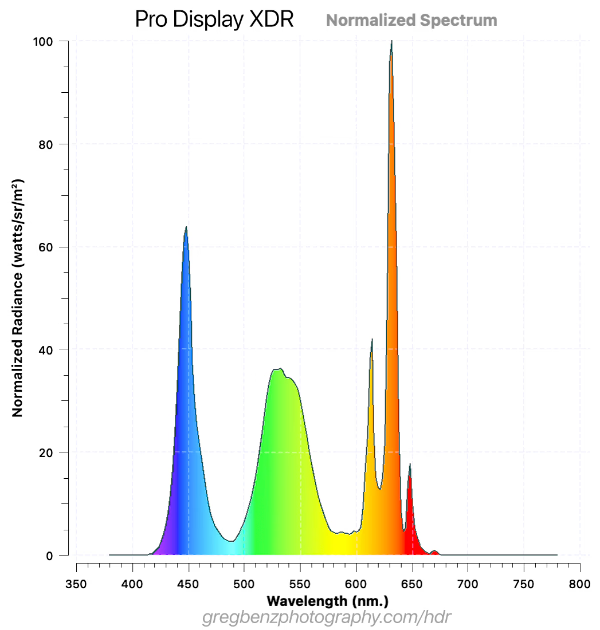
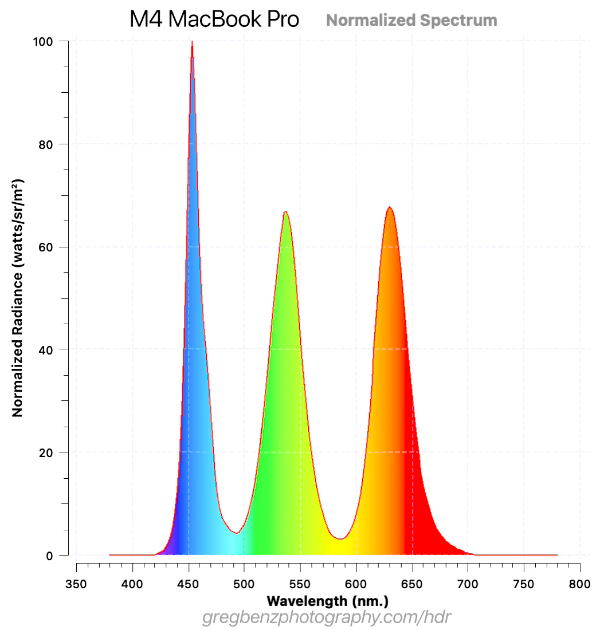
The graphs above show the wavelengths of light emitted for 100 nits D65 white from the Pro Display XDR (which has a red KSF phospher) vs the M4 MacBook Pro (which changed to quantum dot). Both look like very similar whites to a human, but there is a limit to just how well you can get these two displays to match each other even after calibration or profiling.
We can turn up or down the level of blue, green, or red sub-pixels by changing the voltage. That’s the nature of calibration / profiling – altering the mix of red, green, and blue used to produce a given color.
However, the characteristic shapes are just scaled as we change those voltages. We can make the red sub-pixels in the Pro Display XDR brighter or darker, but they will always have that odd triple peak. The PSD is an inherent property of the hardware. Calibration and profiling can’t change the fact that the Pro Display XDR has a super-peaky red or that the M4’s blue is shifted about 10nm towards wavelengths we see as cyan – but our tools try to do the best they can.
These shapes are the foundation of the monitor’s gamut too – having narrower peaks means more pure colors to increase gamut.
There are several underlying technical reasons for these differences in SPD, such as light source (backlight, OLED emitters), phosphors, color filters, quantum dot films, etc. The results may a function of cost considerations and technical targets. An ideal SPD probably has well defined peaks with minimal overlap for red, green, blue (to produce wider gamut), controls the blue spike (minimize eye strain), etc.
To measure and improve the accuracy of monitors, we have two fundamental types of measurement tools:
- Spectrophotometers
- These are very expensive devices (typically $2,000 – $50,000), so they are typically only used by serious professionals with a massive budget, certified TV calibrators, scientists, or display manufacturers.
- These are very accurate and can measure specific wavelengths (with precision down to the 1-4 nanometers being common). In other words, they can see the actual PSD as shown in the graphs above.
- My CR-250-RH has a a spectral bandwidth of 4 nm (covering the 380 – 780 nm range). This is the minimum performance needed for Apple’s full calibration (for example you cannot use the $2k i1 Pro 3, as it only measures down to 10 nm precision).
- This is not a device any photographer needs. I purchased one for some very specific reasons. I wanted to educate myself (factory results vs best possible, better understand various HDR display technologies, etc) and to facilitate better reviews of HDR monitors (as I test them frequently and often find color matching functions for colorimeters are missing or unclear even in CalMAN for the display I wish to test). As you’ll see below, it is very easy to use and does improve the accuracy of even Apple’s XDR displays. So if money is truly no object, go for it – but the gains are modest.
- Colorimeters
- This is a relatively low cost device (often $100-500 for consumer / prosumer grade devices).
- They most commonly have 3 colored filters to detect light (though they might use 2-10).
- This makes them relatively analogous to human vision, but their sensitivity to specific wavelengths is different and varies quite a lot from one device to the next.
- They cannot tell you the PSD of the display, they are don’t have nearly that level of precision. My colorimeter collects 3 data points per color (while my spectro collects 100).
- As a result, they are only useful when you make some assumptions about the SPD of the display you are testing. That is why you would typically be asked which type of display you are measuring (mini-LED, LCD, OLED, etc).
- That gets you in a reasonable ballpark, but limits accuracy. My spectro automatically knows the difference between the PSDs for the monitors above and anything else I might test – but my colorimeter can’t tell the difference and the only hint it gets is me choosing the generic “mini-LED” to interpret the data it collects.
You certainly don’t need the accuracy of a spectro for photography, but it’s helpful for making more definitive evaluations of displays like this. Apple’s XDR displays hold up very well under scrutiny with lab-grade measurement tools.