Adobe just released Lightroom v15.4 with several updates:
Much better “select subject” masks.
Duplicate detection to help automatically find and remove clutter from your catalog
16-bit HDR exports to give you more control in Photoshop
Assisted culling updates to filter out images based where your subject’s eyes are closed or out of focus
More options to sort/find images based on use of AI masks
Keyword syncing across the cloud and mobile versions of Lightroom
More responsive brushing, camera updates, and more
The video tutorials below go into depth on these first three updates (broken into two parts to record relevant video in HDR when comparing how 16 vs 32-bit exports affect Photoshop editing).
Part 1: Select subject and Duplicate Detection:
The new mask quality improvements are automatic when you use select subject going forward. For an existing image, you may replace your existing mask as shown – or just change the AI denoise setting to create a prompt to update masks and click to refresh them.
The workflow for duplicates:
Click the icon for Duplicates in the Library (or menu: View / Duplicates).
There is unfortunately no shortcut key for this module, which is a bit cumbersome to get back here if you try to view any images large (which automatically takes you out of the Duplicates view).
Expand each stack to review, and right-click your favorite image to “set as original” (which is the top of the stack).
Right-click and show in Finder if you need to check the full path.
It would be ideal if LRC were updated to show the full path in the future.
You may right-click a thumbnail in the normal grid and use View Options to enable “top label” to show “folder” to at least see the parent folder in the Duplicates view.
When you are comfortable to commit to removing images, select all target stacks, right-click and choose “remove duplicates”.
Note that images with virtual copies are not marked and it would be ideal if LRC were updated to help make this more clear.
Part 2: 16 vs 32-bit HDR workflows:
Opening as 16-bit HDR in PS is ideal when the only edits you wish to make are with tools which are missing in 32-bit Photoshop. You may later switch to 32-bit if needed via Image / Mode / 32-bits per channel. Going in the opposite direction isn’t a simple task in Photoshop, but Lumenzia / Web Sharp Pro support it (via the flyout menu in WSP or by clicking the selective color icon in Lumenzia and you may delete that extra adjustment layer).
Note that 16-bit HDR files are nearly as large as 32-bit when you open as RAW Smart Objects. That is the ideal workflow since it is non-destructive, but 16-bit HDR files will save you quite a bit of space over 32 if you open as rasterized layers.
For more details on the other v15.4 updates, see the detailed post from Victoria Bromptom (“Lightroom Queen”)
I’ve got a great tutorial on the latest Adobe updates below – but first, want to share a time-sensitive announcement. I’m teaching TWO new classes focused on creative HDR editing this week at the Lightroom Virtual Summit. The Summit includes >30 hours of instruction from 17 top instructors. You can view the sessions for free for 48 hours after each airs this week, or better yet, get the VIP pass for lifetime access to course recordings, detailed class notes, bonus videos, presets, cheat sheets, and more. If you buy through my affiliate links on this page, you’ll also get access to a bonus “ask me anything about HDR photography” session as well – live this Saturday with a recording included.
Adobe just created new AI mask refinement controls in Adobe Camera RAW (ACR) v18.3. This includes AI masks for sky, subject, landscape (vegetation, architecture, mountains, etc), background, and person.
Each of these masks now includes two new sliders:
Feather: a simple gaussian blur softening hard mask edges that aren’t critical.
Edge: lets you expand or contract the mask to better align with important edges, such as trees or buildings.
Sometimes just moving the edge slider a tiny bit can completely eliminate halos! You shouldn’t expect these tools to do all the work for you. The best results come from using them in combination with other masking techniques, so be sure to watch the full tutorial to get the most out of these great new controls.
As is often the case, ACR gets the newest capabilities before Lightroom. You’ll need ACR v18.3 for now. If you work primarily in Lightroom, you can edit there and open the image as a RAW smart object, then quickly tweak the mask via ACR.
To learn more about getting the most out of RAW, be sure to see my new Advanced RAW Masks course.
I am excited to announce the official launch of Lumenzia v12. The headline features in the initial release are a unique ability to align smart objects and new non-destructive focus stacking workflows (see the release notes for a full listing of recent updates).
In recent years, I’ve been trying to get you new features early rather than hold things back for a bigger release. But after hundreds of updates in the v11 life cycle and with major updates today, I think it’s past due to acknowledge how much Lumenzia has improved – so this is the official start of the v12 updates.
Lumenzia v12 is now available as another free update for all customers (see the update page to download and install page for more info). If you purchased Lumenzia when it launched over a decade ago, you’ve now received thousands of improvements with that single purchase at no additional cost..
Align smart objects
The most significant update in v12.0 is a new ability to align smart objects. This unlocks the ability to use the most powerful non-destructive tools (RAW smart object editing) while aligning images that were hand held, shot on a tripod which got bumped or moved, or when focus stacking (to correct focus breathing). None of this removes the need to shoot and compose your images carefully, but it offers much more flexibility for non-destructive workflows.
Note that there is no change in the user interface – the existing PreBlend “align” feature now simply works even when your source is a smart object. But under the hood is literally years of work to perfect the code to make this technically feasible – even Photoshop does not offer alignment of smart objects.
Focus Stacking
The most exciting use for this may actually be focus stacking, which is now a new tab in Lumenzia’s “PreBlend”. Focus stacking always requires alignment due to focus breathing (changes in field of view as you change the focus distance). In the past, focus stacking meant you always had a destructive workflow, as you could not make any changes to your RAW processing after stacking. That is no longer the case. You can now tweak your RAW processing after stacking, which is especially ideal if you wish to exposure blend or otherwise improve the sky in your focus stack.
The Focus Stacking options under “PreBlend” include:
Sort by layer name or inferred focus distance. This helps easily organize the layers from near to far focus distance.
Lock layers to help avoid accidentally altering source pixels when painting on masks. However, if you prefer not to use the “RAW” button in the Basics panel to edit smart objects, you might prefer to leave the layers unlocked.
Match color to active layer. This helps manage minor shifts in brightness or color which may be common when shooting at stack in fast changing light at sunrise or sunset. This feature is not available when working with Smart Objects (though you can easily tweak exposure and white balance in those RAW objects to match).
Crop transparent edges eliminates gaps at edges which occur when correcting for focus breathing. You may wish to leave this off if you prefer to use content-aware fill instead of cropping.
For those of you already familiar with focus stacking, you know that it often requires some degree of manual refinement to pick the sharpest frames across all parts of the image. And because refining the original masks can get tedious (as you’d have to delete parts of masks on upper layers as you reveal lower ones), it often involves doubling the number of layers. The correction process can therefore get tedious as you search for the right layer to use for correction. Lumenzia’s approach simplifies this by offering novel ways to make corrections.
Here’s the workflow to refine the focus masks:
Activate the move tool (<V>) and right-click on sharp pixels next to the ones you need to repair, and click the layer name that appears. This identifies / selects the sharp layer and Lumenzia will automatically make the correct layer mask active and switch to the paint brush for you.
Paint white on the layer mask to reveal the sharp pixels.
Repeat the process as needed until your blending is complete.
Here’s the workflow to refine RAW processing:
Select the layer (the thumbnail, not the mask) you wish to edit and click the “RAW” button in Lumenzia Basics. This will let you edit the RAW settings without needing to unlock the layer. Because Lumenzia creates the correction layers as dependent smart objects, you’ll be editing both the source and correction layer at the same time, while also avoiding file size increases which would occur with independent smart objects.
If you need to copy adjustments from one RAW layer to another:
Click <ctrl/cmd>-C to copy all settings while editing the source layer, then close it, open the target, and <ctrl/cmd>-V to paste.
If you wish to only copy certain settings: use <alt/option><ctrl/cmd>-C when copying
(or use the … menu if you don’t remember the shortcuts).
Note that while you are viewing an image that was focus stacked by Lumenzia AND have the move tool active, any attempt to select one of the original lower layers will cause the correction layer mask to become active and the lower group to close. This is how Lumenzia helps you use the move tool to pick images, but it cannot discriminate between using the move tool and directly clicking the layer. If you wish to select one of the lower layers, simply switch to any tool other than the move tool. It is unlikely you would ever need to access the lower layer, as you’ll do mask refinements on the upper layers and any RAW edit on them will also update the lower layers automatically. It is generally best to leave the lower layers alone. You could merge the whole group if you wish, but this will end your ability to make further RAW changes.
Special announcement: I’m teaching 2 new classes focused on creative HDR editing at the upcomingLightroom Virtual Summit(affiliate link). Register now for early-bird pricing. If you want to get more natural, compelling results from HDR images in Lightroom, this is a great opportunity to learn the workflow step by step. Get the VIP pass for on-demand access to every class, plus extras including detailed class notes, bonus videos, presets, cheat sheets, and even live Zoom sessions.
I’m happy to announce the launch of Web Sharp Pro (WSP) v7, which is another free update for all existing customers. The key goal for v7 is to give you even more options to share HDR photos, including in scenarios where HDR photos are not well supported. This launch is very unique, as most of the new capabilities are for Apple Silicon users (for reasons explained below).
With WSP v7, Apple Silicon users can now:
wCreate an HDR video slideshow with custom transitions and music.
Share HDR photos on AppleTV via AirPlay or the native Photos app (exported as video)
Share HDR photos on Facebook and Instagram Reels (exported as video)
Share HDR photos on YouTube (exported as video)
Get diagnostic information about your HDR setup
Additionally, both Apple Silicon and Windows users will be able to share HDR photos over iCloud and iMessage (i.e. iPhone text messages) using the new “Apple map” setting in the HDR section. And using this encoding is compatible with exports you can already create for Instagram and Threads, so you may create a single export to use on all these platforms if preferred.
Note: the new HDR video export is only supported on Apple Silicon only at this time (Apple Silicon has the largest installed base of users creating HDR content and is a simpler platform for me to support). These tools would require significant effort to support other platforms that I cannot justify at this time. I anticipate the need to use HDR video slideshows will be reduced HDR photos gain more native supported in the near future. If there is significant user demand longer-term for these features on Windows, I may consider supporting these new features there as well. Support for old Intel-based Macs is not planned as these machines have limited HDR support and MacOS Tahoe is the last update planned to support those old computers. Web Sharp Pro will otherwise continue to support all platforms as it always has – some v7 features are simply limited in scope as development effort is extremely high and I expect expanded HDR photo support in the coming year should reduce the need to use video as a workaround. The new “Apple maps” option to make images compatible with iMessage / iCloud works on all computers, only the video export and diagnostics are limited at this time. For HDR diagnostics on any platform, see my HDR tests and HDR troubleshooting pages.
Workflow to create an HDR video slideshow from your HDR photos:
Export your photos from Web Sharp Pro using any of the following formats using sRGB, P3, or Rec2020 color:
JPG (w/gain map) offers the best speed for rendering video. You may set the WSP tone map method to “auto” for faster batch exports (this avoids the need to provide input to the SDR base, since we won’t be using that part of the gain map for video)
TIF and 32-bit JXL are supported, but the video rendering will be much slower.
EXR should only be used if you export as sRGB (colorspace is not embedded in EXR)
Go to the top-right flyout menu (four bars icon) and select “Create Video / HTML slideshow (supports HDR)“. This video feature is only available on Apple Silicon (but other users may continue to create an HTML slideshow)
Select desired options and click “create HDR video“
Select the folder with your source images
You’ll now see a new popup screen with a grid of your images where you can finalize the details:
Content:
Click and drag the thumbnails to change the order of images.
You may click on an image to make it active and then <delete> to remove it from the slideshow (this does not delete the source image). You may use <shift> or <cmd>-click to select multiple images to move or delete at once.
You may use the “select” option at bottom-right to select images by aspect ratio, which may be helpful if you wish to quickly remove any tall images from a wide video or vice versa.
Drag and drop any supported images, video, or music you like onto the grid to add more content.
Click on the music tab to change the order of tracks or trim start/end.
At the bottom, you may select the desired export size. Use “1080p portrait” for social media such as IG Stories/Reels. You may use 4K for YouTube.
At the bottom, you may select the time per image and duration of cross fade.
Right-click an image if you would like a specific image to be faster or slower than the global “time per image”.
Images use a simple cross-fade by default:
When you don’t pick any advanced styles, simple cross-fade images will get a black letterbox to fill as needed.
You may also click “styles” to choose custom transitions such as zooming in.
If you use styles, you will see cropping rectangles. You may click and drag them to use something other than the default center crop. Double-click an image to see a large preview (helpful for precise cropping).
The gear icon at bottom-right offers options for encoding:
HLG is generally safest, but PQ may offer better fidelity to your original
Quality is usually best left at the default “high”. You can safely use “good” with minimal visual impact. There is little visual benefit to “ultimate” for most slideshows.
HLG is forced for 1080p vertical and will enforce 1000-nits (3.3 stops), as this is best for social media. You can always set the same dimensions with a custom size if you pref to choose something else, but that is not recommended.
Click “render” to export. Exported video will default to your original source folder, but you may click the folder path at bottom left to choose another location.
You may make changes and render again if desired, or click “close” (or cmd-W) when you’re ready to exit.
Recommended formats for popular platforms:
YouTube seems to accept everything.
4K landscape is best for sharing to computers / TVs. YouTube will automatically create optional smaller size options for your audience.
Use 1080p vertical for YouTube shorts.
There is a significant transcoding delay, which means your video will not show as HDR for a period of time – which may be as long as 3 days in some cases with long videos (or just bad luck if their servers are busy).
As you can control publication, it is best to wait until you see HDR (red indicator in the gear icon) before sharing your video.
Instagram Stories and Reels:
Use 1080p vertical.
Unlike HDR photos, HDR video support is not deterministic on IG. Test accounts with no followers may never show an HDR result. However, transcoding is typically quick for accounts which will get HDR (wait a few minutes before checking your upload).
IG will show video as HDR in the mobile apps, but will not on the website (unlike photos, which work as HDR on a computer just fine). You may safely upload the content from a computer.
Threads should work like IG, but I have not yet confirmed it.
Facebook seems to accept everything:
Use 1080p portrait for Reels/Stories (just like IG).
Use 1080p landscape for the feed (2K and 4K are safe, just not beneficial).
Facebook will hold your video while transcoding and not share it until ready.
Like IG, you may upload from a computer, but only the mobile app will show video as HDR.
On Meta (IG, FB), you unfortunately cannot prevent your video from being shared before the HDR version is fully ready (drafts and scheduled posts do not seem to help). However, as transcoding is typically very quick, it isn’t a big issue (for the small number of people who might see an SDR video, they will still see a pretty good result – just not the ideal HDR).
Note that HDR video is inherently different from HDR photos. There is no pragmatic artistic control like gain maps for consumer video at this time – but most people seeing these videos on IG / Threads / FB are using mobile devices where HDR support is extremely common.
Workflow to create images which will show as HDR on iMessage and iCloud:
All you need to go it go to WSP Settings / File and check the new “Apple maps” option (this is available on all computers using WSP). When you do this, the image will be encoded so that Apple preserves HDR over iMessage (text messages received on iPhone) and iCloud. The image will also have its normal ISO encoding so that the image works in all the usual places.
Due to limits in Apple’s format, there is some loss of quality when using this encoding. Specifically, the gain map uses luminosity only, which means that the HDR may not be as colorful as your source (as bright values in the base SDR will often have lower saturation). For this reason, you may wish to use this option selectively (when needed) or at least compare exports with and without it to determine what is best for your needs.
HDR Diagnostics:
To help evaluate HDR performance on your system, there is a new [HDR monitor diagnostics…] option in the top-right flyout menu of WSP (only available under Apple Silicon). This will show your current HDR headroom and a comprehensive list of factors which may affect HDR performance for your education and review.
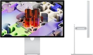
Apple just announced the Studio Display XDR, and it is a game changer for HDR photography. This incredible 27″ monitor outperforms the legendary Pro Display XDR on almost every dimension but size, and yet costs only half as much. This sends one of the clearest signals yet that we are quickly moving towards HDR be a mainstream technology for computer monitors (laptops / tablets are moving even more quickly and HDR is already the default for phones and TVs).
The new Apple Studio Display XDR features:
Excellent HDR support: 2,000-nits mini-LED with 2,304 dimming zones
One upstream Thunderbolt 5 port (120Gb/s) with 140W charging
One downstream Thunderbolt 5 port (you can even use this to daisy chain a second Studio Display XDR and still only need a single cable to connect to your laptop)
Two USB-C ports (up to 10Gb/s)
Dual ambient light sensors dynamically adjust display brightness and black point (plus white point with True Tone enabled) based on surrounding lighting conditions to maintain visual consistency.
No fan noise (the fans run at 16dB, which is essentially inaudible)
High-fidelity six-speaker system with support for Spatial Audio / Dolby Atmos
Note that a separate (non-HDR) Studio Display is offered for $1,599. This is the same price as the previous model launched in March 2022, but now offers upgraded Thunderbolt, deeper bass, and desk view from the webcam (otherwise, it offers the same mostly SDR experience).
TLDR: The Studio Display XDR is hands-down the best 27″ HDR display on the market for Apple users (and likely Windows, see discussion below on support). It has unmatched performance and accuracy for both HDR photos and making SDR prints. The only major limitations here are its premium price (though it offers outstanding value and is well worth it) and lack of a 32″ size option. Keep reading for full details on how to get the most from this incredible monitor.
This launch is notable for several reasons:
It cuts the cost for a premium HDR monitor from Apple in half.
It fills a significant void as the only 27″ monitor offering this level of HDR performance and accuracy
It breaks new ground as the first 2,000-nit prosumer HDR display, supporting up to 5.4 stops of HDR headroom.
It adds a wide range of capabilities which were lacking on the Pro Display XDR (audio, webcam, and much faster downstream ports).
Apple’s white paper notes use advanced mini-LED techniques to keep haloing extremely minimal (ie much more than just a high zone count)
Machine learning (AI) is used to minimize halos based on the content displayed.
The timing controller uses calibration data for each of the 2304 LED zones.
The processor has been bumped to the A19 Pro (even the base non-HDR model got a huge bump from A13 to A19 chip).
This is a better processor than the brand new MacBook Neo laptop uses (which uses A18 Pro), and both have a display, webcam, and audio.
The monitor needs heavy processing power for supporting optimized mini-LED backlighting, 120Hz refresh rates, and 5K image processing with near zero latency.
It also needs to support center stage camera, desk view, audio, and perhaps Thunderbolt 5 (I don’t know if any of these features are processed with separate/dedicated chips in the monitor).
Presumably, Apple is using such a powerful processor to leave room for future firmware updates for a product which is likely to have a long life cycle.
It includes 12GB of LPDDR5X RAM.
That’s also more than the new MacBook Neo or standard iPhone 17 (which both have 8GB RAM).
It includes a whopping 128GB of internal SSD storage.
That’s double the prior Studio Display. The storage is likely used for Storage its iOS-based software and would need extra space to accommodate firmware updates and likely protect for a larger code base as feature may get improved over time.
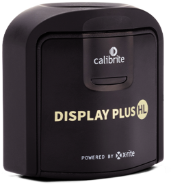
You can ensure perfect color accuracy over time via “full calibration” using the Calibrite Display Plus HL (Apple did not previously support HDR calibration with such an affordable colorimeter).
Utilizes a new color matching function (Apple CMF 2026) to improve on known mismatch limitations of the CIE 1931 model, and are working with the CIE to help create an industry-wide standard.
This is likely intended to help different display better match neutral values (i.e. to reduce observer-metamerism issues on modern wide-gamut displays with narrow or peaky spectra).
It offers a new “HDR photography (P3-D65)” reference mode.
It also offers two new DICOM reference modes and Apple has submitted a new Medical Imaging Calibrator for FDA approval.
This is a medical imaging format (such as for viewing CT / MRI scans). Apple says this supports “medical imaging for diagnostic radiology”.
This is not directly relevant to photography, but shows that Apple has designed this monitor to support extremely high standards for display uniformity, stable luminance performance, grayscale calibration, etc. Apple notes that their headroom above the reference white in these modes helps maximize display lifetime (all displays dim over time and this offers significant buffer to a calibrated display to meet strict targets as it ages).
In DICOM modes, the black level is raised based on ambient light to account for reflections and disables local dimming to ensure best possible uniformity and eliminate any blooming.
[Disclosure: This post contains affiliate links. I rarely endorse other products and only do when I think you would thoroughly enjoy them. By purchasing through my on this post, you are helping to support the creation of tutorials like this at no cost to you (and Apple service / warranty is the same when you buy through B&H or Amazon).]
Image quality and performance:
The Studio Display XDR is without a doubt the best 27″ HDR monitor on the market. The HDR specs are best in class and both image quality and accuracy (even without calibration) are outstanding.
HDR performance is outstanding. It not only delivers true 2000-nits, it also supports up to 5.4 stops of HDR headroom (see setup details below, you’ll need to create a custom preset to get above 4).
Color volume is excellent. Apple has expanded beyond the P3 color gamut to additionally cover Adobe RGB. This is ideal for photography as the monitor is optimized for both electronic display (which is typically P3) and prints (the extra Adobe RGB coverage supports printable cyan and green colors outside the P3 gamut). Tests with CalMAN show gamut coverage of 99.7% P3 and 99.5% AdobeRGB, and 81% Rec2020. This is the ideal gamut for photographers and greater coverage of Rec2020 would be of limited value for your art.
The XDR presets may sound confusing as they offer “P3 + Adobe RGB”. Your monitor of course only has one gamut – Apple just means that using this mode unlocks the full monitor gamut. In practical terms, that means the green primary is near Adobe RGB and red primary near P3 such so that the the monitor natively covers both gamuts. Like all HDR monitors, communication with the display would be in Rec2020 values (both P3 and Adobe RGB are fully inside the Rec2020 space).
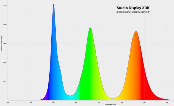
Studio Display XDR Power Spectral Density (PSD)
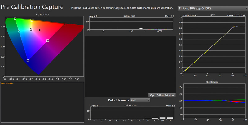
I have previously shared detailed testing of various XDR displays using a lab-grade spectrophotometer and found that most photographers do not need to calibrate XDR displays. That remains true with the Studio Display XDR, which offers excellent color accuracy with the factory calibration for both SDR and HDR with no need to calibrate. Using CalMAN and a lab-grade CR-250 spectrophotometer, I found the factory calibration showed average deltaE of 0.9 (max 1.6) for the HDR Video (P3-ST 2084) preset. The “Photography (Adobe RGB-D65)” showed an average deltaE of 1.0 (max 1.4), though there is no need to switch to an SDR-only mode for print work (which is just as accurate while in the HDR mode). I then created custom preset to test it the complete range. I found average deltaE was 1.3 when measuring P3 with full HDR range (100 nits SDR, 2000 nits HDR) and an average deltaE of 1.4 for a similar test of Adobe RGB. I couldn’t test for the P3 + Adobe gamut via CalMAN, but given both were accurate, I feel comfortable that the full gamut is sufficiently accurate to meet the needs of most photographers without calibration.
These results are somewhat outside the ideal 0.5 to 1.0 deltaE, which means there are minor errors which are visible to expert users. The main issue was a bias towards color white balance in bright neutrals.To ensure the highest levels of accuracy, see the section below on how to calibrate the display with theCalibrite Display Plus HL.
After using “fine tune” calibration alone (with my CR-250 as Calibrite hasn’t updated their software yet for this XDR), average deltaE was reduced to 0.8 for both my P3 and Adobe 100 SDR / 2,000 HDR custom presets (pictured below). So a very simple white point measurement is enough to ensure you have ideal accuracy across the full 2000 nit range (including SDR work) and P3 + Adobe RGB gamut. This process requires a little bit of manual work and will need a Calibrite update (or Apple automating the test) to use it with a consumer colorimeter.
After using “full” calibration alone with the Calibrite colorimeter (which Apple supports), average deltaE was reduced to 0.9 for both my P3 and Adobe 100 SDR / 2,000 HDR custom presets. They showed even better color error at 0.4 for P3 and 0.5 for Adobe RGB. This is great news, as this fully automated test improves accuracy to ideal results with a consumer colorimeter. See calibration details below.
Achieves 0.8 average deltaE after single-point fine tune calibration over the full 2000-nit range with Adobe RGB gamut
Those measurements are based on standard 10% test windows. Those values can be misleading, as real image content fills the full screen and HDR monitors (nearly all OLED) will dim in real use which is not captured by those tests. The sustained brightness of mini-LED will give you an enormous advantage in real-world accuracy for editing HDR photographs. Apple specs claim that it can sustain 1000 nits of full-screen brightness indefinitely at temperatures up to 25°C (77°F). My tests show that understates the capability. I measure 1970 nits in a 25% test window, 1700 nits at 50% and 1200 nit at 75, and 980 at 100%. No reasonably edited image will come close to these limits, which means your content will never be dimmed and this monitor offers perfect accuracy even when using the full 2000 nits. You won’t come anywhere that level of accuracy with any OLED on the market (other than Apple’s Tandem Stack OLED iPads, which are only sold in 11 and 13″ sizes).
Given high accuracy across the full range, you can setup your monitor to support everything you do (HDR, prints, and normal productivity work) and never have to change anything. Just turn on “automatically adjust brightness” and switch to “Apple XDR (P3 + Adobe RGB-2000 nits)” in settings and it will do everything including adapting to changing in ambient light. Or if you have controlled ambient lighting, you can create a custom reference mode to ensure maximum consistency in your workflow. This is a great advantage for using Apple’s approach to HDR, your display will be very predictable and accurate (unlike HDR under 3rd-party monitors or Windows, where you cannot target specific reference brightnesses and the EOTF is unspecified).
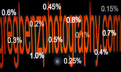
Blacks are much more clean than the Pro Display XDR, which already performs much better than most mini-LED. There is almost no haloing in real content. When viewing my quality test #4 on Studio Display XDR, Pro Display XDR, and iPad M4 Pro all in the same reference mode, the Studio Display is much closer to the OLED than it is the Pro Display. The images below are iPhone shots of the Studio Display XDR (which shows no haloing anywhere but the brighter cursor) vs the Pro Display XDR. Note that the photo makes haloing look much worse than it does in real life, but you can see there is a significant improvement due to both higher zone count (smaller radius of blooming) as well as software control (zero halos around most content).
Studio Display XDR has minimal halos
Pro Display XDR (photo halos look worse than actual)
You will still see the OLED clearly win in fireworks, star fields, or a brutal comparison like this on Blur Busters (moving HDR squares large enough for full brightness set against black). Those scenes do show up in movies (watched in rooms dark enough to see the difference). But photographs rarely show such scenes and are less often viewed in a room dark enough to see that detail. Apple’s mini-LED offers superior accuracy for content creation and the tradeoffs for halos are nearly irrelevant. Using their Tandem Stack OLED for a monitor would be exciting, but would be only a modest benefit (and may cost a fair bit more for 27-32″ sizes).
Another way to consider black performance is contrast ratios. CalMAN’s sequential contrast ratio (black screen vs white patch) shows values from the CR-250 averaging around 600,000:1 (peak being 2043 nits white and black being truly zero as no backlights are used).
A more useful test is intra-frame contrast. This is a black and white checkerboard, which means haloing will lift blacks (especially near the white borders). The whites are also affected, as peak white will be reduced in smaller checkerboard patterns even with the same number of total pixels (as the center of the white patches is closer to black and blooming considerations will come into play). CalMAN’s Patterns generator for MacOS does not appear to support the automated test, so I created the same pattern manually and measured a couple of patches. For a 4×4 grid, average white was 1475 nits and black was 0.092 for a contrast ratio of 16,000:1. With a tighter 4×4 grid, white is lowered and blooming impacts black more. In that case we see 1339 and 0.149 nits for a 9,000:1 contrast ratio. We cannot test like this down to the pixel level, but you can get the idea that micro contrast is ultimately where OLED may have the greatest benefit over haloing in a monitor like this. It’s a more subtle concern than haloing, as you really can’t assess it without comparing the same image to an OLED display.
Refresh rate:
The new 120Hz support is very welcome. However, the benefit here is not the same as a 120Hz OLED. When you view the 120Hz line at Blur Busters, the UFO is softer than I would expect. The GtG (“gray to gray” time) is likely too high to fully appreciate the refresh rate. In other words, the pixels are being requested to update quickly, but the physical response time is not quite keeping up. It’s better than 60Hz, but this is an area where OLED would likely have an advantage.
Nano-texture:
The nano-texture is amazing for reducing reflections, and I highly recommend it. It significantly improves your ability to see the display without reflections. When you look carefully (especially when the display is near black or just off), you’ll find even rooms with no significant lights or bright objects typically have a lot of reflections on a glossy display. I see much more upside than downside.
Keen observers will notice a slight loss of sharpness in black text on a white background as the nano-texture does smear the white (like a halo). I snapped photos with my iPhone and zoom in to compare my nano-texture Studio XDR to my Pro Display XDR (which has no nano texture and should be comparable as the actual pixel density is the same given screen + 5K/6K offsetting each other and halos cannot be controlled at the pixel level). I see see the same text in the same browser renders 3 pixel wide black lines in text. Blacks are lift in both (due to backlight). The uncoated display is mostly at the deepest levels across all three pixels, while the nano-texture shows a black level about 1 stop brighter for about half of the first and half of the last pixel. On the flip side (for white text on black), there is significant red and blue fringing on the uncoated pixels which is much more subtle on the nano-texture (which blends the sub-pixels better). I would rate the coated display to be as readable as the uncoated one, but there is faint visible loss of sharpness for text with nano-texture. When viewing dark image detail in a room with no bright/widow lights, the nano-texture is a winner for me. When there is brighter light, it’s a benefit in a broad range of images. So if you are sensitive to small changes in sharpness and work in a room with almost no reflections, you may prefer to skip it or evaluate yourself before purchase. But I would recommend nano-texture for most people.
I have also found it easy to clean with the included Apple cleaning cloth (I have heard many stories about the challenges of cleaning the nano-texture on the old Pro Display and Apple seems to have improved the coating significantly over the years). I put my CR-250’s rubber hood directly on the screen for measurement and it left marks which are obvious when the display is off and I was able to remove them easily with the cloth (without needing 70-percent isopropyl alcohol). In my opinion, it is well worth the $300 to upgrade. Note that the nano-texture display comes with a polishing cloth which should be used when you need to clean the display.
Other aspects of the monitor:
It offers compatibility with:
all Mac models featuring Thunderbolt 3 or later ports.
120Hz requires newer Macs. 60Hz is the maximum supported on the base M2 / M3 systems and all levels of M1.
If using this monitor connected to an iPad, you’ll need the M5 iPad Pro or later for 120Hz.
Apple silicon Macs additionally offer advanced color management in macOS for seamless reference mode switching.
Windows and Linux (per Apple’s white paper, but I have been unable to confirm this, please see the section on bugs below)
It offers the ability to easily connect a laptop with a single cable:
The upstream Thunderbolt 5 port offers 140W charging.
It offers one downstream Thunderbolt 5, which can be used to daisy chain another Studio Display XDR, hub, or other high speed accessories.
It also offers two 10Gb/s USB-C connections.
The included stand is excellent. You wouldn’t expect to marvel at something simple like this, but it is incredibly well done. Adjusting up and down is very smooth – and yet it will not alter the angle of tilt (which you can adjust, it’s just that it keeps it as you move the display up and down).
However, the does not rotate 90 degrees for portrait orientation like the Pro Display XDR stand (so get the VESA mount if you need to turn the Studio Display). When you rotate 90 degrees clockwise (leaving the ports toward the bottom), the display will automatically switch to a portrait orientation (ie there is a tilt sensor and it works in one direction).
The fans are inaudible, operating at up to 16 dBA in typical room conditions. This is the same rating as the Pro Display XDR, and I have never heard those fans once in years of operation.
It includes a 12-megapixel web cam with “studio-quality” mic. They are perfect for Zoom calls. While I could making YouTube videos with this mic, the quality cannot truly compete with a studio mic. The key limitations are more about physics than the quality of this mic (perhaps some future AI processing might close the gap). The monitor’s mic is too far from my mouth and resulting in capturing a bit of room echo, as well as a lack of a shock damper which makes the sound of the keyboard, mouse, and my arms on the desk much more audible.
If you’re going to use your own, you should be aware that there appears to be a slight delay in the audio to keep it synced with the video. As a result my video is slightly off, as the editing software I used does not support sub-frame audio slipping (the timing misalignment is less than the length of one frame of video). I could likely do better,
It offers a high-fidelity six-speaker system with spatial audio and Dolby Atmos. Unlike most monitors, the included speakers have pretty good audio quality. It offers more volume and somewhat better quality than the MacBook Pro. You’ll still get better results with external speakers, but these are great and should be more than enough for many people.
What could be better?
This is an outstanding display and it’s hard to find any fault. The main concerns or complaints I expect to hear will relate to the things it does not attempt to offer:
It isn’t cheap. This is built to be the best 27″ HDR prosumer or professional monitor for years to come. The price will be out of reach for many, but the value is excellent for who need a high level of HDR performance with excellent accuracy.
There is no 32″ version of monitor. I hope that changes in the future, as there will certainly be many interested users. But the specs are so high, that the pricing would likely put it into a niche category like the Pro Display XDR which was just discontinued.
If these are deal-breakers, that’s understandable and this simply isn’t a display designed for you. I have suggested alternatives for all of these below and on my recommended monitors list.
Why is there no 32″? Perhaps Apple will release one later, but I’m not holding my breath. I suspect the main reason is there probably is not sufficient demand for one at the even higher price tag it would inevitably have. Beyond that, there may be technical concerns. Jumping from 5K to 6K means a 38% increase in the bandwidth required to support the display. That’s a serious concern even for Thunderbolt 5. When you add up the demands of 10-bit (HDR) and 120 frames per second, you would need to use Display Stream Compression to support two 6K 32″ monitors. And that’s without considering the extra bandwidth you’d want to protect for web cam, audio, downstream devices like fast drives, etc – plus a margin of safety to account for the fact that real bandwidth won’t hit advertised Thunderbolt rates on all cables. So a 6K 32″ display might end up being a very pricy display with a lot of caveats for multi-monitor users about dropping to lower refresh rates or connecting the monitors through separate cables. As much as I would be thrilled with a single 32″ Studio XDR, I can appreciate the rationale for why we may not see one.
There would be room to improve on these results with a Tandem Stack OLED. The iPad XDR has some clear advantages for motion (better results at 120Hz) and perfect blacks mean zero halos and better micro-contrast. However, that OLED does not cover Adobe RGB or get to 2000 nits, so it is not better in every way and cost could easily be a challenge turning that 11-13″ display into a 27″ monitor. There are diminishing returns on these benefits for photography, but there is room for a future display to push further over even the Studio Display XDR’s class-leading performance.
There are some other small things which could improve the Studio XDR experience:
MacOS calibration is nice, but could be improved:
Fine tune calibration is manual. It is a tedious, error-prone process which requires 3rd-party software to get the reading. When using a supported measuring device, fine-tune should just be automated like full calibration is.
There is no report on the accuracy of the display. Ideally, there would be a validation mode to get a report with deltaE to determine how accurate your display is, whether calibration improved it, and monitor performance over time (so you can decide how often to calibrate).
MacOS has some limitations affecting all HDR monitors:
The brightness slider for XDR displays should show the SDR / reference white in nits. This would be very helpful to get into a pseudo reference state in the variable brightness mode (such as targeting ~100 nits for evaluating work to print).
It would be very nice if MacOS were updated to make the “fine tune” calibration easier to use. It should let you easily pre-fill the target numbers with 100 or 203-nits D65 (for speed and to avoid mistakes). And ideally, it should show a white target and support the most popular colorimeters. You can do all this on your own, but it would be easier and more approachable for less tech savvy users.
For those who buy two of these 27″ displays to daisy chain together, it would be very nice if the speakers could be set up as a stereo pair across them.
The included mic isn’t truly studio grade and it is difficult to sync an external mic with the web cam
I prefer to use an external mic (see 4:45 mark of the video above for a demo of audio quality).
When I use my own mic with the monitor’s camera and found there is a slight latency issue resulting in visible lip sync issues. The internal video/audio has a lag which is around one frame (at 24fps), but not quite.
I wasn’t using I’d probably need to use sub-frame audio slipping to properly correct it. I need to give it some thought, but it would be ideal if Apple offered a way to delay any fast audio paths to keep them in sync enough that you would not notice in a video. I partially corrected it in the video on this page, but was not using an editor with sub-frame audio slipping.
I don’t typically record like this and welcome any feedback in comments if you know a better solution.
How to set up the Studio Display XDR for best results?
If you simply connect your laptop to the Studio Display XDR, it will support outstanding HDR by default. I recommend using a high-quality Thunderbolt 5 cable to ensure best support for any downstream connections (Thunderbolt, USB, another monitor, etc).
There are no options you need to configure and you do not need to calibrate. However, there are several controls which will be useful for those with the most demanding needs.
I recommend going to System Settings / Menu Bar / Display and making sure it is both check and set to “always show”. This will create an icon at the top of MacOS you may use at any time to change reference modes, which is very convenient. It also offers a slider for brightness (which more precision than just clicking the F1/F2 keys), as well as toggling dark mode and night shift / true tone (though I do not recommend using those modes for any photography editing or evaluation).
The following reference modes are useful for photographers:
Apple XDR Display (P3-2000 nits)
This default mode supports variable brightness, and will adapt HDR tone mapping based on ambient light.
It will also adapt brightness and white point if automatic brightness adjustment and true tone options are enabled in system settings.
The SDR range uses gamma 2.2, making it a great option for both print and HDR work.
Uses Apple CMF 2026 (all the fixed brightness modes use CIE 1931).
It should be a great option for most photographers and would limit your color gamut to only show values available on other Apple and Android devices.
Apple XDR Display (P3 + Adobe RGB-2000 nits)
This is similar to the previous mode and expands the gamut to support Adobe RGB, which offers printable green/cyan/blue colors which are outside the P3 gamut.
I believe this is the best choice for many photographers, as it gives you the full color gamut and allows you to adapt to your ambient light if needed.
However, you should take care to know what brightness achieves 80-120 nits for print work and set ambient light to use that for such work. Alternatively, you could set a custom XDR preset to achieve similar parameters with fixed brightness.
HDR Photography (P3-D65)
Uses a fixed 203 nits SDR and sets peak HDR to 1624 (ie HDR headroom is 3.0 stops)
Gamut is limited to P3.
I’m not sure I appreciate the need for this preset. It is built around the reference standards for HDR and might be used to soft proof the typically brighter displays used by consumers. However, there is very little you can predict about the brightness and I don’t see the need for this. You can realistically edit the same images for HDR just as well at 80-120 nits. More importantly, you’ll be able to work with the full Adobe RGB gamut and a reference which which is much better for print-related work.
HDR Video (P3-ST 2084)
This tracks the PQ EOTF and is a ideal for editing video under reference lighting conditions (dim ambient light).
However, it will clamp peak HDR to 1000 nits. This ensures nearly perfect EOTF tracking even when using extremely bright content. Personally, I would create a custom preset to allow mastering with the full 2000 nits if you’d like an extra stop of HDR support in your video (of course this comes with the tradeoff that there will be greater tone mapping, and HDR video lacks the great controls we have for photos with the use of gain maps).
I would not worry about the sustained brightness limit, you’d only hit it if your editing a transient frame or two which is very bright (such as an explosion) which is rare and likely won’t need to be accurate. Such a scene is not applicable for photography (no properly edited HDR photograph should ever hit the 1000-nits sustained limit).
I would skip the following modes:
“Photography (P3-D65)” or “Photography (Adobe RGB-D65)”- SDR only. The above modes should cover this need, or you could create your own custom XDR preset to achieve this mode while retaining HDR support.
Anything marked with D50. Photographers should use a D65 white point.
You can create your own custom XDR reference modes to ensure consistency and use the full capabilities of the display (including support for headroom up to 5.4 stops, as the variable brightness mode is limited to 4). Just look for “customize presets” at the bottom of the dropdown to create your own.
I recommend the following custom preset setup for photographers:
color gamut: P3 + Adobe RGB (gives you the full gamut)
white point: D65
SDR Transfer Function: Pure Power 2.2 (ie gamma 2.2)
Enable PQ for HDR content
SDR luminance = 80-120 (based on what is most comfortable for your ambient lighting).
At 80 nits, you will have 4.3 stops of HDR headroom.
You can set SDR as low as 48 nits, which is usable in a dark room and will give you 5.4 stops of HDR headroom.
HDR luminance = 2000 (to allow maximum HDR headroom)
Note that using the full 2000 nits will prevent use of fine tune calibration if the display needs to get brighter (you’ll see a warning by the target luminance with a tooltip showing the allowed range). The only way to improve peak white balance is to turn down one or more channels, so you’re leaving no room for this if you try to achieve the full range.
Limit HDR to 1800 or 1900 as needed to give yourself room to calibrate.
Display optimization: Higher Quality
Custom reference modes are stored in the display and are made available to any computer you connect to it.
New in the Studio Display XDR: a Reference Status Indicator in the menu bar will indicate when the display is unable to sustain the desired brightness required by the image content in the currently selected reference mode.
How to calibrate the Studio Display XDR
Apple XDR monitors are very accurate out of the box, but any display can change over time. I have an M1 MacBook Pro with an aging display which is dimmer than target (deltaE 2.5) without calibration. But by using that colorimeter with the full and fine tune calibrations in MacOS, I’m able to get it back to perfect (deltaE 0.5). You do not need to do this, but if you want the best possible performance you calibrate the display with the colorimeter I recommend about every 6-12 months (the drift I see suggests there is no need to check more often).
Apple recently added support for “full” calibration of XDR displays using the Calibrite Display Plus HL (you need this specific model, the cheaper ones are not supported by Apple). This is incredible news, as it allows for perfect calibration using an affordable consumer colorimeter. And this method of calibration supports all XDR modes (including the variable brightness modes). Other than ASUS, no one has a monitor offering remotely similar HDR accuracy at this time as there is no ICC standard for profiling HDR displays. This full calibration mode requires an update to monitor firmware v26.4 (see below).
To perform full calibration:
Leave your laptop clamshell open and not in a mirrored mode (you should not need a second display, but in my testing with macOS 26.4, calibration would abort if the Studio Display XDR was the only active display). This isn’t true for other XDR monitors and will hopefully be fixed in a future update. If you run into this, you will see the computer go to sleep / lock near the start of the test (no bright white warmup) and there will be an error message “error during calibration cause by user log out, fast user switch, or manual system sleep”.
Go to System Settings / Display / Studio Display XDR.
Select “Calibrate display” at the bottom of the list of presets dropdown.
Make sure you have connected the supported colorimeter, opened the cover so that the glass measuring aperture is visible, and point it at the center of the display (tilting the monitor backwards makes it easier to keep it flush and in place).
Click begin. The whole process is automated and should complete in under 90 minutes.
The other method of calibration Apple supports is “fine tune”, which is available while using any of the fixed brightness modes or your custom XDR presets. With this method, you must make your own measurement of the white point, but this is easy to do with that same colorimeter or anything you already have.
To perform fine fune calibration:
Go to System Settings / Display / Studio Display XDR
Choose the reference mode you wish to calibrate (ideally a custom mode as recommended above).
Let your display warm up for 30 minutes if it hasn’t already (just a best practice to ensure you are measuring with a stabilized display).
Measure your SDR white manually. With the Display Plus HL, use Calibrite PROFILER (go to Utilities / Monitor Quick Check and select the monitor / mini-LED).
Go back to the Studio Display XDR settings and look for “Calibrate display” at the bottom of the list of presets.
Click “fine tune“.
Enter the measured x, y, and luminance values (ie nits or cd/m^2).
Enter the target values.
For D65, you’ll have x = 0.3127 and y = 0.3290.
The luminance is the SDR luminance from your custom preset (or 100 nits if you use the included HDR video preset, or 203 nits for HDR photo).
For the new XDR preset modes using Apple CMF 2026 (the modes where you can change brightness), you should be aware that the x,y values are different for D65. It’s still the same D65 illuminant, but the observer math apparently results in different x,y values in that model for D65. This should not impact your calibration workflow as the only place this shows up are in modes where “fine tune” calibration is not an option, but you’ll see it if trying to validate accuracy in those modes. But this may show up if you try to test the monitor manually in those variable brightness modes.
Apple CMF 2026 (variable brightness modes):
x = 0.3144, y = 0.3302
Note that under the new observer model, the white perceived as neutral is represented by a point that sits a bit warmer (and slightly greener) than the old CIE 1931 D65 coordinate
Note that CalMAN (Ultimate version) now supports a new Apple CMF 2026 workflow. It can help validate the calibrated results (Apple’s native calibration solutions do not report deltaE or other measurements of final results).
Bugs in Studio Display
It has been my experience that Apple generally releases new products with few bugs, but I have encountered a few in the Studio Display XDR. All of them struck me as things which can be resolved through software updates and I would assume Apple will address these relatively quickly. Issues I have seen:
Lack of support under Windows (not fixed in firmware 26.4).
Apple’s white paper notes support under Windows and Linux (with some limitations such as as the expanded Adobe RGB gamut, custom XDR modes, and calibration not being supported). This would be consistent with support on the Pro Display XDR, which works very well for me on both of my Windows laptops.
However, with the Studio Display XDR, one laptop fails to recognize the monitor at all (though it will charge) and the other offers only 60Hz SDR-only 1080p support. So it would appear that Windows support is unavailable or unreliable at this time (I would assume Linux is a risk, but have not tested it).
Given the white paper and Pro Display support, I assume the Studio Display XDR will likely gain support through some update. I have not seen any support article from Apple on this, and I do wonder if any update may require connecting a monitor to a MacOS computer to get a firmware update before it might support Windows. My Pro Display used to not work for me under Windows years ago – yet now it does, so I presume it (or perhaps Windows 11) got some update to enable that use.
I do not recommend buying this monitor yet if you need support for a non-Apple computer. Hopefully that is addressed or Apple clarifies minimum requirements for 3rd-party HDR support, as this is an outstanding display and have support similar to the Pro Display would make this an excellent monitor for Windows users.
Halos in the variable brightness presets (not fixed in firmware 26.4).
You can see this by viewing my quality test #4. Click the image to view full screen while viewing in a dark room to see deep shadow detail clearly.
Halos are very well controlled in fixed XDR presets (as noted above).
However, this is not the case when using the variable brightness XDR presets (including both the default mode). When using that preset, halos are significantly worse than the Pro Display XDR (disabling automatic brightness adjustments does not help).
As the fixed modes show the hardware clearly supports outstanding results, my assumption is that we will likely see this fixed by some Apple update. Even in its current state, most users will never notice this (which might explain how it wasn’t caught earlier in testing).
The display may blackout or reject some mode changes (with firmware 26.3, may be fixed now)
I have seen this when changing the display preset to other modes (especially the new Adobe RGB mode). I have seen this on three separate systems (my own display and in two different Apple stores).
Changing refresh rate or reconnecting the display both reliably address blackouts. When the mode change was rejected, it changed to the default (variable brightness P3-only) mode without any error message.
I have seen one review report 85% Adobe RGB coverage and strongly suspect they attempted the mode change and the display reverted to P3.
When I create test patterns in Photoshop, I clearly see much more vibrant green and cyan colors in Adobe RGB than P3. I believe the monitor likely truly delivers a wider gamut, but a software bug may be preventing its use in some cases.
“static” in the display or crashes (with firmware 26.3, may be fixed now)
I have not seen this, but here is a video of the concern and someone reported an experience to me which which sounded consistent with this.
Suggested workarounds: update MacOS, make sure you use a high-quality cable (the one that comes with the monitor), and set refresh rate to 60Hz.
Note: The original firmware (v26.3, build 23D8128) had some issues which may have been fixed in monitor firmware version 26.4 (Build 23E246). This update also added support for full calibration. To get it, update to MacOS 26.4 (not the beta), and then MacOS should offer an option to update the firmware. You can discover which firmware you have by going to the Apple menu at top left / System Settings / System Report and looking under Graphics / Displays.
None of the the issues I have personally experienced are serious concerns for Apple users and I would expect all these concerns likely get resolved fairly quickly. The reported crash issue sounds serious but there appear to be workarounds and this is likely to only affect a small number of users. None of these affect my personal use of the display and I suspect most people wouldn’t see anything other than potentially some blackouts during initial setup if you wish to customize modes.
However, I would hold off buying this monitor for Windows / Linux use until support is confirmed as you may not be able to use it yet (and I can imagine support may require existing hardware to be connected to an Apple computer for a software update to gain support). I will keep this post updated over time. Please check back for the latest information if any of these are a concern for you.
How does the Apple Studio Display XDR compare to the Pro Display XDR?
The Pro Display XDR had been the best HDR monitor on the market since it launched in 2019. To be the clear leader for over six years is a testament to the extremely high standards and capabilities Apple offers in their XDR displays. It has been discontinued without a 32″ replacement, but it has been the gold standard for the past six years and continues to be an important reference point for any premium monitor. The new Studio Display raises the bar on almost every dimension but size, and yet costs half as much.
Advantages of the Studio Display XDR over the Pro Display XDR:
Roughly half the cost: $3.3k vs $6k with stand (or $3.6k vs $7k with nano-texture and stand)
1.4 stops greater HDR headroom
The Studio Display hardware natively supports 0.3 stops more than the Pro Display, but software limitations of MacOS result in a 1.4 stop advantage for the Studio Display.
While the Pro Display technically supports up to 5.0 stops of HDR headroom in custom presets, you cannot use more than 4 stops in a browser, Lightroom or Adobe Camera RAW as MacOS reports a clipped 4.0 stops value.
Studio Display supports up to 5.4 stops in custom presets and MacOS will pass on this information for full support in browsers and Adobe software.
120Hz refresh rate vs 60Hz for the Pro Display
This is a significant benefit for scrolling, panning, and video.
Note that M1 or base M2/M3 systems only get 60Hz support
Much faster downstream ports for daisy-chaining displays or connecting hubs or other high speed devices.
Pro Display has 3 USB-C ports (up to 480Mbps USB 3.2 Gen 1)
Studio Display has one Thunderbolt 5 port and two USB-C ports (up to 10Gb/s)
More powerful charging – the Studio Display offers 140W charging for the upstream connection vs 96W for Pro Display.
Very good speakers, mic, and web cam (vs none in the Pro Display)
This allows single-cable connection to a laptop, even if you also connect downstream accessories or a second display.
Improved HDR performance:
Less haloing (better blacks) thanks to 4x higher zone count (and perhaps updated processing)
2,000-nits peak (vs 1,600 nits). This is only one third stop more HDR headroom, but does mean you still have a full 4 stops of headroom even if you need 120-nits for SDR.
Adds an “HDR photography (P3-D65)” reference mode.
Improved SDR performance:
Wide gamut expanded to now cover Adobe RGB, which is advantageous for print-related work.
1,000 nits vs 500. This is a minor benefit but helpful if you have some short term need to work near bright window light, though cuts HDR benefit to one stop and indicates the ambient light needs to be better controlled for serious photography work. Note that (like recent MacBook Pros), the Studio XDR will only use the full 1,000 nits for SDR when the ambient light sensor determines it is necessary.
Advantages of the Pro Display XDR:
32″. This larger display is the only compelling advantage
It is unfortunate the new Studio Display does not offer a 32″ size option. I would happily pay more to get these updates in a 32″ display and know many other photographers who would as well.
However, you can connect two 27″ Studio Display XDRs for roughly the same cost and do so with a single Thunderbolt cable thanks to the upgraded ports.
6k. This isn’t really a benefit over 5K at 27″, it just ensures the same “retina” pixel density on the larger screen.
Stand supports 90 rotation to portrait orientation (however the new Studio Display XDR can also support this using a VESA mount).
Note that both displays support outstanding HDR performance, retina resolution, and the option to use either a stand or VESA mount.
How does the Apple Studio Display XDR compare to the 3rd-party HDR monitors?
Apple offers both excellent HDR headroom and highly accurate displays. The only 3rd-party monitors which offer comparable performance are ASUS ProArt monitors, which offer HDR calibration in the hardware (ICC profiling is not supported for any HDR monitor). ASUS has two very compelling reasons to consider them over Apple: 32″ size options and much lower prices.
You should also be aware that XDR monitors offer a great HDR experience under Windows, but need MacOS and more recent Apple hardware to unlock the full specs of this monitor. Under Windows or Linux, you won’t be able to use the reference modes, Adobe RGB gamut (just P3), and you won’t have options for fine-tune calibration. Even with those limitations, it still offers a premium experience.
This is the only other 27″ monitor with great HDR performance and high color accuracy and a very good option. It has a considerable cost advantage, but Apple offers a clearly superior HDR experience which justify its much higher price.
Pros for ASUS:
$1,800-2,000 lower cost than the Studio Display XDR.
OLED offers superior blacks, which may be appreciated when viewing movies in a dark room but will have little or no benefit for most photographers over Apple’s excellent mini-LED performance.
240Hz. This is very beneficial for gaming. It is also beneficial for scrolling text or panning/zooming photos as 120Hz will offer faster display updates than 120Hz in mini-LED (see the discussion above on refresh rate).
Supports multiple inputs to switch between multiple computers without changing cables.
Pros for the Studio Display XDR:
Significantly better HDR capability
2,000 nits (vs 1,000). This means one full extra stop of HDR headroom and the ability to ensure four stops of headroom under ideal editing conditions.
As a mini-LED, offers superior EOTF tracking in real use thanks to its sustained brightness. It will not suffer from OLED’s automatic brightness limiter will cause significant dimming in brighter content, which will bias photographers towards making their images too bright for other more accurate displays (including OLED phones).
Setup is significantly easier than any 3rd-party display under MacOS. Just plug it in and get outstanding HDR support automatically. The ASUS displays require some setup, though I’ve described the key steps in my linked reviews.
Higher resolution (5K vs 4K).
Offers an optional nano-texture anti-reflective coating.
$1,100-1,600 lower price (or possibly more during big sales). Be sure to budget $200-300 for an HDR-capable colorimeter like the Calibrite Display Plus HL if you don’t buy the kit with ASUS colorimeter.
Same OLED and refresh rate benefits as the PA27UCDMR
Pros for the Studio Display are the same list as above for PA27UCDMR
Lower price (often $500, potentially $800+ during big sales).
Supports multiple inputs to switch between multiple computers without changing cables.
Pros for the Studio Display:
Setup is significantly easier than any 3rd-party display under MacOS. Just plug it in and get outstanding HDR support automatically. The ASUS displays require some setup, though I’ve described the key steps in my linked reviews.
Higher resolution (5K at 27″ vs 4K at 32″).
Offers an optional nano-texture anti-reflective coating.
No fan noise (ASUS firmware updates have made fan noise fairly minor).
Offers XDR reference modes for predictable EOTF tracking and reference white point, which is ideal for professional use.
If none of these monitors fit your budget, see my list of recommended HDR monitors for more recommended options.
Conclusions
The new Apple Studio Display XDR (available via B&H or Amazon) breaks important new ground by offering a level of HDR performance, accuracy, and ease of use never before available at this price point. It fills an important gap in the thinly covered 27″ monitor segment for HDR monitors. And it offers numerous substantial improvements over the previous gold standard for HDR, the Pro Display XDR.
Overall, this further strengthens Apple’s position as the clear leader in HDR photography. I highly recommend the Studio Display XDR if you are able to budget for it. You will likely not see a monitor with similar or better performance for many years to come, as Apple has set the bar very high for capability, performance, and ease of use.
The only significant limitations here are: there is no 32″ option and the premium pricing (though the value is excellent and there is nothing like it). Due to bugs noted above, Windows users may wish to hold off purchasing for a little while to confirm support.
If you need lower-priced alternatives or a 32″ size, I recommend the ASUS displays listed above or looking for a used Pro Display XDR.
If size is your concern, you might also consider working with two Studio Display monitors (perhaps one without XDR support to reduce costs). You can connect them with a single cable from the laptop thanks to daisy chaining with the new ports (ie you’d have a cable from the laptop to one display and then a cable from it to the next display). Getting two XDR displays would cost roughly the same as the old Pro Display XDR – but with much more screen real estate and numerous other benefits.