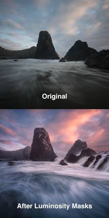
Want to take a good landscape image and give it a couple of finishing touches that will make it perfect? I love using Nik Color Efex Pro (CEP) to make my images pop in Photoshop. It has a handful of extremely useful and easy to use filters to help get exactly the right enhancements. And you can use it on Smart Objects to work non-destructively to keep your options wide open.
In this this tutorial, you’ll learn how to use CEP, which filters you should use, and how to optimize them to their full potential. If you don’t already have CEP, it is part of the recently updated Nik Collection 3 from DXO. You can get a free demo of CEP and the whole collection, which also includes tools for black and white (Silver Efex Pro), sharpening, noise reduction (Dfine), precise color adjustment (Viveza), distortion correction (Perspective Efex), and more.
Here’s the basic workflow:
- Convert to a Smart Object.
- Smart Objects are much better than working with flattened layers. This gives you the freedom to come back and make changes to any settings you choose in Nik (filters, slider settings, control points, etc), as well as perfectly preserving all the layers you already created. This way you can change any of the work you previously did and everything will automatically update when you’re done. You will inevitably find something you want to clone out, change your mind on color balance, or some other tweak that will be so much easier to do with this non-destructive workflow.
- To do this, <shift>-click to select all your layers, then right-click and choose “Convert to a Smart Object”.
- Start CEP by going to Filter / Nik Collection / Color Efex Pro.
- Choose the first filter you want to use.
- This is best done via the “Favorites” tab on the left after clicking the stars on your favorite filters (the best ones are listed below). After experimentation, you’ll probably setting on just a few that you use over and over.
- Adjust the filter as needed per recommendations below.
- Use the “control points” to apply the filters locally where they enhance the image and avoid causing unwanted changes elsewhere.
- Click Add Filter to keep adding more effects. Be sure to do this before clicking on another filter or you will accidentally replace the current one with another. If you make this mistake, just undo and then add a new filter.
Some general tips:
- Control points are used to apply a given filter locally (like an invisible layer mask)
- No matter how many control points you use, they all use the same master slider settings for your filter. If you want to use different filter values in different parts of the image, click the “add filter” and add the same filter again with different settings and control points.
- Control points only do two things: set opacity of a given filter and determine where it is applied in the image.
- The opacity of a given filter is controlled by the lower o slider when you add a point. Click and drag it left or right to change opacity of the filter at that control point. By default, a + control point starts at 100% opacity and a – control point starts at 0% opacity.
- The placement of a given control point determines not only where in the image to apply the filter, but it also tries to automatically select similar neighboring pixels. Effectively, this is form of luminosity masking within the Nik filters (not the same as luminosity masks in general, as controls are limited and you can’t apply this outside Nik). So placing it on white water will affect other bright areas, but not shadows. And there is a radius control, which you can set by clicking and dragging the top slider.
- The master “opacity” slider in in the the filter itself determines the default opacity for any part of the image not affected by a control point. It starts at 100%, but will be switched to 0% for you if you add a + control point first (as this is the only way for other parts of the image not to get the filter).
- You can view the hidden mask created by your control points by clicking the triangle to open the list of control points and then clicking the little box with a dot to the far right. Just like layer masks in Photoshop, white shows where the filter is revealed and black is where it is concealed.
- <alt/option>-click to duplicate a control point. This is a very handy way to target in more complex ways, such as increasing tonal selection or expanding the selection in a way that isn’t uniformly round.
- <shift>-click and drag to select multiple control points at once so that you can change all their slider values at once or delete all (via <del> key).
- Double-click any slider to set it to its default value.
- You can change the order the filters are applied by clicking and dragging their titles.
- You can delete an unused filter by clicking the “x” right of its title.
- You can undo via <ctrl/cmd>-Z. There is no “redo”.
- It helps to compare before and after, and there are a few good ways to do this:
- Click the “compare” button at the top to see before and after.
- Alternatively, click the split preview button at top and then move the red vertical line where you like to see before and after at the same time. You can click and drag to wipe it back and fore to compare as well.
- Use the check mark by the filters to turn individual filters off and on. This is very helpful when working with multiple filters.
- This is especially helpful to do at the end to ensure you haven’t overdone things, which is easy to do when you keep making incremental changes.
- Use the typical <ctrl/cmd> + and – to zoom and <space> for the hand tool to move around while zoomed in.
Tips for using the best filters:
- Tonal Contrast
- This allows you to make targeted contrast adjustments for shadows, midtones and highlights.
- Start by setting all the sliders to 0 and then moving them one at a time to get a feel for what each affects in your image. In general, the midtones slider is typically the most useful.
- Pro Contrast
- This gives you nice control over local contrast via the Dynamic Contrast slider.
- The other sliders are something you should use as often, but try them to get a feel for how they affect your image.
- Detail Extractor
- This can be a great tool for showing increased shadow detail at the default values. It ultimately acts like an HDR tone compressor and will try to create maximum local contrast.
- Adjust the Detail Extractor slider for the desired amount of effect, and you should generally leave the rest at default values.
- Glamor Glow
- This is a great way to add glow and drama to the sun.
- To get a sense of the sun emanating from the sky: place a large + control point at the center of the brightest part of the sky, then make duplicates around it to help target a range of tones.
- You may then try increasing Glow for more intensity in the sun. This is one of the rare times when you might wish to increase the Shadows slider, which helps enforce a minimum black to avoid crushing the shadows.
- Increasing the Glow Warmth is often also helpful to add color to the sky
- Saturation may be helpful, but don’t overdo it.
- Foliage
- This can be useful for enhancing soft forest greens.
- Change the Method for different colors and Enhance Foliage for the amount. Don’t overdo it, as you will lose the subtle color variation the image probably needs to look natural.
- Sunlight
- This filter also lets you add add glow and drama to the sky. It’s a bit confusing to learn, as there is no set of slider values where the filter is not adjusting the image.
- Light Strength creates a sense of glow by lightening the shadows, while Brightness affects overall brightness.
- Temperature, Contrast, and Saturation do pretty much what you’d expect.
- Watch out for color casts outside the sky if you increase Saturation.
- To get a sense of the sun emanating from the sky: place a large + control point at the center of the brightest part of the sky, then make duplicates around it to help target a range of tones.
- White Neutralizer
- This is a great way to help minimize color casts, especially ones you may create via CEP.
- Click the color sampler and then click on a neutral gray in the image. This will determine a white balance correction that tries to make the target color gray, while everything else moves a relative amount (ie, you are not desaturating, just applying a custom white balance).
- Neutralize Whites controls the amount of correction.
- Adjust Whole Image is used to create the equivalent of a color range mask. Slide to the left for precise correction of the just the sampled color or to the right to affect the entire range of colors in the image.
- Brilliance / Warmth
- The warmth slider is a great way to tweak the overall white balance in the image. (I generally leave the other sliders at 0).
- Like the Skylight Filter, this is often best done as one of the last filters.
- Skylight Filter
- This simple slider lets you increase sunset color.
- Its often best to add this filter to the bottom of the stack, so that you can optimize color at once without further changes from other filters.
- The rest of the filters can generally be ignored for landscape work (skin softener may be helpful for portraits, and many of the other filters can be used for stylistic effects on abstract work).
- It is often best to use these filters in the same order they are listed here (or at least to apply tonal changes before color changes).
- Don’t use them all or push them too hard, a little goes a long way.
Be sure to take advantage of their free trial of CEP and the Nik Collection (look for the little yellow text link towards the bottom of the initial page).
[Disclosure: This post contains affiliate links. If you purchase through these links, a small percentage of the sale will be used to help fund the content on this site, but the price you pay remains the same. Please see my ethics statement if you have any questions. I have been personally using Photoshop and Lightroom CC for years and would not endorse any product I do not believe would be highly valuable to my readers.]

