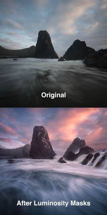
The old vs new “HDR” photography

True HDR photography is one of the most significant advancement in image display in decades – I would argue the biggest thing since color. But a lot of people seem to overlook it due to confusion with the older “HDR”, which is completely different (other than confusingly having the same name). This tutorial is intended to help clarify how these are completely different, and why the new HDR is so exciting.


The “old” HDR (Photomatix, etc):

The old HDR involves software like Photomatix, Nik HDR Efex Pro, and Luminar Neo (via “HDR merge”)**. This technique was most famously associated with Trey Ratcliff (whom I greatly respect as both an artist and friend). It was extremely popular for a while, but ultimately was more of a trend and is used much less often now than it was a decade ago.

Almost every photographer is familiar with the old HDR. Some love its ability to reveal more shadow detail and add color and local contrast. Many dislike it because they feel the results show excessive noise, unrealistically bright shadows, over-saturated colors, and generally deviate too much from the real world.

If I can digress for just a moment… Personally, I feel that a large number of bad images were the result of improper processing. I always treated it as a filter to blend into my images at low opacity and have probably never shared an image that used the old HDR technique at anything over 40-50%. I don’t intend to dive into this approach, but merely bring it up to make the point: these are all tools and any tool can produce bad results if not used properly. Give photographers a knob and someone is going to turn it up to 11 (the new HDR isn’t going to escape misuse either, it’s inevitable with almost any new tool – especially while learning how to use it optimally).

Getting back on topic… What is the old HDR? Technically, it is “tone mapping” high dynamic range image data to an SDR display. In simple terms, it’s a way of dealing with the fact that our cameras capture far more dynamic range than our monitors have traditionally been capable of showing. Most monitors support “standard dynamic range” or SDR. These monitors are capable of producing about 8 stops of dynamic range. However, digital cameras have been capable of recording much more than that for decades. Modern digital cameras are often capable of capturing 14-15 stops of dynamic range. There are only two general ways to display such rich image data on a limited display: you can either reduce the contrast, you can discard some of the data (clip highlights/shadows), or use some mix of the two.

Standard RAW processing deals with this problem primarily by compressing and clipping highlight details by default (because the most important content in an image is the shadow and midtone detail). This often leads to a loss of saturation in the highlights (for example, the only way to brighten a blue sky beyond the limits of a blue sub-pixel is to light up the red and green subpixels, which makes white). You can of course darken the image to help recover sky detail and color, but then you start to lose the shadows. These are significant tradeoffs.

The old HDR (tone mapping) tries to offer a different approach to the same problem. It tries to avoid clipping the data in order to simulate a wider dynamic range. Simply using a low contrast curve to show the full range of image data would look dark and dull. Instead, tone mapping employs sophisticated algorithms which try to preserve contrast in local parts of the image. Those methods are what produce the results that some people love and some people hate. Those methods also vary depending on the software used and the results are of course dependent on how the photographer uses the available settings.

Many people associate tone mapping with merging several exposures together to increase dynamic range. This is a source of tremendous confusion. It is completely unnecessary in most situations because a properly exposed RAW file already contains vastly more dynamic range than a standard monitor can display. So in a way, it’s just leaning into the problem: the dynamic range of the image is just getting that much better than the monitor can handle. In practice, it can be beneficial to help reduce shadow noise – but it’s not mandatory for tone mapping and is used much more often than is necessary. It’s not terribly important to this discussion, you can use one or multiple exposures with either the old or the new approaches to HDR – but the biggest differences have nothing to do with how many exposures you use.

In the end, the maximum dynamic range is the same whether you use standard RAW processing or the old HDR methods (tone mapping via software): it’s an inherent limitation of older monitors determined by the the darkest and brightest pixels they can display. Whether you like tone mapping results or not, that’s the key point: it is designed for technology limits which no longer apply with many displays and we now have much better options.

** Note that Lightroom (LR) and Adobe Camera RAW (LR) actually support both this old approach and the new approach we’ll discuss below (the old approach in LR uses “merge to HDR” without subsequently enabling the “HDR” editing mode).


The “new” HDR (requires new display technology capable of brighter pixels):

The “new” HDR tries to address the same problem, but in a totally different and superior way: with better monitors. The new HDR involve new monitor technology which are capable of displaying brighter pixels, while still offering deep (or even darker) black shadow values. This involves technology like mini-LED or bright OLED displays.

The peak brightness of a monitor can be measured in “nits” (which is identical to cd/m^2, often seen in calibration software). Older SDR display technology often shows a maximum white value about 100-200 nits (but potentially higher for use in bright situations such as near a window). New monitors which support HDR offer a peak brightness of typically 400 – 1600 nits, with 1000 nits being the level of support where these displays really start to look incredible (though you’ll likely have a great experience at lower levels if you’re in a sufficiently dark room).

These new HDR displays offer up to 4 stops of additional dynamic range over an SDR. That does not completely close the gap with the capability of our RAW files, but nearly so. That means there is no longer a need to make any significant compromise highlights by reducing contrast, clipping, or tone mapping. The result is more colorful sunsets, city lights that truly glow, truly higher dynamic range, and an image which is much closer to representing the real world light captured by the camera.

So what is the new HDR? It is true high dynamic range display of high dynamic range image data. It may still involve some need to compress the dynamic range, as even an HDR monitor has limits. But those limits are much higher and if there is any compromise of dynamic range, it is far less than when editing for an older SDR display.

If you have not seen a properly edited HDR photo on a good HDR monitor, it is impossible to really appreciate how incredible the results are. It would be like trying to understand the benefit of a hi-fi stereo by listening to an old AM radio. After seeing a properly edited image on a great HDR display, I consistently hear photographers say “wow!” or things like “everything else looks dull in comparison”. You really have to see it for yourself. A great way to do that is to view my comparison images with Chrome on any of the 14 or 16″ Apple Silicon MacBook Pros (ie any M1 or later).

Are images processed for an HDR monitor better? In many cases, yes and the results are dramatically better. But there are many images where using the HDR range would be a terrible creative decision. This is no different from many other creative options. You shouldn’t use a bunch of filters on every image just because they’re installed on your computer. You shouldn’t boost the saturation of your images to the maximum just because you have a wide gamut P3-capable monitor. And you shouldn’t make your images brighter just because you can. All of these options are just creative tools which are neither universally good nor universally bad. They can greatly enhance the right image when used properly, or make a visual mess when used incorrectly.

The benefit of true HDR display depends on your subject and your creative vision. If you shoot images in dramatic light such as sunset landscapes, cityscapes at the blue hour, or concerts with elaborate stage lights – then you almost certainly have many images which will clearly look better in HDR. But if primarily shoot corporate headshots or closeups of wildlife in soft light, you probably won’t have many images that will benefit. Human skin and animal fur shouldn’t glow, and you probably don’t need more contrast. The scenes where HDR will really shine are the ones where the limitations of SDR have compromised highlight detail and color which are an important part of the visual narrative.


Common misperceptions about the new HDR:

Even for those who have some appreciation that there is a completely new HDR display technology, there are a few common misperceptions which merit discussion.

First, there is a common misperception that HDR displays are rare. It is true that they are rare for external monitors. However, they are widely available on many other displays. Almost all decent TV’s sold in the past several years have good HDR (including some models as far back as 2016). The majority of smart phones sold in the past 3-4 years have great HDR displays. Almost every Apple monitor sold since 2018 has at least some degree of support and the MacBook Pros since 2020 have been incredible. There are an increasing number of PC laptops with 600+ nit OLED displays. In many cases, these displays have not been appreciated due to a lack of software or content. The software gaps have been significantly reduced over the past couple years, and we are now very close to a point where you can easily create HDR images which can be appreciated by a large audience (as Instagram is rolling out support for HDR and most people use Instagram on HDR-capable phones).

The cost of external monitor can be a real barrier for creators who don’t have an Apple laptop or edit on a mobile device. This new much newer and better technology, so it doesn’t come at the same price at this point. ASUS has great options (including with hardware calibration and support for both Windows and MacOS) at a range of price points. If you’re willing to use a TV as a monitor (which can work very well), you can get excellent results at a great price. For example, you could probably find a used 42″ LG C2 for $600. Prices and selection will improve considerably in the years ahead. See my list of recommended HDR monitors for much more discussion on the best options and what to consider.

Second, there is a concern that HDR images cannot be shared with those who lack SDR monitors. If we had to wait for every to have an SDR display, that would be a serious limitation. Thankfully, we already have a solution that makes these images completely backwards compatible with any display. A new way of encoding images with a “gain map” effectively allows you to put both a standard (SDR) and enhance (HDR) image into the same image. This can be done with minimal effort and ensures that everyone sees a great result. The viewer either gets something as good as your best standard images, or a vastly better HDR display. With the gain map ISO standard for sharing HDR images likely to be finalized in late 2024, we should expect that 2025 should be a significant inflection point in the awareness and adoption of the new HDR photography. At that point, the value of the already large installed base of HDR displays will become much more apparent.

Third, there is a common concern that you cannot print HDR. Our prints are not getting brighter (the literal interpretation of HDR on paper would require ink that glows), so it is true that trying to directly print an HDR image will likely produce poor results. Thankfully, that doesn’t really matter. It is very easy to adopt workflows which support both print and HDR display of the same image. In fact, you can edit for print and automatically generate an enhanced HDR image using Web Sharp Pro. So you can do both with no change to your existing workflow if you like (as well as upgrade your existing SDR edits). Realistically, most images are never printed and HDR display removes a lot of the time and technical challenge of editing images for an SDR display. So even if you don’t prefer not to have an HDR version of an you print, it may offer a lot of benefit for the rest of your images.

Fourth, some viewers have voiced concerns that an HDR video / image may be too bright. This is potentially true if viewing a bad edit (excessive use of HDR) when viewing in very dark ambient light (such as viewing a phone in the bedroom). But you probably need both of those things to be true in order for it to be an uncomfortable experience (which is the result of the display being far too bright relative to the ambient light). Most pixels in a properly edited HDR image should remain in the SDR range, it’s only a small portion of the image which should be brighter (the highlights which would have been compromised on an SDR display). Of course, that doesn’t stop someone from making bad edits. But keep in mind that even the brightest pixels (around 1,600 nits) are much darker than the original subject (for example, a tungsten filament is probably closer to 30,000 nits). And you probably won’t get anywhere near that maximum when your screen brightness is set appropriately for the ambient light. For example, the peak brightness of a phone or computer is typically limited when brightness is below 50% (even if you have a 1600 nits-capable MacBook Pro, you won’t see anything close to that in your brightest HDR pixel when you set the brightness to a low level). I have seen a lot of confusion around this topic, such as a comment from someone on a test post of mine that it “hurt his eyes” while at the same time making it very clear that his display lacked HDR support and he was just looking at a block of standard SDR white. It’s entirely possible that SDR content is too bright if you’re in a nearly black room.  But I don’t want to dismiss the issue either. To there degree that there is a real concern for some poorly edited HDR images viewed in dark conditions, there is also potential for improved software here as HDR continues to evolve. For example, peak brightness might best be limited if a device’s ambient light sensor detects a nearly black room or the image uses too many bright HDR pixels. And perhaps such a solution might offer some degree of user choice in the operating system, as everyone has different preferences and that’s completely valid. Beauty is in the eye of the beholder.

So there are some opportunities for HDR to improve, and that’s not at all surprising for a technology which is rapidly evolving. But most of the concern around these points tends to boil down to reading misleading information, a lack of experience, a lack of spending enough time to get up the learning curve for a new technology and artistic choices, or a lack of awareness of how quickly things are progressing and what’s right around the corner. I had similar questions too when I first started exploring HDR. I encourage everyone to spend some time exploring HDR before forming any strong opinions.


Conclusions

Both the old and new HDR technology try to help us get the best results out of high dynamic range RAW files. The old HDR tone mapping methods were designed to give us an alternative way to represent that great data within the limits of standard dynamic range displays. New HDR display technology remove the need for such comprises as we finally have monitors can live up to the dynamic range our cameras have captured for decades.

The new hardware is widely available in TVs, smart phones, and Apple displays – and continues to advance rapidly. Recent advances in editing software and browsers finally offer great support for that hardware. And as the gain map standard is finalized and critical sites like Instagram continue to offer support, we are quickly approaching a world where it will be very easy to share HDR content with a large audience (and without sacrificing the experience of those still using older SDR displays). Now is an excellent time to start experimenting with editing HDR images, and our ability to share that work with others is set to greatly expand in the very near future. The benefits are substantial: HDR is going to be an important part of the future of photography.

Photographer’s review of the ASUS PA27UCX-K HDR monitor

HDR displays are already the norm for TVs, smart phones, and Apple computers. However, options are more limited for external computer monitors. I have several options and general buying advice on my recommended HDR monitors page. ASUS has caught my attention with a large number of great HDR options in their ProArt line, so I recently acquired three of them to test and see how they compare to my Pro Display XDR and MacBook Pro’s XDR display, both of which are outstanding mini-LED displays.

This review is focused on the ASUS PA27UCX-K, which caught my attention for several reasons:

  • Great HDR support:
    • 1000 nits peak brightness for great highlights
    • 576 local dimming zones to ensure good blacks
    • wide gamut (99.5% Adobe RGB, 98% DCI-P3)
    • 4k resolution in a 27 display
    • A film designed to offer improved halo performance over older models
  • Great accuracy:
    • deltaE <1%
    • Support for calibration in the monitor hardware itself. This is ideal for HDR because there is no standard for the typical ICC-based calibration at this time.
    • A colorimeter is included with the monitor (at least in North America).
  • Great value: monitor, colorimeter, and a very nice stand for only $1499.

This monitor is well supported on both MacOS and Windows.


Image quality:

I tested three different ASUS monitors and they have consistently under-promised and over-delivered on brightness. I actually get over 1,500 nits brightness with this display. This translates to a potential 4+ stops of HDR headroom (depending on SDR brightness), which is excellent. Sustained brightness is 1000 nits, which in practice means you’ll almost never have brightness the limitations which are more likely to impact your experience with an OLED display. This monitor offers outstanding HDR capability.

Just as important as that HDR capacity is its accuracy, and this monitor delivers. Unlike most monitors, the ASUS ProArt displays support full calibration for SDR and HDR in the hardware. That is a huge benefit, as there is no standard yet for the sort of ICC profiles we typically create for SDR displays. This particular model also includes a slick built-in colorimeter. It’s motorized and will automatically pop out when needed and hide the colorimeter when not in use. This display shows great color accuracy after calibration in the custom User Modes. I have some questions on the results in the default system modes which may need a firmware update (I have sent details to ASUS). That isn’t much of a concern as the User Modes work great.

It supports a wide range of capability and control for calibration. You can target all common gamuts (with covering including 100% sRGB, 99% Adobe RGB, 97% DCI-P3, and the option to target Rec. 2020). You can target various EOTFs (sRGB, gamma, PQ, HLG, etc). And can set a target white luminance in SDR modes, which is very handy to have as a consistent reference for evaluating images to be printed.

A common question with any mini-LED display is blooming / haloing, which may occur in dark pixels near very bright areas of the image. This display offers minimal haloing. It does not exhibit the dark halos seen on the lower cost PA32UCXR, though it does have some minor bright halos. They are trivial, but the flagship PA32UCXR offers clear improvements for the most demanding photographers (it even outperforms the Pro Display XDR in deep shadow detail with its 4x greater local dimming zones).

Overall, this is a great monitor for both serious SDR and HDR photography.


Other aspects of the monitor:

The monitor comes with a very nice stand. It is easy to setup – you just snap the display right onto it and it secures itself nicely. It looks beautiful and offers simple adjustment. You can easily adjust height, tilt, and swivel. You can even rotate the display between landscape and portrait orientation, though you will need to momentarily tilt the display somewhat to clear the base while rotating it.

It includes a wide range of inputs: USB-C, Display Port or HDMI. The Thunderbolt is the ideal option as it can supply 90W to charge your laptop and enables pass-through connections to downstream devices. Its downstream ports include 4x USB 3.2 Gen 1 Type-A connections so that you can easily dock a laptop with a single cable.

The on screen display menus offer typical controls and is fairly easy to use, but like most monitors may be a little daunting to users who aren’t experience with customizing their display. Thankfully, there is little that needs to be done.

It includes a speaker, but like most monitors is nothing special. Expect to use your laptop or other external speakers if you want great sound.


How does this compare to other ASUS monitors?

The ASUS PA27UCX-K sits in a funny middle ground between the entry level mini-LED (PA32UCR-K) and the flagship (PA32UCXR). It has a smaller 27″ screen at a higher price point ($1500 vs $1200) than the entry-level 32″ model, but justifies it with display technology that avoids the dark halos of its lower cost sibling. The haloing on that other 32″ model won’t be a concern for many users (once setup properly as noted in my review), but the extra cost of the 27″ model will be justified for those who want higher display uniformity.

There is less of a comparison to the flagship (PA32UCXR). That is a newer model with higher image quality and simpler calibration (the colorimeter is built into the monitor), but double the price. It’s in a different class, and well worth the upgrade if your budget will accommodate it.


Conclusions: Who should buy this monitor and what are good alternatives?

The ASUS ASUS PA27UCX-K offers an great HDR experience with ~1600 nits, high color accuracy with integrated colorimeter, and very good image quality in a 27″ display, and support for both Mac and PC. It is a great option for those who are looking for high HDR image quality at a budget price and who do not wish to consider an OLED TV. It’s also a great option for those who prefer a smaller 27″ display, as most alternative HDR options are 32″ monitors or much larger TVs.

If you are primarily focused on low cost, the PA32UCR-K will get you a larger display (and still support calibration) and an OLED TV will offer you even larger size options at even lower price points.

If you are primarily focused on image quality, the PA32UCXR is an ideal choice for both MacOS and Windows.

Be sure to see my recommended HDR monitors page for details on how to evaluate HDR displays and even more options to consider.

How to shrink your RAW files by 90% or more

Imagine if you could store 10 times as many RAW files on your laptop? Or if you could email a RAW file to someone else that was only 1-5 MB instead of 50+?

Lightroom Classic (and ACR) recently added support for a new DNG format which enables the ability to create RAW files which are 92% smaller with no visible loss of quality! This is made possible by using a new “lossy” image format based on the new JPEG XL (aka JXL) file format in DNG v1.7. Lossy means that the new DNG is not 100% identical to your original RAW file. However, in my testing, the results are extremely good and would be indistinguishable from the original in nearly any real scenario. The loss of quality is nearly undetectable for the vast majority of RAW files. Even the most discerning photographer would be hard pressed to see a difference in any realistic scenario (you’ll find a difference if you enlarge well beyond reasonable limits).

And if you really want to push things, you can also reduce resolution to create RAW files which are easily >98% smaller than the original. That will obviously cause a loss of quality compared to full resolution, but may be a great format for sharing a source image over email if the end use won’t be printed. You could even use it as a proxy and copy your RAW adjustments back to the original later.

CAUTION: By using the information on this page, you understand you are taking significant risks and agree that you are solely responsible for your own actions and  agree not to hold Greg Benz responsible for your use of the information. When you convert, you will no longer have mosaic data and may later be unable to use software such as Adobe AI Denoise on the lossy version of the image. When you export files, you risk overwrite existing ones if not careful. If you delete your original files, you risk loss of data if you did not convert properly. You could accidentally convert at reduced resolution. Furthermore, is possible that there are bugs in any software, that software behaviors may vary by platform or change in future releases, or that there errors / omissions / confusing information in this tutorial.  Please be sure to back up your images and catalog, and validate your results before you delete any original files. Bulk conversion elevate all of these risks substantially, and should be avoided unless you are an expert user with high confidence in your own ability to do that safely.


What impact does “lossy” compression have on the RAW?

If you zoom in extremely close, you may find some artifacts in the detail. You’ll have to zoom in to levels which are absurdly close for any realistic print to notice, but they are definitely in there. For example:

  • I’ve seen some discoloration and haloing along the edges where building structures touch a clear sky. And I’ve seen some skin textures look a little strange.
  • It’s more about how the noise relates to the content, such as smooth, fair skin shot at ISO 400 on a 50mm lens. In that case, using a higher or lower ISO, longer or shorter lens, or different model probably would have avoided it. So it’s a little like the risk of moire in that it’s very specific, and you’d need significant enlargement to see it even when it does occur.

In my experience, you’d typically need to enlarge the image >10x to see a difference at normal viewing distances (ie the size of a very large wall when shooting a modern 40+ megapixel camera). If you’re a serious pixel peeper and will view the image much closer than normal viewing distance, I’d say a 4x enlargement is probably your upper limit for more extreme cases (such as building details against a clean sky). I find the likelihood of seeing a quality difference is most likely with a low quality source (such as images from a smart phone or from an old low resolution camera). In general, I’d say you should hold off on images which you might print very large until you’ve done some testing to make sure you are comfortable with the limits.

I’ve also seen that the compression can slightly alter the way some intelligent sliders (such as shadows) work when pushed to the extreme. For example, I had to tweak a shadows slider from 95 to 100 to get a better match to the original. I haven’t seen it often, and it has been easily correctable when I have. But if it does occur, it can affect large areas of the image (not just fine detail).

The relatively new Adobe AI noise reduction shows some interesting interaction here. First, you can only apply it to the RAW before conversion to lossy. You can use both, but you must do the noise reduction before compressing the file. Secondly, while noise reduction makes the original file larger, the image with noise reduction will actually be smaller than the compressed version without noise reduction. Noise is very detailed, so cleaning up the image has the added benefit of shrinking your final file a further 15% or so.


When should you use lossy DNG?

As you’ll see below, there are a lot of caveats if you want to use this on a broad range of files. I don’t know that anyone should use this on all their files (I’m personally skipping my most important RAW files). But I do think think this could be valuable for those of you who would benefit from saving significant space. Here are a few scenarios where this may be worth the effort:

  • To avoid having to buy more storage. This is my case, as compressing a large number of my images has helped me avoid the need to replace six hard drives on a nearly full RAID array.
  • To archive large batches of files without having to cull them first. If you shoot lots of brackets, weddings, sports, etc – you may have a lot of images you’re keeping but unsure if you’ll ever need. This can give you a way to keep more or everything, just in case.
  • To make the most of limited internal SSD storage on a laptop.

Perhaps in the future we’ll see an option in LR to import RAW images as lossy DNG (ideally with an option to apply noise reduction). Or perhaps someone will create a plugin for LR which helps facilitate this whole process. Either would be far simpler and more convenient for compressing images going forward than this manual process.


When should you NOT use lossy DNG?

There are also several scenarios where it is probably not worth it:

  • If you don’t feel very comfortable with the steps below. Don’t risk your work if you are unsure how ensure the safety of your images.
  • I’d probably skip your most important files. The risk isn’t worth the benefit on a small number of files.
  • When you might want the originals in case of future improvements in RAW processing which require the original mosaic data. *
  • You might skip existing images with edits (virtual copies, old process versions, or anything else which is more complicated or higher risk). You might simply choose to do this going forward on newly imported images before you make any edits to them.
  • If you’re sending the image to someone on an old version of LR / ACR (raw v15.3 or later supports the new compression).

* Why can tools like AI Denoise work on the original


How to convert to lossy DNGs?

Before we discuss a specific workflow, here are a few general things to know / consider when using lossy compression:

  • Lightroom does not offer a way to create lossy DNGs at the time of import. You’ll need to use the export feature to compress the images.
  • If you want to use AI Denoise, do it before the lossy compression. You cannot use Adobe’s noise reduction after conversion to the lossy format.
  • Use your export preset to compress any RAW images which are low risk (haven’t been adjusted heavily, won’t be printed extremely large, etc).
  • After the export (and with only the same source files selected), add a unique keyword to the source images such as “duplicateRawToDelete” to make it easy to confirm later that the file is safe to delete because you’ve created a lossy DNG. You might also mark those images as rejected (“X”) to ensure they are queued for deletion, as you’ll only benefit once you’ve deleted the large originals.
  • Review a few images after compression before you delete anything to make sure you are comfortable with the results.
    • Double-check that your lossy DNG file names say “Enhanced-NR” if your intention was to remove noise. You will not be able to use this type of noise reduction on the files after compressing to the lossy format.
    • You might consider marking the source as rejected rather deleting immediately if you want to be caution.
    • You might confirm everything is converted by checking that your total number of lossy images in a given folder is exactly half the total number of RAWs in that folder (obviously, this only works if you have appropriate filters and aren’t mixing other similar files in the same folder).

Select your RAW image(s) to process and then use the export dialog in LR. It can help significantly to filter just to original RAW images (as noted below).

Or if you are using ACR, you can open multiple RAW files directly into ACR, shift-click in the filmstrip to select all of them, and then click the save icon near the top-right (just left of the gear icon). Note that there will be no DNG option if you open an image which is not RAW.

Export settings:

  • export location:
    • If your goal is to save space on the computer: you may export to “same folder as original folder” and check “add to this catalog
    • If your goal is to share small RAW files with someone else: then export to a specific folder outside your catalog.
  • in the file naming section:
    • use “document name” and then append something like “-lossyDNG” so that you can easily find and differentiate both the original and newly compressed output.
  • in the file settings section:
    • select Digital negative (this requests DNG and allows you to see the rest of the options)
    • select compatibility = Camera Raw 15.3 and later for maximum savings (v6.6+ offers an older version lossy compression which is twice as big).
    • JPEG preview = medium size
    • enable “embed fast load data
    • enable “use lossy compression” (and choose “limit size to 2560 pixels” or limit pixel count set for 8.0MP or more).
    • leave “embed original Raw file” unchecked, or you’ll be making a larger image.
  • Image sizing:
    • turn off “resize to fit” if you want to preserve quality.
    • You can get significantly greater file size reduction by using resizing, but this will obviously reduce quality (as you will no longer have full resolution).


Existing images and bulk conversions

I recommend you limit your use of compressed DNG to new images you shoot, at least for a while. There is greater complexity with existing edits, virtual copies, and especially with bulk conversions across multiple folders.

I have developed my own workflow to help manage bulk conversions where use custom filters and keywords to help tag the image and move through each stage of conversion (AI denoise, compress DNG, delete the original). It’s complicated and I’m going to skip it here for now. But if there is significant interest in a follow-up article on bulk conversion, I may share it later (please comment below if you’d like to see such a tutorial).

There is a utility built into Lightroom meant to help do conversions. Go to Library / Convert Photo to DNG and use the following settings:

  • check “only convert Raw files
  • you may wish to check “delete originals after successful conversion”
  • compatibility = camera raw v15.3 or later (to ensure smallest files)
  • check “use lossy compression
  • use medium JPG previews
  • check “embed fast load data”
  • do not use “embed original raw file”, as this will result in files which are larger, not smaller.


How filter for original vs compressed images in LR?

There are a few helpful search filters:

  • Set metadata “file type” to both “raw” (originals which are not DNG) and “digital negative / lossless” (uncompressed DNG) for potential sources that have yet to be converted.
  • Set metadata “file type” to “digital negative / lossy” to find converted images.
  • Set metadata “edit” to “unedited” if you want to avoid any images you’ve processed. This isn’t always helpful as even very trivial changes are marked as edited (such as if your default import always enables remove chromatic aberration). So this is only useful in some cases.
  • Use a keyword or file name search if you’ve tagged your converted source images (with something like “-lossyDNG”). You can search by “does not contain” to exclude these files.
  • If you failed to update the name on your lossy conversions or to keyword the source, you can filter by date to help select select images that way (since the converted images will have a newer date).

While you cannot search on other aspects of the DNG type, you can change the metadata tab in the library to show “DNG” and will find the following information about the active image:

  • DNG version will be at least 1.7 if the image was compressed.
  • Lossy compression will say “yes” if the image was compressed.
  • Mosaic data will say “no” if the image was compressed or converted with some other tool.
  • Bits per sample will say 16 if the image was compressed (or in the unusual case that your camera captures 16-bit RAW).


Does this compress RAW Smart Objects?

Yes, but only modestly. If I open a compressed and original RAW as smart objects (in separate documents) and save as a compressed TIF, the result is that the image based on the compress smart object is about 43MB smaller.

So there is a real gain here too. However, the overhead in either TIF is enormous, so the savings in percentage terms are modest (about 8%). My 7MB lossy DNG becomes a 560MB TIF, while a 49MB original becomes a 603 MB TIF. So in both cases, there is an increase of about 550MB over the source file. And even though a TIF only has a single compatibility layer, the difference doesn’t substantially change when saving a file with numerous smart objects.


Caveats: edge cases to be aware of:

  • There are some caveats when processing images which use RAW process version 1 or 2 (these would likely have been imported in 2012 or earlier).
    • I have found that conversion of process version 1 or 2 can create some unexpected results when converted to a new DNG (either for noise reduction or a lossy DNG). This resolved itself simply by turning B&W off and then back on. I haven’t found serious issues I couldn’t resolve by updating, but I’ve only tested a few files.
    • I found that updating the process version (found in the calibration tab) to v6 avoided the issues, but can’t guarantee that will always be the case – and this update will change the appearance as the sliders change (in many cases this may be an improvement for tonal adjustments and clarity, but it will definitely be different). My solution was simply to select all RAW/DNG files up through through 2012 which had no star rating and update to PV6 (I could change or revise the edit later if needed and I felt comfortable enough to make the change in bulk – but this definitely altered some old photos of mine).
    • If you want to search your catalog for particular process versions, you may use the Any Filter plugins (or Data Explorer or Search Replace Transfer). I have not personally used Any Filter, but have heard very good things about it. Lightroom’s only search tool (Library > Find Previous Process Photos) will match all prior versions, and it’s really just v1 or v2 which might cause a conflict.
  • Be careful if your target images are virtual copies or are referenced by virtual copies.
    • Virtual copies are deleted when you delete the original they point to. If you convert the original file and not virtual copies, you could delete your virtual edits (the file would be safe, but you’d lose your editing work).
    • You could copy and paste the virtual copy settings, but that’s a tedious manual process and prone to error. The best approach is probably either to skip such files with virtual copies or just covert the virtual copies themselves (less efficient, but still saves space almost every time since they are so much smaller than the original).
    • You may also use the Any Filter plugin (linked above) to exclude any source images which are referenced by 1 or more virtual copies.
  • There may be others, these are just the problems I know of…

Generative Remove in Lightroom / ACR

Adobe just released an awesome new AI-based feature for your RAW files: “generative remove“. This allows you to do much more advanced cleanup right with much less work. In the past, you could easily remove dust spots or do simple cloning – but even moderately more complicated jobs often required Photoshop. Not only does that add extra work and time, but it forces you to work on rasterized data. That meant you couldn’t update the RAW later without having to redo any cloning work.

You can now tackle much more complex jobs right in the RAW, like removing the branches as shown in this tutorial video.

Workflow for Generative Remove:

  • Activate the remove tool (Q in LR, B in ACR)
  • Set the mode to “remove” (pencil eraser icon)
  • Check “generative AI
  • Brush over the target area to fix.
    • You can brush multiple times to refine results or add areas which aren’t connected.
    • Hold <alt/option> when brushing to remove red target areas (there’s a button, but the keyboard shortcut is much faster).
  • Click “apply” when your red target area is ready.
  • If you don’t like the initial results, click the “variations” arrow for other choices. If none of the three are ideal, click “refresh”. If you need to go back after refreshing, you can use history.


Tips for working with Generative Remove:

  • You may optionally check “object aware” if you want it to help refine your target area. This concept is great, but I find the results are a bit mixed and tend to leave it off. I expect this will keep improving and would be very interested in using it after further enhancement.
  • Set the tool overlay to “auto”
    • the UI for repaired areas will hide when you move the cursor out of the image
    • you’ll see an outline of the selected move pin, and can easily select others as needed for review or deletion (to undo).
  • Click the eyeball icon at bottom left of the remove panel to see before / after.
  • Be sure to combine with the healing brush (band aid icon), sometimes that tool works better for small areas and these tools work great together.
  • Once you apply, there is no way to refine the targeted shape, but you can move it or change the variation. Just delete and redo if your target area isn’t working.
  • Note that generative remove is like generative fill, but without a way for you to provide text input. You’re effectively deleting part of the image and asking the AI to fill it with something it would expect there. This has a couple implications:
    • Margins matter. For example: if you want to delete a license plate, paint it out to the edges. But if you want to simply remove the current license plate number, don’t go to the edges.
    • You can use this like generative fill. If you remove the face of an animal, the AI will likely see the body and generate a new face. I’ve found this works well in some cases, but not others (faces, hands, and feet for people tend to not work well with this initial release).
  • Leave opacity at 100% (anything less will just cause ghosting or poor results)


What is the best “order of operations” for LR / ACR?

The order in which you make some changes matters. For example, the remove tool affects any AI masks you might create later (and existing ones are not updated automatically).

So I recommend you consider the following order for your RAW editing workflow to avoid unexpected results:

  1. Denoise first:
    • This will affect both remove and any AI masks.
    • The impact is minor, so I wouldn’t sweat if you need to remove noise later – but you might want to check and see if you need to update anything else.
  2. Generative Remove:
    1. (at least be aware that it will use data outside your visible crop, and that it can affect lens blur)
  3. You can generally safely proceed with other edits (but remember that the active state of the image can affect some tools like masks)
  4. Use last: point color (it’s very dependent on other edits)

Generative Remove is supported in Lightroom Classic v13.3, LR Desktop v7.3, and Adobe Camera RAW16.3

ASUS PA32UCXR: The best HDR monitor for photographers?

FYI B&H is currently offering $200 off this monitor.

The new HDR display technology is the greatest leap forward in image quality in decades, offer super sunset color, highlight details, and the ability to truly show a wider dynamic range (this is completely unrelated to the old “HDR” software that many of you know, but confusingly has has the same name). And it’s much more widespread that most people know as it is already in the majority of TVs, smart phones, and Apple displays sold in the past few years. We’ve seen rapid updates in software to support it over the past few years, and we’re seeing a growing range of external HDR monitors for editing with a large display.

ASUS has an impressive lineup of HDR monitors. I previously reviewed their budget-friendly PA32UCR-K and in this review want to focus on their new flagship model, the PA32UCXR.

This monitor boasts an impressive set of specs, including:

  • 1,600 nits peak brightness with 2304 local dimming zones.
  • 1,000,000 : 1 contrast ratio
  • deltaE <1%.
  • Support for calibration in the monitor hardware itself. This is ideal for HDR because there is no standard for the typical ICC-based calibration at this time.
  • A colorimeter is built into the monitor itself and can even run automatically on a schedule.
  • It offers 4k resolution, a 32″ display, and a wide gamut (99% Adobe RGB, 97% DCI-P3, 85% Rec 2020)
  • Includes a nice monitor stand which includes easy adjustments for height, tilt, swivel, and even 90 degree rotation to view in portrait orientation.
  • Includes a detachable, wrap-around hood to minimize reflections if needed.
  • Overall, these claims are comparable to the Pro Display XDR, but with 4x the dimming zones and support for both MacOS and Windows at half the price with a stand.


Image quality:

I tested three different ASUS monitors and they have consistently under-promised and over-delivered on brightness. I actually get up to 1,800 nits of brightness with this display. This translates to a potential 4+ stops of HDR headroom (depending on SDR brightness), which is excellent. Sustained brightness is 1000 nits, which in practice means you’ll almost never have brightness the limitations which are more likely to impact your experience with an OLED display. This monitor offers outstanding HDR capability.

Just as important as that HDR capacity is its accuracy, and this monitor delivers. Unlike most monitors, the ASUS ProArt displays support full calibration for SDR and HDR in the hardware. That is a huge benefit, as there is no standard yet for the sort of ICC profiles we typically create for SDR displays. This particular model also includes a slick built-in colorimeter. It’s motorized and will automatically pop out when needed and hide the colorimeter when not in use. This display shows great color accuracy after calibration in the custom User Modes. I have some questions on the results in the default system modes which may need a firmware update (I have sent details to ASUS). That isn’t much of a concern as the User Modes work great.

It supports a wide range of capability and control for calibration. You can target all common gamuts (with covering including 100% sRGB, 99% Adobe RGB, 97% DCI-P3, and the option to target Rec. 2020). You can target various EOTFs (sRGB, gamma, PQ, HLG, etc). And can set a target white luminance in SDR modes, which is very handy to have as a consistent reference for evaluating images to be printed.

A common question with any mini-LED display is blooming / haloing, which may occur in dark pixels near very bright areas of the image. This display offers minimal haloing and even out-performs the Pro Display XDR when viewing dark shadow areas, likely due to it having four times as many local dimming zones.

Overall, this is a great monitor for both serious SDR and HDR photography.


Other aspects of the monitor:

The monitor comes with a very nice stand. It is easy to setup – you just snap the display right onto it and it secures itself nicely. It looks beautiful and offers simple adjustment. You can easily adjust height, tilt, and swivel. You can even rotate the display between landscape and portrait orientation, though you will need to momentarily tilt the display somewhat to clear the base while rotating it.

It includes a wide range of inputs: Thunderbolt 4, Display Port or HDMI. The Thunderbolt is the ideal option as it can supply 90W to charge your laptop and enables pass-through connections to downstream devices. Its downstream ports include one Thunderbolt 4, one USB-C USB 3.2 , and three USB-A USB 3.2 connections so that you can easily dock a laptop with a single cable.

The on screen display menus offer typical controls and is fairly easy to use, but like most monitors may be a little daunting to users who aren’t experience with customizing their display. Thankfully, there is little that needs to be done. However, switching between SDR and HDR modes will be a new experience for many people, and is something you’ll occasionally want to do to make the most of any HDR monitor if you make prints or use MacOS and want to dim the display for a dark room.

It includes a speaker, but like most monitors is nothing special. Expect to use your laptop or other external speakers if you want great sound.


What could be better?

There are a few software / firmware updates which I believe would enhance the experience of using the ASUS:

  • The last SDR or HDR mode should always be the default when toggling HDR mode. So for example, if I last used User Mode 2 for SDR and HDR P3 for HDR, that’s what I should get when I toggle HDR mode in the operating system. This would be extremely beneficial for MacOS, where you need to disable HDR if you wish to change SDR brightness. That could be achieved via a firmware update, so hopefully we’ll see that in the future.
  • The settings for the User Modes should be clearly shown on the monitor or at least in the ASUS calibration software. It can be a little confusing to confirm what color gamut, EOTF, white point, and brightness setting is in use (the ASUS software will keep clear records for you, so this isn’t a concern if you know where to look).
  • The on-monitor option for calibration (including automatic calibration) should include the User Modes so that you can easily keep them up to date.
  • Firmware updates are rare, but it would be ideal if the process were simpler. Updating requires using a USB drive no larger than 32GB (to use the required FAT32 formatting), inserting it into a specific USB port on the monitor, and doing a 2-button press to start the update. Once you understand those quirks, it isn’t hard, but that will likely confuse some users. Ideally, the ASUS ProArt Calibration software would be used to deliver updates (as it already communicates from the computer to the monitor).

For Windows users, there is nothing else that quite compares to this display. An OLED TV can be excellent (and more affordable), but has some limitations (such as no simple calibration option). MacOS users with a large budget do have the option of the excellent Apple Pro Display XDR.


How does it compare to the Pro Display XDR?

The PA32UCXR has several advantages over the Pro Display XDR:

  • Half the cost of the XDR
  • Built in calibration.
    • I believe calibration of the XDR is entirely optional for most users, but the ASUS offers a complete calibration solution that supports HDR and can be fully automated (to update itself on a schedule).
    • Most Apple users would be able to use the “fine tune” calibration method with a modestly priced colorimeter, but you’d need to spend $8k+ for a spectrophotometer to do a full calibration.
    • We will likely see options for more standard calibration of any display once HDR standards are finalized, but it may take some time before we get to that point.
  • Supports both MacOS and Windows (the Pro Display XDR doesn’t really support Windows). This is quite simply the best mini-LED HDR display available for Windows (unless you’re looking to spend roughly the cost of a new car for a reference monitor).
  • You can connect a single USB cable to the monitor for the display, to power the laptop, and to connect to downstream devices via one spare Thunderbolt or four USB ports. The XDR does not support any downstream devices.
  • Less mini-LED bloom in dark shadows due to 4x the dimming zones.
  • and other secondary benefits:
    • Full calibration. The XDR offers only a partial calibration when using fixed reference / custom presets (full calibration is an option if you have access to an $8k+ spectrophotometer). The accuracy of the XDR is so good that I consider calibration unnecessary for most users.
    • Support for the Rec 2020 color gamut, which shows modest increases in green / cyan saturation (which are printable colors beyond the P3 gamut).
    • Includes a monitor hood.
    • Can accept HDMI or Display port signal inputs (in addition to Thunderbolt).
    • Supports picture-in-picture (or picture-by-picture) display of two simultaneous inputs.


Yet the Apple Pro Display XDR has several advantages over the ASUS (primarily due to its tight integration with MacOS), including:

  • Simple control of SDR brightness via keyboard or control center.
    • This is very convenient with the XDR if you need to adapt to changing ambient lighting or target a specific SDR brightness for print-related work.
    • With the ASUS, you need to switch to an SDR mode to control the brightness (you can do this fairly easily by toggling HDR mode in MacOS settings and then using a shortcut button on the display you set for an SDR user mode you’ve created in the monitor).**
  • Superior customer service.
    • Apple generally stands out for its great technical support.
    • My experience with ASUS has been typical of many other computer companies: below expectations. You can get someone one the phone fairly quickly and are likely to get good assistance for issues with billing, returns, etc. No concerns there. However, technical support is a weak spot, and call quality can be quite bad (it was hard to hear some people and there were some random disconnections).
  • and other secondary benefits:
    • 6k vs 4k resolution. The benefits are modest in a 32″ display, though I do prefer the pixel density at 6k for evaluating prints.
    • Simpler setup and control. Everything is done within MacOS (the XDR doesn’t have any buttons at all). The ASUS on-screen display isn’t hard to use and rarely needs to be touched once you set it up, but there is more of an initial learning curve.
    • More uniform display, particularly for the edges when viewing very dark and uniform content. In practice, I don’t see this as a huge benefit for most photographers.
    • Always feels like a very premium display, while the ASUS occasionally shows some (relatively insignificant) rough edges. When running calibration (but not nearly so much in regular use), there is haloing around text and the unevenness of the backlight at the edges and top corners is pronounced.
    • See my previous review of the Pro Display XDR for more details.

** Note that neither of these limitations apply to Windows, brightness control is a MacOS-specific limitation. And these limitations could be resolved with a future MacOS update or perhaps some creative solution from display makers like ASUS.


Conclusions: Who should buy this monitor and what are good alternatives?

The ASUS PA32UCXR offers an outstanding HDR experience with 1600+ nits, high color accuracy with integrated colorimeter, excellent image quality, several nice advantages over the older Pro Display XDR, and support for both Mac and PC. While $3k is not cheap, it is half the cost of a Pro Display XDR and offers very competitive performance. It is an excellent value. This is among the best HDR monitors you can buy for consumer use.

If you are a MacOS user and have the budget, the integrated controls of the Pro Display XDR and darker SDR brightness in HDR mode are really nice. That’s a niche option at that price point (I personally got mine used with stand for $3k off Craigslist). However, I do think it offers some great capability for MacOS users doing professional work. I particularly appreciate the ability to turn down the brightness at night and still be able to see and edit HDR content.

If these displays are out of your budget, see my review of the more affordable PA32UCR-K as well as my recommended HDR monitors page. And an OLED TV can be a great way to get a gorgeous large HDR display at low cost (consider budgeting a bit more for a professional calibrator with OLED if you need highly accurate color, and note that OLED offers the greatest performance if you work in a dark room and use MS Windows).

If you have a 14-16″ M1 or later MacBook Pro, you already have an outstanding HDR display. Given the cost of external HDR displays, you wish to simply use that internal display for now as as HDR options for external monitors continue to expand.

Greg Benz Photography