“Bit depth” is one of those terms we’ve all run into, but very few photographers truly understand. Photoshop offers 8, 16, and 32-bit file formats. Sometimes we see files referred to as being 24 of 48-bit. And our cameras often offer 12 vs 14-bit files (though you might get 16-bit with a medium format camera). What does it all mean, and what really matters?
What is bit depth?
Before we compare the various options, lets first discuss what the naming means. A “bit” is a computer’s way of storing information as a 1 or 0. A single bit isn’t really good for anything beyond “yes” or “no” because it can only have 2 values. If it was a pixel, it would be pure black or pure white. Not very useful.
To describe something complex, we can combine multiple bits. Every time we add another bit, the number of potential combinations doubles. A single bit has 2 possible values, 0 or 1. When you combine 2 bits, then you can have four possible values (00, 01, 10, and 11). When you combine 3 bits, you can have eight possible values (000, 001, 010, 011, 100, 101, 110, and 111). And so on. In general, the number of possible choices is 2 raised to the number of bits. So “8-bit” = 2^8 = 256 possible integer values. In Photoshop, this is represented as integers 0-255 (internally, this is binary 00000000-11111111 to the computer).
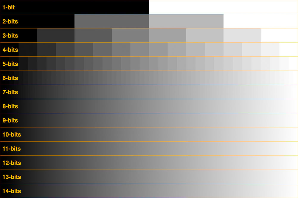
So “bit-depth” determines how the smallest changes you can make, relative to some range of values. If our scale is brightness from pure black to pure white, then the 4 values we get from a 2-bit number would include: black, dark midtones, light midtones, and white. This is a pretty lumpy scale and not very useful for a photograph. But if we have enough bits, we have enough gray values to make what appears to be a perfectly smooth gradient from black to white.
Here’s an example comparing a black to white gradient at different bit depths. The embedded image here is just an example, click here to see the full resolution image in the JPEG2000 format with bit depths up to 14-bits. Depending on the quality of your monitor, you can probably only display differences up to 8-10 bits.
How is bit-depth defined?
It would be convenient if all “bit-depths” could be compared directly, but there are some variations in terminology that are helpful to understand .
Note that the image above is a black and white image. A color image is typically composed of red, green, and blue pixels to create color. Each of these colors is handled by your computer and monitor as a “channel”. Photography software (such as Photoshop and Lightroom) refer to the number of bits per channel. So 8-bits means 8-bits per channel. Which means that an 8-bit RGB image in Photoshop will have a total of 24-bits per pixel (8 for red, 8 for green, and 8 for blue). A 16-bit RGB or LAB image in Photoshop would have 48-bits per pixel, etc.
You would assume that this then means 16-bits means 16-bits per channel in Photoshop. Well, it does and it doesn’t. Photoshop does actually use 16-bits per channel. However, it treats the 16th digit differently – it is simply added to the value created from the first 15-digits. This is sometimes called 15+1 bits. This means that instead of 2^16 possible values (which would be 65,536 possible values) there are only 2^15+1 possible values (which is 32,768 +1 = 32,769 possible values). So from a quality perspective, it would be very fair to say that Adobe’s 16-bit mode is actually only 15-bits. Don’t believe me? Look at the 16-bit scale for the Info panel in Photoshop, which shows a scale of 0-32,768 (which means 32,769 values since we are including 0). Why does Adobe do this? According to Adobe developer Chris Cox, this allows Photoshop to work much more quickly and provides an exact midpoint for the range, which is helpful for blend modes). Should you worry about this “loss” of 1 bit? No, not at all (15-bits is plenty, as we’ll discuss below).
Most cameras will let you save files in 8-bits (JPG) or 12 to 16-bits (RAW). So why doesn’t Photoshop open a 12 or 14-bit RAW file as 12 or 14 bits? For one, it would be a lot of work to develop both Photoshop and file formats to support other bit depths. And opening a 12-bit file as 16-bits is really no different than opening an 8-bit JPG and then converting to 16-bits. There is no immediate visual difference. But most importantly, there are huge benefits to using a file format with a few extra bits (as we’ll discuss later).
For displays, the terminology changes. Monitor vendors want to make their equipment sound sexy, so they typically refer to displays with 8-bits/channel as “24-bit” (because you have 3 channels with 8-bits each, which can be used to create roughly 16MM colors). In other words, “24-bits” (aka “True Color”) for a monitor isn’t super impressive, it actually means the same thing as 8-bits for Photoshop. A better option would be “30-48 bits” (aka “Deep Color”), which is 10-16 bits/channel -with anything over 10 bits/channel being overkill for display in my opinion.
For the rest of this article, I’ll be referencing bits/channel (the camera/Photoshop terminology).
How many bits can you can see?
With a clean gradient (ie, worst case conditions), I can personally detect banding in a 9-bit gradient (which is 512 shades of gray) on both my 2018 MacBook Pro Retina display and my 10-bit Eizo monitor. A 9-bit gradient is extremely faint (barely detectable) on both displays. I would almost certainly miss it if I weren’t looking for it. And even when I am looking for it, I cannot easily tell exactly where the edges are in comparison to a 10-bit gradient. I’d almost say there is no banding at 9-bits. An 8-bit gradient is relatively easy to see when looking for it, though I might still potentially miss it if I weren’t paying attention. So, for my purposes, a 10-bit gradient is visually identical to 14-bits or more.
How did I test that? To give a little more detail on my methods, I created an image that is 16,384 pixels wide – which allows me exactly 1 pixel for every value in a 14-bit gradient. I created a software algorithm to generate my gradients in every bit depth from 1 to 14 on the image. I would gladly share the original PSB file, but it is over 20GB. Instead, I’ve posted a full-resolution JPEG2000 image (ie 16-bit; I do not see any differences between it and the original detail, even when processing it with extreme curves). Amazing how that JPEG2000 file shrinks down ~10,000X to only 2MB.
Note that if you want to create your own file in Photoshop, the gradient tool will create 8-bit gradients in 8-bit document mode (you can then convert the document to 16-bit mode and will still have an 8-bit gradient for testing/comparison). Photoshop’s gradient tool will create 12-bit gradients in 16-bit document mode. There is no 16-bit option for the gradient tool in Photoshop, it is a 12-bit tool internally (but 12-bits is more than enough for any practical work, as it allows for 4096 values). Be sure to enable/disable dithering in the gradient toolbar as best for your testing. And if you convert color spaces, be aware that there is a dithering option for 8-bit images under Edit / Color Settings / Conversion Options. Using dithering will often reduce the appearance of banding if your bands are close to 1 pixel wide (ie, dithering won’t hide bands in documents above a certain resolution; a Nikon D850 file is almost twice as wide as you would need to display every value in a 12-bit gradient).
It is also important to note that you are likely to run into false “banding” when viewing images at less than 67% zoom. See my post on false banding to learn how to avoid any confusion.
Why use more bits than what you can see?
Why do we have options for even more than 10-bits in our cameras and Photoshop? If we never edited photos, there would be no need to add any more bits than the human eye can see. However, when we start editing the photos, previously hidden differences can easily start to show.
If we significantly brighten the shadows or darken the highlights, then we are expanding some portion of the range. We are making any minor errors or rounding error in the data more obvious. In other words, increasing the contrast in the image is like decreasing bit depth. If we manipulate the photograph enough, this will start to show up as “banding” in the image. Banding is obvious/discrete jumps from one color or tone to the next (instead of a smooth gradient). You’ve already seen a theoretical example with the low-bit gradients above. Typical real-world example would be various “bands” showing up in the clear blue sky or excess noise.
Why do 8-bit images look the same as 16-bit images?
If you convert a single layer 16-bit image to 8-bits, you will see something that looks exactly like the 16-bit image you started with. If so, why bother with 16-bits? As you apply Curves or other adjustments, you are expanding the tonal range of various parts of the image. This can start to make small gaps between values turn into large gaps. So even though the difference may not be initially visible, they can become a serious issue later as you edit the image.
So how many bits do you really need in camera?
A 4-stop change in exposure is on the order of losing a little over 4 bits. A 3-stop change in exposure is closer to only losing 2 bits. I rarely would adjust RAW exposure out to +/-4 stops, but it can happen with extreme situations or portions of poor exposures. So I’d suggest an extra 4-5 bits over the limits of visible banding to be safe. Adding that margin of safety on top of a goal of at least 9-10 bits to avoid visible banding gets you to roughly 14-15 bits as an ideal target.
In reality, you will probably never that many bits for several reasons:
- There aren’t that many situations where you would encounter a perfect gradient. Clear blue skies are probably the most likely. Anything else with detail makes it MUCH harder to see the difference in bit depth.
- Color offers more bit-depth. My discussion here is limited to a single black and white channel. If you process for fine art black and white, then these numbers apply directly to you. But if you process in color, you probably have a little more wiggle room.
- Your camera’s accuracy is not as high as its precision. In other words, there is noise in your image. This noise typically makes banding a little harder to see at a given bit-depth (ie, real world images don’t typically show banding quite as easily as the smooth gradients I’ve used above.)
- You can remove banding in post processing using a combination of Gaussian blur and/or adding noise. Of course, you’ll need to be on the lookout for it so that it doesn’t sneak into a print.
- The extra bits mostly only matter for extreme tonal corrections.
Taking all of this into consideration, 12-bits sounds like a very reasonable level of detail that should allow for significant post-processing. However, cameras and the human eye respond differently to light. The human eye is more sensitive to shadows, and a “logarithmic” curve is applied to the RAW sensor data (not to TIF or other files after RAW conversion). The result is that the bits used for shadows are lower quality (see DPReview for an in-depth discussion of the topic). So there there may be value in capturing extra bits of detail depending on your needs and camera.
To test the limits for my Nikon D850, I shot a series of exposures bracketed at 1 stop intervals using both 12 and 14-bit RAW capture with my D850 at base ISO under controlled lighting. My test scene included a gray card to help precisely evaluate white balance. I then processed the images in Lightroom (LR) using exposure and white balance adjustments. I do not see notable differences in noise, but there are huge differences in color cast in deep shadows (with the 12-bit file shifting a bit yellow and quite a bit green) and some minor differences in shadow contrast (with the 12-bit file being a little too contrasty). The color cast starts at about 3 stops of underexposure (-3ev), is much more apparent at -4ev, and is a serious issue at -5 and -6. Results from other cameras are likely to vary, and the differences are ISO-dependent – so you should test with your own camera.
Furthermore, RAW processing software matters, so I also tried processing the same images in Capture One (testing auto, Film Standard, and Linear curves for the D850). LR and CO aren’t directly comparable since you can’t do more than 5 stops of exposure adjustment in LR or more than 4 stops of exposure adjustment in CO. So I set both to +4 exposure and then adjusted the RAW curve to bring in the white point to 50%.
What I found surprised me, the Capture One (CO) results fell off much more quickly with deep shadows. CO was not as good as LR at -5 and nearly unusable at -6ev, while the LR result was surprisingly usable at -6ev.
Ultimately, I find that at ISO 64 with a Nikon D850:
- 12-bit files can be pushed 3-4 stops in LR or CO
- 14-bit files can be pushed 5-6 stops in LR or 4-5 stops in CO
As I generally try to avoid more than 3 stops of shadow recovery due to noise, the color cast due to 12-bit files is rarely going to be an issue in my work. 12-bits is definitely a reasonable choice. That said, I care much more about quality than file size, so I just shoot at 14-bits all the time. This gives me more latitude to deal with extreme scenes or work with files that I may accidentally underexpose.
Below are some extreme examples from my testing. First is the original 14-bit RAW, which is about 6.5 stops underexposed. It probably looks pure black to you, but if you look closely, you’ll see there’s some detail. Clearly, this is massively underexposed throughout the image and about as extreme an example as you could ever imagine. I’m not posting the 12-bit original RAW as it looks the same before processing.

Because Lightroom only allows +5 stops of exposure, I also adjusted the curve to bring in the top-right point to 80% for the both of the versions below. The first version (on top) is the processed 14-bit image. As you can see, there is tremendous shadow detail. There is of course noise in the image, but this is actually a printable file (though certainly not ideal). Lightroom’s white balance tool was easily able to use the gray card to get proper white balance.

This next variant is the processed 12-bit image. It is also surprisingly useful for such an extreme adjustment, but has some clear issues. I used the exact same +5ev and curve adjustments. Lightroom was unable to get a proper white balance from the gray card, there is simply too much color noise at the pixel level in this file. So I copied the white balance from the above image, which resulting in an image which was slightly warm and definitely a bit too green. I then manually corrected the image the best I could, but there were no white balance settings which looked fully correct nor matched the 14-bit file. The final image shows a residual color cast and greater contrast (with the shadow behind the towel being most notable). Much more concerning though is the splotchy color noise (which you can see in the lighter part of the towel shadow below). Also, tweaking the white balance just slightly more than I have here started to show some large grey splotches in the wood of the door. So while this result is “ok”, it is just shy of a disaster.
So there is an advantage to shooting with a 14-bit file on the Nikon D850, but it is relatively slight under extreme conditions. Even if portions of your shadows are this underexposed, I can’t see a scenario where you would fully correct them to a middle gray. 12-bit files are a very reasonable option. (I have not posted the Capture One results here, but both are worse, with the 12-bit file being truly terrible for this extreme underexposure.)

What if you have a fancy camera that captures 16-bit RAW files – should you be worried about Photoshop’s 15-bit quality? No. For several reasons:
- The limiting factor is your RAW conversion software, not Photoshop. I don’t know if Lightroom uses 15+1 or true 16-bit math internally, but I suspect the latter. I don’t have a 16-bit camera to test. No matter which camera or RAW conversion software you use, it is best to do white balance and tonal adjustments in RAW before Photoshop for best results.
- As noted above, 14-15 stops is plenty.
- Camera companies can claim any bit depth they want, it does not mean that you are getting better quality. In other words, precision (the number of bits) and accuracy (the quality of the numbers stored with those bits) are not the same. Noise is a very good example of this discrepancy. I wouldn’t be surprised if you are not getting 16-bit accuracy from a 16-bit file, but that is speculation on my part. [Note that I’m not saying these aren’t excellent cameras that produce better images, they probably are – I’m just saying that I don’t think Photoshop’s 15+1 bit depth design is something to worry about when processing files from these cameras].
- That said, using 16-bit capture should give you at least an extra bit in Photoshop and may be beneficial.
In summary:
- Do not shoot JPG (8-bits)
- A 12-bit RAW file is excellent for most work and offers significant space savings over 14-bit RAW. This is the best choice if you care about file size.
- If you want the absolute best quality in the shadows, shoot 14+ bit RAW files (ideally with lossless compression to save space). This is the best choice if you don’t care about larger files and shoot scenes with wide dynamic range (deep shadows).
- If you can shoot 16-bits, that’s fine but probably overkill. Worth testing your camera to see if you can use a lesser setting to save on file size.
How many bits should you use in Photoshop?
Based on the discussion above, it should be clear that 8-bits is not enough. It is possible to see banding immediately in 8-bits. And if you don’t see it right away, even modest adjustments can expose it. So go with 16-bits.
That holds true even if you are using an 8-bit source file (such as a stock image downloaded in JPG). Even if the source has been degraded, processing in 16-bits will still yield better results as it will minimize compounding of rounding errors in the math with multiple adjustments.
There is no reason to use 32-bits for photography unless you are processing an HDR file.
How many bits do you need for sharing on the internet?
The benefits of 16-bits are largely in the ability to manipulate the image without causing issues. Conversion of the final edited image to 8-bits is perfectly fine, and has the advantage of creating much smaller files in the internet for faster uploads/downloads. Be sure that Photoshop’s dithering is enabled. Go to Edit / Color Settings and make sure “Use dither (8-bit/channel images)” is checked. If you are using Lightroom to export to JPG, dithering is used automatically (you don’t have a choice). This helps add a bit of noise that should minimize the risk of any banding being exposed with the final conversion to 8-bits.
How many bits do you need for printing?
If you print at home, you can just create a copy of your 16-bit working file and finalize it (flatten, sharpen, change color space if needed, etc). But what about if you are sending your images over the internet to be printed by a pro lab? Many will accept 16-bit TIF files, and that’s a great way to go. However, if the vendor requires a JPG or you want to send a smaller file, you might be faced with questions about converting to 8-bits.
If your print lab accepts 16-bit formats (TIFF, PSD, JPEG2000), that’s probably the way to go – but ask your vendor what they recommend if you are unsure.
If you have to send a JPG, it will be in 8-bits, but that shouldn’t be a concern. In reality, 8-bits is fine for final print output. Remember that most issues with 8-bits are caused by making changes to 8-bit data, not the initial conversion. I have printed hundreds of very high-quality images that were uploaded to my vendor as 8-bit JPGs and the final images look amazing (exported from Lightroom with 90% quality and Adobe RGB color space). I would recommend making all other changes (flattening, color space conversion, sharpening, etc) before conversion to 8-bits.
If you don’t see banding on your monitor after conversion to 8-bits, you should be ok to print. However, you can help guard against potential issues by ensuring that Photoshop is using dithering for the conversion to 8-bits (see previous section).
What is the difference between Bit-Depth and Color Space?
Bit-depth determines the number of possible values or increments. Color Space determines the maximum values or range (commonly known as “gamut”). If you were to use a box of crayons as an example, greater bit-depth would be like having more shades (more crayons) and greater gamut would be like having the most saturated color be more bold (regardless of the number of crayons).
To see out the difference, consider the following simplified visual example:
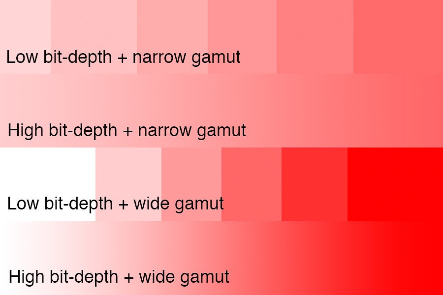
As you can see, increasing bit-depth reduces risk of banding by creating more increments, while expanding color space (wider gamut) enables the use of more extreme colors. But the two do interact, because the jumps will get bigger if you use the same bit-depth with a wider gamut. And it is those jumps that relate to banding.
How does Color Space impact Bit Depth?
Color space is gamut (the range over which the bits are applied), so a very large gamut could theoretically cause banding if it stretches your bits too thin. Remember that bits determine the number of increments relative to a range. So you can get larger jumps (risks of banding) by either reducing bit depth or increasing the range over which the bits are applied. I have heard/read various discussions about the “risks” of using ProPhoto RGB as a working space because its gamut is so much larger than needed (including a large number of colors that are beyond any foreseeable printer or monitor technology). Defining a range with a bunch of unused (imaginary) colors is wasteful/innefficient and causes larger jumps over the range of image values we care about. But ProPhoto is a well-defined standard worthy of consideration, so does it create jumps large enough to cause banding issues?
In reality, the longest dimensions of ProPhoto compared to Adobe RGB aren’t quite double the linear distance in XYZ coordinates. I haven’t spent the time to investigate how it all nets out when you factor in log-scaling used on the data, but my sense is that using ProPhoto is roughly like throwing roughly 1-bit of data. I wouldn’t worry about it if you are using a 16-bit working space (you definitely do not want to throw away any bits if you are using an 8-bit working space, but you should never use 8-bits anyhow).
But I’m not a big fan of speculating, so I’ve done a lot of testing. It is always important to validate your assumptions. I have heard many experts claim something to be true (in theory), only to find that real world factors make the theory essentially irrelevant. A Ferrari is theoretically faster than a Ford truck, but maybe not on a dirt road.
I have tried various test edits designed to induce banding with ProPhoto and still not run into it (with 16-bit files). Even using extreme curves and other adjustments that go well beyond how I imagine anyone would edit these photos, I am not able to see any issues. ProPhoto is a good choice to keep all printable colors. If you really want to maximize your bits, check out the betaRGB or eciRGB v2 profiles (which contain all print/display colors with much less waste than ProPhoto). But personally, I’m sticking with ProPhoto.
Recommended settings and workflow to avoid banding
After all that discussion, it really comes down to a few simple rules.
Camera settings:
- A 14+ bit RAW file is a good choice if you want the best possible quality, particularly if you expect you may need to do extreme tonal adjustments (such as increasing shadow exposure by 3-4 stops).
- A 12-bit RAW file is excellent under most conditions and should be used if you want to save file space or shoot more quickly. For my D850, a 14-bit RAW file is roughly 30% larger than a 12-bit one, so that’s an important consideration. And the larger files may impact your ability to shoot long continuous sequences as the camera’s buffer fills.
- Never shoot JPG if you can avoid it. If you shoot live events, you might be the exception to the rule (to quickly upload and send images). Even still, you might consider using a JPG+RAW setting if you need a higher quality file too. I’d probably stick with sRGB as your camera color space if you do shoot JPG, as your work is probably just going on the web and a smaller gamut reduces risks of banding with 8-bits. If you are shooting RAW, you can ignore the color space setting (RAW files don’t really have a color space, it isn’t set until you convert the RAW file to another format).
Lightroom and Photoshop (working files):
- Always save your working (layered) files in 16-bits. Only use 8-bits for your final output to JPG for sharing smaller files on the web (and printing if that’s what your vendor requires/prefers). It is ok to use 8-bits for final output, but it should be avoided at all costs prior to final output.
- Be sure to zoom in to 67% or closer to make sure that any banding you see is not due to the way Photoshop previews layered file. This is a very common issue that causes the photographer to falsely believe there is banding in the image (see my previous tutorial “No, You Really Don’t Have Banding” for details).
- Be careful when using HSL in Lightroom and Adobe Camera RAW, as this tool is prone to color banding. This has very little to do with bit-depth, but is a source of banding. (See my tutorial on how to use HSL for beautiful color and avoid banding).
- If your source file is only available in 8-bits (such as a stock JPG), you should immediately convert the layered working document to 16-bits. Subsequent edits on 8-bit images will not degrade as badly if that math is performed in a 16-bit mode.
- Skip the 32-bit working space, unless you are using it as a way to combine multiple RAW files and then multi-process them as 16-bit layers (HDR workflows). There are massive feature limitations in the 32-bit space, workflow challenges, and the files are twice as big. I would generally recommend merging to HDR in Lightroom instead of using 32-bit Photoshop files.
- Lightroom’s HDR DNG format is perfectly fine to use. (You may be aware that it uses 16-bit floating point math in order to cover a wider dynamic range with a similar number of bits. Keeping in mind that we only need to expand dynamic range a few stops with HDR and that we really only need 12-14 bits in a single RAW file, this is an acceptable format that increases quality without creating enormous files.) Of course, be sure to export from this RAW as a 16-bit TIF/PSD when you need to continue on to Photoshop.
- If you are one of the few people who needs to use an 8-bit workflow for some reason, it is probably best to stick with the sRGB color space. With a 16-bit workflow, I see no reason to worry about banding/posterization with ProPhoto RGB and I use ProPhoto RGB as my primary color space these days. I believe the concerns with ProPhoto are probably driven by theoretical concerns that not found in the real work, banding caused by use of HSL in RAW (ie, not related to the color space), false perception of banding when viewing layered files without zooming in, or using ProPhoto with 8-bit test files (because any loss of quality at 8-bits is a big deal). Others may disagree with me on this, but I have yet to push a file and find banding issues related to ProPhoto in 16-bits. You should always use 16-bits when working with ProPhoto, which makes the minor waste of bit-depth a non-issue.
- When using Photoshop’s gradient tool, checking the “dithering” option creates the perception of 1 extra bit of detail. This may be helpful if working in an 8-bit file. For a 16-bit file, it is unnecessary and increases the size of the saved file (assuming you are using compression to save your files).
- A better generalized solution for removing banding is described below.
Exporting to the web:
- JPG with 8/bits and sRGB color space is ideal/standard. While some monitors are capable of of displaying greater bit depth, the increased file size is probably not worth it. And while more and more monitors are capable of wider gamuts, not all browsers properly support color management and could display your images incorrectly. And most of those larger gamut monitors have probably not been color calibrated by their owners either. So, sadly, the lowest common denominator rules the internet for now.
Printing:
- 8-bits is fine for the final output, but go for 16 if your vendor supports it.
Monitor:
- A standard monitor is fine. But be aware that you may potentially see some banding due to an 8-bit display that is not truly in the image.
- If you can afford it, a 10-bit display is ideal if you aren’t on a budget. A wide gamut (ie Adobe RGB) monitor is also ideal. But neither is really necessary, and I’ve done plenty of high-end work on a standard monitor. Be sure to calibrate the monitor though if you are sending files out for print. I do critical work on a 27″ Eizo (CG2730).
Future proofing
As we discussed above, sometimes the choice of bit depth doesn’t matter right away, but later in the process. The same would apply to monitors and printers, which may get better bit-depth and gamut in the future. The recommended 16-bits for working files should remain sufficient for a few reasons: (1) that’s greater than most monitors and printers are or will be in the foreseeable future and (2) beyond the limits of our ability to see differences.
However, gamut is another consideration. Most likely, you have a monitor with an sRGB color gamut. If you have a “wide gamut” (Adobe RGB) or P3 gamut monitor, then you have better gamut (with Adobe RGB expanding the blues/cyan/greens more than P3, and P3 expanding red/yellow/greens further than Adobe RGB). Aside from P3 monitors, there are printers commercially available which exceed the AdobeRGB gamut as well (particularly in the cyans). So both sRGB and AdobeRGB already fail to capture the full range of colors that can be recreated on a monitor or printer today. For that reason, it is worth using a wider gamut now so that your working file can take advantage of better printers and monitors later, such as ProPhoto RGB. Of course, you’ll need to convert the RAW to the wide gamut during the initial export, switching the color space later won’t recover any colors you throw away earlier in the process. And as discussed above, wider gamuts should be used with 16-bit files.
How to remove banding:
If you follow the recommendations above, it is very unlikely you will run into banding. Be sure that you aren’t seeing false banding due to the way Photoshop manages layered files (see my previous post “No, You Really Don’t Have Banding” for details on the issue and how to test for real banding).
But if you do run into banding (most likely if you get an 8-bit stock image), you can take the following steps to minimize it:
- Convert the relevant layer(s) to a Smart Object.
- Add some Gaussian blur. Just enough to hide the banding (a radius equal to the pixel width of the banding is perfect).
- Use the Smart Filter mask to apply the blurring just where it is needed in the banding. It is easiest to select the mask, invert it to black, and then paint white where you need the blur.
- Lastly, add some noise to restore the appearance of grain lost due to blurring. If you are using Photoshop CC, use the Camera RAW filter to add some noise. Try using an amount of 6, size 4, and roughness 50. This should give a good appearance of grain. You can easily go back and try other values with the Smart Filter. [If you are using Photoshop CS6, you don’t have Camera RAW, so go to Filter / Noise / Add Noise instead and try 1% Gaussian monochromatic.]