The latest updates to Lightroom and ACR include powerful new color grading controls. A lot of photographers have been asking for the sort of capabilities available in competing programs like Capture One, and Adobe’s offering seems spot on. Not only have they massively expanded the capabilities from the legacy “split toning”, but done so in a way that doesn’t break anything. You can still do all the old things, your RAW adjustments are migrated exactly as they were, and you can do so much more. Read on to make the most of these exciting updates.
How does the new Color Grading compare to the old Split Toning?
Most of you have likely used or heard of Adobe’s old split toning controls, so it makes to start with what’s familiar (you can just jump to the next section below if you only want to read about the new stuff). And I’ve used split toning extensively in many of my tutorials, so this should also serve as a handy reference as to how to apply settings I’ve shown in previous tutorials when working with the new Color Grading controls. The old split toning system was based on 5 inputs and all of them map directly to a control in the new color grading approach.
Before we get to the controls, it’s important to note that the new system lets you view the settings in a couple different ways. The default shows three colored circles for highlights, midtones, and shadows. All of the controls are in there, but it feels very different. You can view each of these circles in an enlarged view, where you will see numeric sliders that should start to feel much more familiar.
- Highlight hue:
- You can set this in a couple of ways, but they are the same.
- The most familiar is to click on the enlarged highlights wheel and use the hue slider. This does exactly the same thing as the old split tonight hue slider. The only difference is that holding <alt/option> will no longer give you a preview with saturation temporarily at 100%, so you should boost the saturation slider yourself as needed to help pick the correct hue via slider.
- Or you can use the other approach, which is to drag the point on the highlights wheel. The hue is based on the angle you select in the wheel. One advantage of this approach is that you can drag that point to the outer edge of the wheel (which is 100% saturation) to help quickly pick the hue, and then back off the saturation. Hold <ctrl/cmd> while clicking and dragging on the wheel to adjust hue only (while holding saturation constant)
- Highlight saturation:
- The situation here is very much like hue, but the saturation is represented on the wheel by the distance from the center (0% saturation in the middle, 100% at the edges).
- Hold <shift> to adjust saturation only (while holding hue constant). This is a great way to back off from 100% saturation once you have picked a hue.
- By default, when you click and drag an existing point on the wheel, the hue will be sticky for modest movements of the mouse. So you get the <shift> key behavior by default with careful movement of the mouse. On the flip side, this may frustrate you if you are trying to adjust the hue by a little – and you can work around that by using the <alt/option> or <ctrl/cmd> shortcuts to allow small changes in hue.
- Balance:
- The balance slider is shown in all views (other than the global adjustment view) and works just like it did with split toning.
- Shadow hue works similar to highlight hue.
- Shadow saturation works similar to highlight saturation.
I’ve always used split toning by previewing the saturation at 100% to pick the right hue quickly and easily. As you can no longer hold <alt/option> while dragging the hue slider to do this (hopefully this changes in the future), the following workflow is my recommendation for the quickest and easiest way to get results similar to split toning:
- Click and drag the points on the highlights wheel. Drag all the way to the outer edge (100% saturation) and move around to get the desired hue. Hold <alt/option> as you get close to make small changes with precision.
- Once you’ve picked the hue, hold <shift> to lock the hue and then drag towards the center to set the saturation.
- Repeat steps 1 and 2 for the shadows.
- Set the balance slider by holding <alt/option> as you click and drag (thankfully, you still get 100% saturation previews with this keyboard shortcut).
If you don’t like working with the wheels, do this instead:
- View the enlarged highlights wheel to get highlights sliders.
- Set 100% saturation
- Adjust the hue as desired
- Bring down the saturation to the desired final value
- Repeat steps 1-4 for the shadows.
- Set the balance slider by holding <alt/option> as you click and drag
How to make the most of Color Grading
Of course, it wouldn’t be much of an update if there weren’t new capabilities. So let’s now dig into what’s here and how we can use it. First, what’s new?
- Midtone adjustments: While this is probably more familiar for portrait photographers, there are some great ways to use this in landscape photography as well. For example, if you want to use color grading to affect sunset color, you’ll probably see much more targeted results by working with a combination of highlights and midtones. With the old approach, you’d be forced to use shadows and end up strongly affecting areas that are not part of the sky. This is just one example and there are many other ways you may find this additional control very helpful with any photography.
- Luminance:
- This new slider lets you make make tonal adjustments to shadows, midtones, highlights, or globally.
- My experience so far is that adjusting the blacks slider in the Basic tab (vs the new shadow luminance in Color Grading) or adjusting the whites slider (vs highlights luminance in Color Grading) typically produce better contrast. So be sure to try those approaches first if your goal is really to bring out detail rather than add color. However, there are some very good reasons to consider using this control.
- Using negative luminance on the highlights will allow you to add just more color to the brightest or blown highlights than adjusting the whites. So this may be the best way to add more color to a bright white sky.
- You may prefer less contrast for stylized work, such as color grading portraits. If that’s the case, the loss of contrast is a good thing.
- And the luminance slider is a convenient way to make quick small changes that would work well with either approach.
- Blending:
- This will surely be the most confusing control. Whereas “balance” determines where the transitions between shadows, midtones, and highlights occur; “blending” determines how much they transition or overlap. The best way to understand it is to experiment by creating a black to white gradient and play with this setting to see how it works (without the complication of an underlying image).
- This affects not only how quickly you get from one color to the next, but the degree to which they mix. In fact, if you set blending to +100%, you may not see your midtone color at all. The midtone will tint the final result, but be a mix of all the colors that may be quite different from the midtone hue.
- The midtones are most strongly impacted by high levels of blending, as they mix with both highlights and shadows.
- When you use it on your own images, you can hold <alt/option> to preview the blending at 100% saturation, which helps pick the best blending slider value.
- Global adjustments: This lets you apply a hue, saturation, and luminance across the entire tonal range of the image. I prefer to use the white balance and exposure sliders in the Basic tab, but this is a straight-forward option to make some global color adjustments if needed.
What’s the best overall color grading workflow?
My preference for landscape work is:
- Do your basic tonal work and other image editing first. Color grading should ideally be one of the last steps in your RAW workflow.
- Use the adaptation of the old workflow above, but consider the midtones as well (either replacing shadows or in addition to them).
- In other words: Set highlights hue while previewing at 100% saturation and then set saturation as needed. Then repeat for shadows and midtones as needed.
- Leave the global settings alone
- If you cannot push enough color into the highlights, try reducing highlights luminance.
- Adjust balance (while holding <alt/option> to see it more clearly).
- Adjust the blending (holding <alt/option> can be helpful, but is less important). I like doing this after setting the balance, as I tend to think about it as placing my key colors and then feathering them.
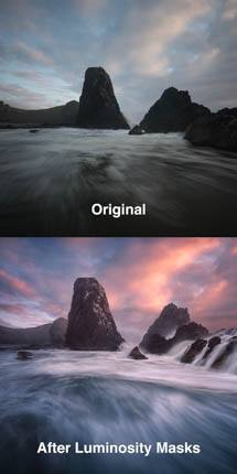
- Blend the color-graded version of the image using a layer or luminosity mask to use the color grading in a more targeted way. This is often much better than applying the color across the entire image.
There’s no single right answer and I would encourage you to see what works best for you.
Shortcuts and other minor details to know about the color grading tab
- To adjust hue only (while holding saturation constant): hold <cmd/ctrl> or just drag the little colored dot just outside the color wheel.
- To adjust saturation only (while holding hue constant): hold <shift>
- To temporarily hide shadow, midtone, highlight adjustments, click and hold the eyeball icon next to them. There is also a master visibility icon for all of color grading.
- In Lightroom only, you can quickly save and load color swatches for any of the color wheels (right-click a swatch to save the current color). Personally, I prefer using white balance over this global adjustment in color grading. However, this is a great way to add predictable color offset if you are using gray cards to achieve accurate white balance, and will give you a more clear understanding of how far you have strayed from the true white balance.