BenQ MOBIUZ EX321UX: 1000 nits for $1000?
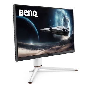 There are a few brands photographers routinely mention as their favorites, and BenQ is definitely one of them. For those of you who’ve started to explore the benefits of HDR display technology for photography, they have a very interesting option: a 1,000-nit mini-LED display priced just over $1,000. It’s marketed as a gaming monitor, so is it a good option for HDR photographers?
The BenQ MOBIUZ EX321UX offers:
- DisplayHDR 1000 certification (for outstanding HDR headroom)
- 1000 nits peak mini-LED with 1,152 zones (2x the Pro Display XDR).
- 700 nits typical (can sustain accuracy in bright content)
- 99% P3, 99% Adobe RGB thanks to quantum dot film (wide gamut with excellent coverage of both HDR and print color)
- 32-inch size with 4K resolution
- 144Hz refresh rate with 1ms response time (for smooth zooming, panning, scrolling)
- HDMI 2.1 and DisplayPort 2.1 (to support full use of high resolution and fast refresh rates for HDR content)
- 65W power delivery and four USB 3.2 downstream ports (one USB-C and three USB-A) to enable single-cable use for typical laptop use
[Disclosure: This post contains affiliate links. I rarely endorse other products and only do when I think you would thoroughly enjoy them. By purchasing through these links, you are helping to support the creation of my tutorials at no cost to you.]
How is the hardware quality?
The monitor feels well built and looks reasonably attractive (it doesn’t have the sort of obnoxious colored lights you see on some gaming monitors). I’d personally prefer that the stand and back of monitor were black (instead of white), but it looks good. The included stand offers nice height, tilt, and swivel adjustments (there is no option to rotate 90 degrees to portrait orientation). In addition to the normal buttons on the monitor for configuration, there is a remote control which makes the minimally required setup even faster and easier (though it’s not something I expect most people will use, after initial setup).
There is zero fan noise with this display, a concern some have raised with some other HDR monitors.
There are no speakers in this display (headphone jack and eARC are supported outputs). I applaud BenQ for not adding speakers if they aren’t going to be excellent (just checking a box to say you have speakers is wasteful for both the consumer and manufacturer). Most monitors have terrible audio and I’d rather the manufacturing only put time and money towards things which will create a great experience.
Image Quality & Color Accuracy
This is a bright screen which offers great HDR support in a range of ambient lighting conditions. Under MacOS, you’ll have up to 3.6 stops of HDR headroom based on the brightness slider setting you choose. Under Windows, you’ll have 1.4 – 3.9 stops depending on how you set the “SDR Content Brightness” slider in display / HDR settings. Due to black limits, I would say that this display supports 3.0-3.3 stops of headroom (100-120 nits SDR white in a room with controlled lighting works well with this display). Even if you have a bright room requiring 250 nits SDR white (which isn’t ideal), you’ll still have 2 stops of headroom.
While BenQ’s spec says 1,000 nits peak, it’s EDID reports 1,234 nits and I measured 1,575 for a 50% window.
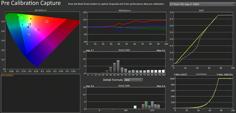 The default settings are geared towards gaming and should be avoided if you want an accurate display. Once color mode is set to “Display HDR” as recommended below, default color accuracy is imperfect, but very good for photography. I’m surprised to see this from a gaming monitor with no calibration / profiling. Many photographers will be happy with the results. Visually, most images on this display look very close to the ProDisplay XDR. It would be even accurate if we could do ICC profiling in HDR mode, but there is no standard yet and you cannot calibrate in the hardware here like the ASUS ProArt monitors. You can of course profile for SDR work such as editing prints, so the implication here is just a matter of HDR accuracy and ease of use if you decide to switch modes when you wish to use an SDR profile.
The most significant errors were that gray values were too dark in the SDR range. Red and green were oversaturated (but offsetting so that yellow was fine). When viewing the same content side by side with the Pro Display XDR, color is not visually perfect but holds up well. I measured an average deltaE 2000 of 2.7 for gray tracking and 3.6 for color. Max delta E was 9.1 at a CalMAN input of 40 (ie target of 33 nits but measured result was 7 nits).
Gamut coverage is excellent with 99.4% P3 and 87% Rec2020.
My test setup:
- Monitor updated to V5 (via BenQ’s firmware utility, monitor arrived with V3).
- CalMAN using C6 colorimeter and G1 generator.
- Note that I used the “BenQ SW242Q” profile for the colorimeter as the closest match as I do not have a spectro to profile the colorimeter or a preset which exactly matches this panel. I retested with the ASUS PA32UGC and P!32UCX profile recommended by the CalMAN experts at Portrait Displays. So, my CalMAN results should be interpreted with the caveat that this is a potential source of minor measurement error. That said, all three profiles returned similar results and the numeric test results are consistent with visual assessment against other displays I trust.
- Separate visual comparison of multiple images on high quality HDR displays including: ProDisplay XDR, M4 MacBook Pro, and Lenovo Yoga Aura (Windows).
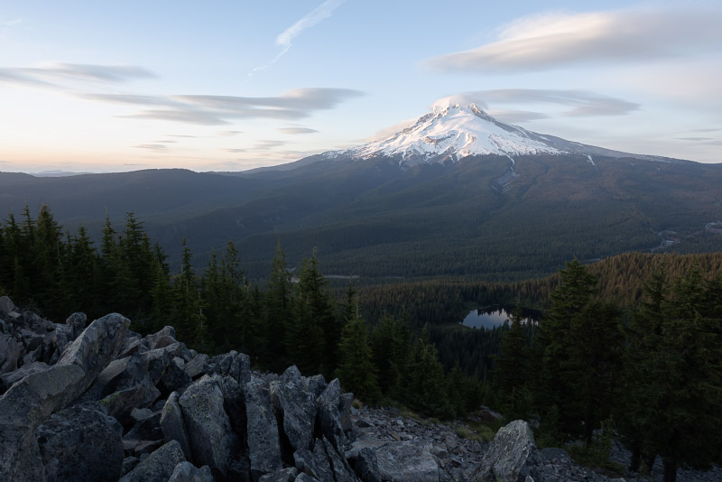
My primary concern with image quality is the dark SDR values in HDR mode. This can make shadow/midtone detail harder to see clearly and could bias you towards editing with shadows brighter than they should be. The foreground trees in this HDR photo shown here are more detailed and separated from the mid-ground trees when viewed on the Pro Display XDR than the BenQ. It’s a challenging scene on any display. For editing, this would potentially cause you to add a little more contrast (and that wouldn’t be a problem here in my opinion). However, you might find dark detail doesn’t pop quite as well on this display. It’s not a deal breaker for a monitor in this price range, but something I’d like to see BenQ address via firmware update. Even better would be an ability to create a custom ICC profile in HDR mode, but that’s outside BenQ’s control and not something we’ll have in the near future.
If you need greater accuracy , you can create an ICC profile in SDR mode for print-related work and switching between SDR mode (using the profile) and HDR mode (without a custom profile). That isn’t ideal, but isn’t that hard to manage and is a valid option to improve accuracy as much as possible. Windows will remember separate profile choices for SDR vs HDR mode, and MacOS users can use a 3rd-party tool called BetterDisplay to help toggle between profiled SDR and the factory profile in HDR mode (enable the “auto switch color profile for SDR and HDR modes” option and set the appropriate profile / factory setting for each mode through MacOS ColorSync Utility).
Local dimming performance and black performance is important to consider for any mini-LED display. There is notable blooming against solid dark to mid backgrounds. For example, you may notice a glow around the cursor or text in Photoshop. Outside of solid backgrounds, you are unlikely to notice it and it’s probably not a concern for most users. But if you go looking for it, you’ll eventually see it in something like the solid dark background of Photoshop and it’s just something to be aware of if you find little details like that distract you. For a good demonstration, view this test image full screen in a dark room: “dark shadow detail” test #4. There is also a very minor issue where small areas of very bright neutrals will shift towards being a cooler white.
If you wish, you may completely avoid blooming by disabling local dimming as noted below in section on setting up the display. Doing so will reduce accuracy and peak nits, so local dimming is best left on while editing photographs – but at least you have the option.
The other deficiency here is shadow performance. This monitor does not offer true blacks. A completely black screen reveals that the backlight is never disabled. As a result, it is unable to match the black performance of the Pro Display XDR (which has half as many dimming zones and provides an example of how comparing zone counts can be misleading for black performance). The latest mini-LED from ASUS is much better yet, and ASUS’s OLED is outstanding for dark shadow detail (as is the case for nearly an OLED). However, this level of deep shadow detail is far less useful for HDR photography than most people assume. You can only appreciate it with dark content in a dark room — and very few people in your audience will have such performance at this time. It’s an exciting goal for photography but is currently more relevant for HDR movies, which are more often consumed on an OLED in a dark room.
Halos are another concern with any mini-LED and here they are visible in high contrast edges where bright content is directly next to midtones (but actually much less of an issue for bright content near deep shadows). There is also a clear color bias in test patterns, but this doesn’t show in real use. There was one very odd but repeatable anomaly. Right around 40 as an input in CalMAN, the local dimming would show a significant color shift towards blue around the edges of the target window. This seems like a bug which could be resolved with a firmware update (I tested with firmware v5).
Local dimming also impacts peak brightness quite a bit. When you run test patches, a 1% or 2% window will be much darker than 10% and the peak is actually achieved with a 50% window. At the default brightness (100, max), a 50% window measures 1,575 nits and a 1% window is 880. While a 1 stop difference sounds large, you wouldn’t view half the screen at peak and the actual impact with real content will be well managed.
Despite having 2x the zone count, this monitor fails to achieve the minimal halos of the Pro Display XDR. This is another example where zone count alone does not predict halo performance. There are many other critical factors which influence the actual image (such as firmware and precision of backlight dimming). The worst case is bright content next to bright midtones, but it’s much less of an issue with darker content and I don’t see it with sunsets behind mountains or buildings.
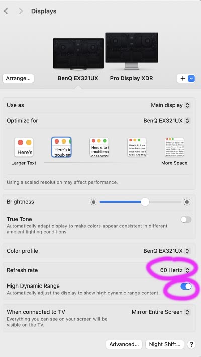
The EX321UX offers HDR support up to the maximum 144Hz refresh rate for 4K resolution. However, due to limitations when scaling for lower “resolution” on my M4 Max MacBook Pro / MacOS, the peak refresh rate for HDR support may drop down to 60Hz. This is not a limitation of the monitor, just a practical limit of my computer when simulating resolutions other than the native 4K offered by this display (ie this would affect any monitor with my computer). For more details, see how HDR, refresh rate, and “resolution” interact.
Overall, image quality is very good. Peak brightness is great and color accuracy is surprisingly good for a gaming monitor. I would like to see better default EOTF tracking in the SDR range of HDR mode, and hopefully a firmware update may be able to provide that. You may likely see local dimming halos for some text or bright objects against solid backgrounds in the user interface, but are unlikely to notice in photos. All the other concerns raised are relatively minor and hard to spot in a real photo. Unless you go looking for trouble with test patterns, you’re unlikely to find these concerns in most images. Most photographers seeking a more budget-friendly HDR monitor will likely be ok with these limitations, but there is (unsurprisingly) a clear benefit when you compare this monitor directly to displays costing 2-5x.
What could be better?
BenQ has done a nice job with this monitor. It offers great HDR, simple setup, and surprisingly good accuracy for a gaming monitor at this price point.
As noted above, I’d primarily like to see better gray tracking in shadow and midtone values. It’s acceptable in this price range, but is a visible error which could likely be improved with firmware. The other concerns raised would be ideal to address, but realistically the performance is pretty good for a gaming-oriented monitor at this price point before we have an HDR profiling standard. The bar for performance keeps increasing and I’d like to see better local dimming / black performance performance in future models. It’s ok today, but I expect that’s one aspect of the display which won’t age well. A few years from now, we’ll hopefully have HDR profiling to get great accuracy, but I’m not sure the local dimming will improve here as consumer expectations rise with ever more options for great mini-LED or brighter OLED.
It would be ideal to be able to see the firmware version shown in the monitor menus so to confirm if the display is current without needing to install software on the computer.
The brightness slider in HDR modes should have a much higher minimum value. Most of the range is too dark to be useful, and SDR brightness is best controlled in the operating system. This slider should only be used to help manage tradeoffs between achieving maximum brightness vs limiting brightness in order to prioritize consistency / accuracy. Ideally, the name of this control might be changed to help clarify that it should not be used to control general brightness (perhaps call it “peak brightness”).
How to setup the BenQ MOBIUZ EX321UX for HDR photography:
Set up the monitor as follows:
- Change color mode to Display HDR.
- Optional: set brightness to 74-90 if you prefer accuracy over peak brightness / contrast.
- At the default brightness (100), peak nits measured 1,335 for a nice punchy result. However, HDR values tracked a slightly brighter than they should have and SDR was a bit too dark.
- Reducing brightness helped prevent the HDR overshoot, but did not improve SDR results.
- Reducing brightness to 90 showed improved HDR tracking, which continuing to outperform the rated 1,000 nits peak
- I found brightness of 74 resulted in a 1,000 nits peak and showed the most accurate HDR tracking.
- I recommend 90 to get more accurate EOTF tracking while retaining a nice bright display.
- You should only adjust this setting down from 100 to achieve better accuracy. If you simply want to dim the display for everyday use, the brightness slider in MacOS or “SDR content brightness” slider in Windows are the best option. That will dim the SDR reference white, without limiting the peak HDR values. (Note that this control would be problematic if you set it too low: reducing brightness down to the minimum of 1 limits the monitor’s HDR peak to only 58 nits)
- Leave all other monitor settings at defaults:
- AMA (Advanced Motion Acceleration, aka overdrive) set to 1
- “local dimming” on (this is what allows darker shadows for HDR on a mini-LED, peak nits will be reduced if this is off)
- Optional: If you wish to disable local dimming:
- Set local dimming to “off” in the “Display HDR” sub-menu.
- Set brightness to 100 (even with this max, the peak brightness measures 710 nits)
- Note that this will limit accuracy of gray tracking (deltaE dropped to 7.3). However, it has the minor benefit of avoiding color shifts in small areas of very bright whites.
- The darkest shadows (minimum black) will be lifted, and peak brightness limited. The result is that most of the EOTF will be darker than target values, shadows are light but retain detail, and color is not significantly degraded.
- This lower contrast image is less accurate for editing, but still looks nice for HDR (with a bit less punch / contrast). This is a useful option if the local dimming halos bother you.
- The best solution is to use the different custom mode options (alpha, bravo, etc). Set one of these modes with dimming on + brightness 74-90 and the other mode for dimming off + brightness 100. You can quickly switch by moving the control switch on the display left/right, or using the remote control.
Under Windows, set your “SDR content brightness” slider (under System / Display / HDR) between 7 (for ~80 nits SDR white) and 30 (~200 nits SDR white). Use a value which would make the display comfortable for long periods of time doing productivity tasks like editing a Word document or browsing the web.
On MacOS, the brightness slider does not show units, but adjusting so that you have 2.6 – 3.5 stops of HDR headroom (see test #1) would put you in the same range.
Conclusions: Is this the right HDR monitor for you?
The BenQ MOBIUZ EX321UX (also sold by Amazon) offers excellent value with its balance of DisplayHDR 1000 performance at a price point around $1,100. If you don’t obsess over color accuracy, this is a monitor I can highly recommend for great HDR capability on a moderate budget. Accuracy is very usable in “Display HDR” mode, SDR mode can be profiled as desired to improve accuracy for print-related work, and the HDR results may improve further (with either BenQ firmware updates or if/when a standard for ICC profiling in HDR mode arrives).
This is a great option to consider for HDR photography if you:
- need great HDR capability in a 32-inch 4K monitor and don’t need the highest levels of color accuracy in HDR mode.
- want the best performance you can currently get with a budget around $1,100 (without using a 42″ TV).
- prefer BenQ.
While it does not offer hardware calibration like ASUS ProArt, you can still profile SDR mode for your print work and there is an HDR working group at the ICC, but it may be a while before you can use profiling to improve HDR accuracy. Given the dark values in the SDR range, it would be ideal to switch to an SDR mode with a custom ICC profile for critical print work and otherwise use HDR (with no profile, as this would clip HDR values to SDR). So the bottom line is that this is a very good monitor, but you’ll want to consider switching between SDR and HDR modes if you want the most accurate display for print-related work (at least until BenQ offers a firmware update or we have ICC profiling for HDR). That’s a relatively minor hassle once you set things up correctly to switch in MacOS / Windows, though something you can already avoid with more expensive alternatives to this display.
The ideal HDR monitor for you depends on your working environment and budget. Here are my recommendations:
- If you have a larger budget:
- If you work in an environment with controlled lighting and have a ~$1,700 budget: ASUS PA32UCDM is an excellent choice (budget $200-$300 more if you need to purchase a colorimeter).
- If you work in a bright environment or want a full 4 stops of HDR and have a ~$3k budget: ASUS PA32UCXR mini-LED is ideal (see my review).
- If you use MacOS and money is no object ($6k new) or you can find it used (~$3k), the Pro Display XDR is ideal for its simple setup, 6k resolution, customer support, and absolute silence (no fans).
- If you’re comfortable calibrating a TV, you can get excellent HDR color accuracy at a good price point by using a 42″ TV as a monitor:
- The LG C4 is an excellent option for ~$900 (while inventory lasts).
- The LG C5 is the current model for ~$1300 (no compelling HDR benefit over the C4).
- CalMAN for Home is ~$450 for the software plus C6 colorimeter and appears to support auto-cal and internal pattern generators on these TVs.
- If you have a more limited budget, there are many good alternatives:
- The Gigabyte AORUS FO32U2 appears very promising as a 4K, 1000-nits OLED monitor for $800 (I have not had the chance to test it, and it does not support HDR calibration).
- If available in your country, the Xiaomi G Pro 27U recently launched a 1,600 nits 4K mini-LED gaming monitor for ~$550 (I have not tested it, but did review the older 2K version).
- If you have a very tight budget (~$350), the Xioami G Pro 27i offers a 1000-nit, 27″, 2K resolution mini-LED with moderate color accuracy (see my review).
- An external monitor is just one option. All of the 14-16″ M1 and later MacBook Pros include an outstanding 1600 nits mini-LED. See my review of the M4 MacBook Pro. Highly recommended!
- See my full list of recommended HDR monitors for much more detail on the key specs to consider and other great options.
 There are a few potential reasons you may not be able to enable HDR mode (or even see an option):
 If your monitor, ports, and cable support the least capable specs for HDR (which is HDMI 2.0), you’ll be able to display 4K HDR at 60Hz. Unless you are using an ultra-premium (5-8K) monitor with a low quality dongle/port, you will be able to enable HDR for any resolution with at least 60Hz. So here’s the best way to set up the display:
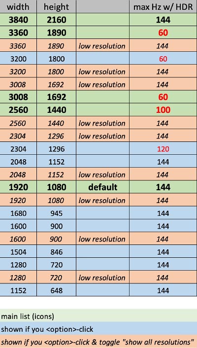
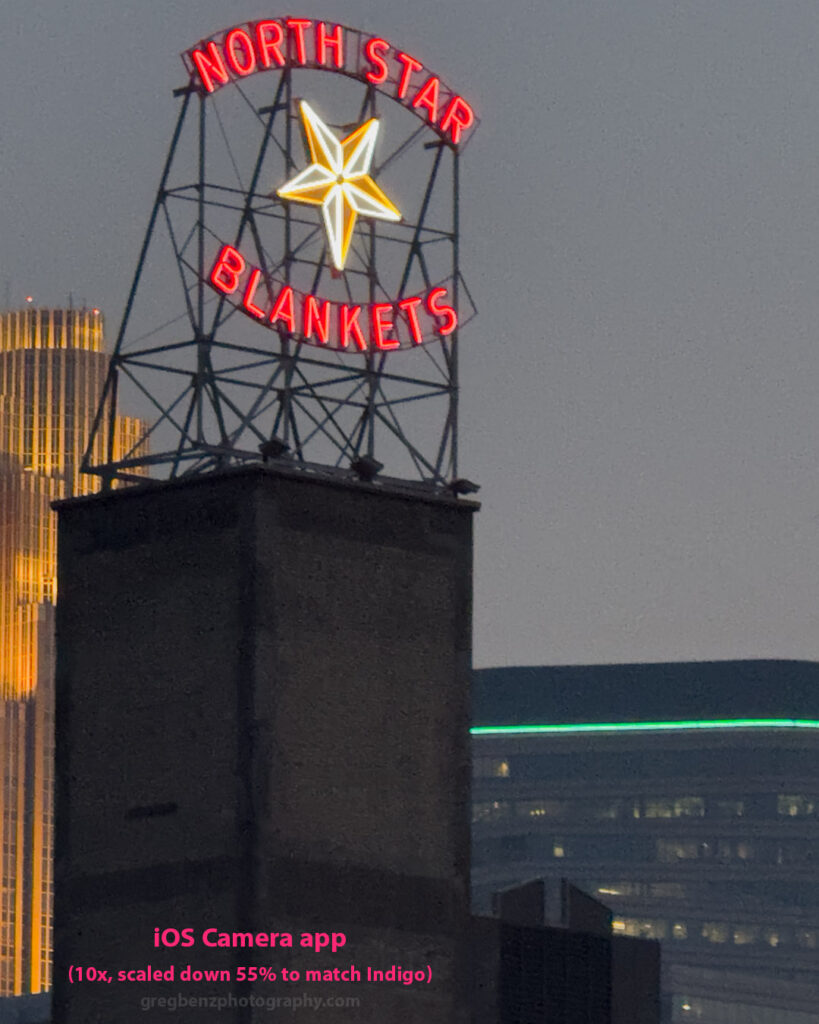
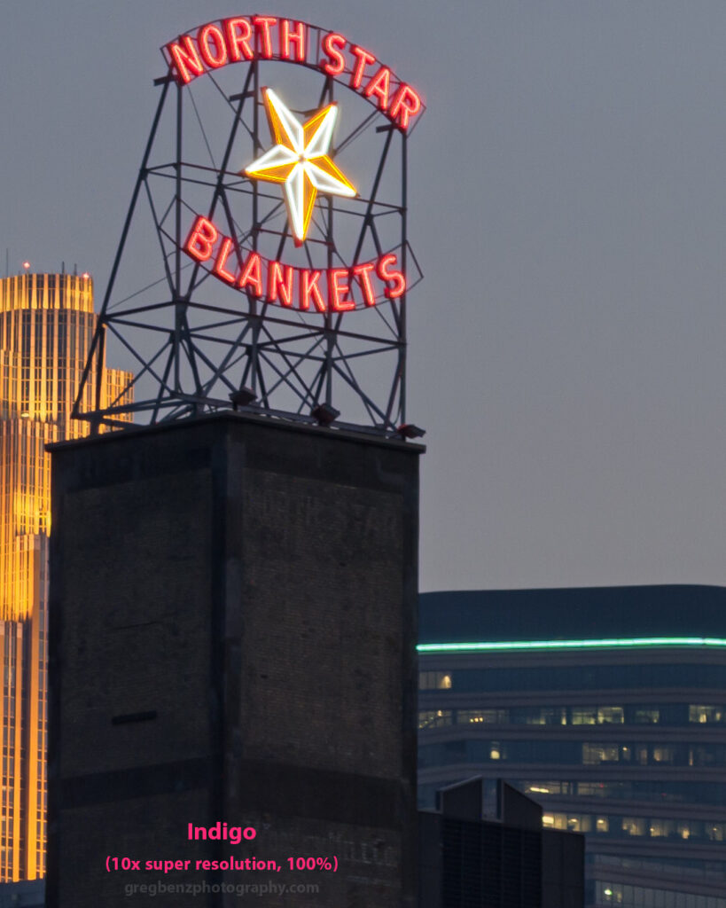
 Smart phone cameras are incredible tools. They’re easy to use, lightweight, you always have it with you, and the image quality is very good. At the same time, a dedicated mirrorless or DSLR camera typically offers simpler manual control and higher image quality. Adobe has a new camera app called “